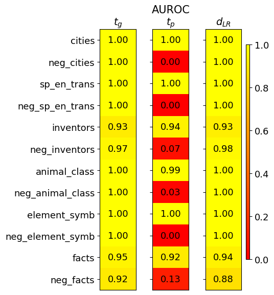
## Heatmap Chart: AUROC Scores Across Categories and Methods
### Overview
The image displays a heatmap chart titled "AUROC" (Area Under the Receiver Operating Characteristic Curve), which is a performance metric for classification models. The chart compares the AUROC scores of three different methods or models (labeled as columns) across twelve different categories or datasets (labeled as rows). The values range from 0.00 to 1.00, with a color scale indicating performance: bright yellow represents a perfect score of 1.0, transitioning through orange to red for scores approaching 0.0.
### Components/Axes
* **Chart Title:** "AUROC" (centered at the top).
* **Column Headers (Methods/Models):**
* `t_g` (left column)
* `t_p` (middle column)
* `d_LR` (right column)
* **Row Labels (Categories/Datasets):** Listed vertically on the left side. From top to bottom:
1. `cities`
2. `neg_cities`
3. `sp_en_trans`
4. `neg_sp_en_trans`
5. `inventors`
6. `neg_inventors`
7. `animal_class`
8. `neg_animal_class`
9. `element_symb`
10. `neg_element_symb`
11. `facts`
12. `neg_facts`
* **Color Scale/Legend:** Positioned vertically on the far right. It is a gradient bar labeled from `0.0` (bottom, red) to `1.0` (top, yellow), with intermediate markers at `0.2`, `0.4`, `0.6`, and `0.8`. This scale maps the numerical AUROC values to colors in the heatmap cells.
### Detailed Analysis
The heatmap contains a grid of 12 rows by 3 columns, with each cell displaying a numerical AUROC value and colored according to the scale.
**Column `t_g` (Left):**
* **Visual Trend:** This column shows consistently high performance. Almost all cells are bright yellow, indicating near-perfect scores.
* **Data Points (Top to Bottom):**
* `cities`: 1.00
* `neg_cities`: 1.00
* `sp_en_trans`: 1.00
* `neg_sp_en_trans`: 1.00
* `inventors`: 0.93 (slightly less yellow)
* `neg_inventors`: 0.97
* `animal_class`: 1.00
* `neg_animal_class`: 1.00
* `element_symb`: 1.00
* `neg_element_symb`: 1.00
* `facts`: 0.95
* `neg_facts`: 0.92
**Column `t_p` (Middle):**
* **Visual Trend:** This column exhibits extreme variability. It contains both perfect scores (bright yellow) and very low scores (deep red), creating a stark, alternating pattern.
* **Data Points (Top to Bottom):**
* `cities`: 1.00
* `neg_cities`: 0.00 (deep red)
* `sp_en_trans`: 1.00
* `neg_sp_en_trans`: 0.00 (deep red)
* `inventors`: 0.94
* `neg_inventors`: 0.07 (red)
* `animal_class`: 0.99
* `neg_animal_class`: 0.03 (deep red)
* `element_symb`: 1.00
* `neg_element_symb`: 0.00 (deep red)
* `facts`: 0.92
* `neg_facts`: 0.13 (red)
**Column `d_LR` (Right):**
* **Visual Trend:** Similar to `t_g`, this column shows very high and stable performance across all categories, with all cells appearing bright yellow.
* **Data Points (Top to Bottom):**
* `cities`: 1.00
* `neg_cities`: 1.00
* `sp_en_trans`: 1.00
* `neg_sp_en_trans`: 1.00
* `inventors`: 0.93
* `neg_inventors`: 0.98
* `animal_class`: 1.00
* `neg_animal_class`: 1.00
* `element_symb`: 1.00
* `neg_element_symb`: 1.00
* `facts`: 0.94
* `neg_facts`: 0.88 (slightly less yellow than others in this column)
### Key Observations
1. **Method Performance Disparity:** Methods `t_g` and `d_LR` demonstrate robust, high performance (AUROC ≥ 0.88) across all twelve categories. In contrast, method `t_p` is highly unstable.
2. **Pattern in `t_p` Failures:** The `t_p` method fails catastrophically (AUROC ≤ 0.13) on every category prefixed with "neg_" (`neg_cities`, `neg_sp_en_trans`, `neg_inventors`, `neg_animal_class`, `neg_element_symb`). It performs perfectly or near-perfectly on their positive counterparts.
3. **Category Difficulty:** The `inventors` and `facts` categories (and their negations) appear slightly more challenging for all methods, as they are the only rows where scores dip below 0.95 for the high-performing models.
4. **Spatial Layout:** The legend is positioned to the right of the data grid. The row labels are left-aligned, and column headers are centered above their respective data columns. The numerical values are centered within each colored cell.
### Interpretation
This heatmap likely evaluates different techniques (`t_g`, `t_p`, `d_LR`) for a binary classification task across various datasets. The "neg_" prefix suggests these are negated or adversarial versions of the base tasks (e.g., distinguishing non-cities from something else).
The data suggests that `t_g` and `d_LR` are reliable, generalizable methods. The `t_p` method, however, reveals a critical flaw: it appears to rely on a superficial feature or bias present in the positive examples of the base tasks but completely absent or inverted in the negated tasks. This causes its performance to collapse to near-random (or worse) on the "neg_" datasets. This pattern is a classic sign of a model that has not learned the true underlying concept but has instead "cheated" by exploiting dataset-specific artifacts.
The near-perfect scores for `t_g` and `d_LR` on most tasks could indicate either very effective models or potentially overly simplistic evaluation datasets. The slight performance dip on `inventors` and `facts` might point to these being more complex or noisy categories. The chart effectively communicates not just raw performance, but the *robustness* and *failure modes* of the compared methods.