\n
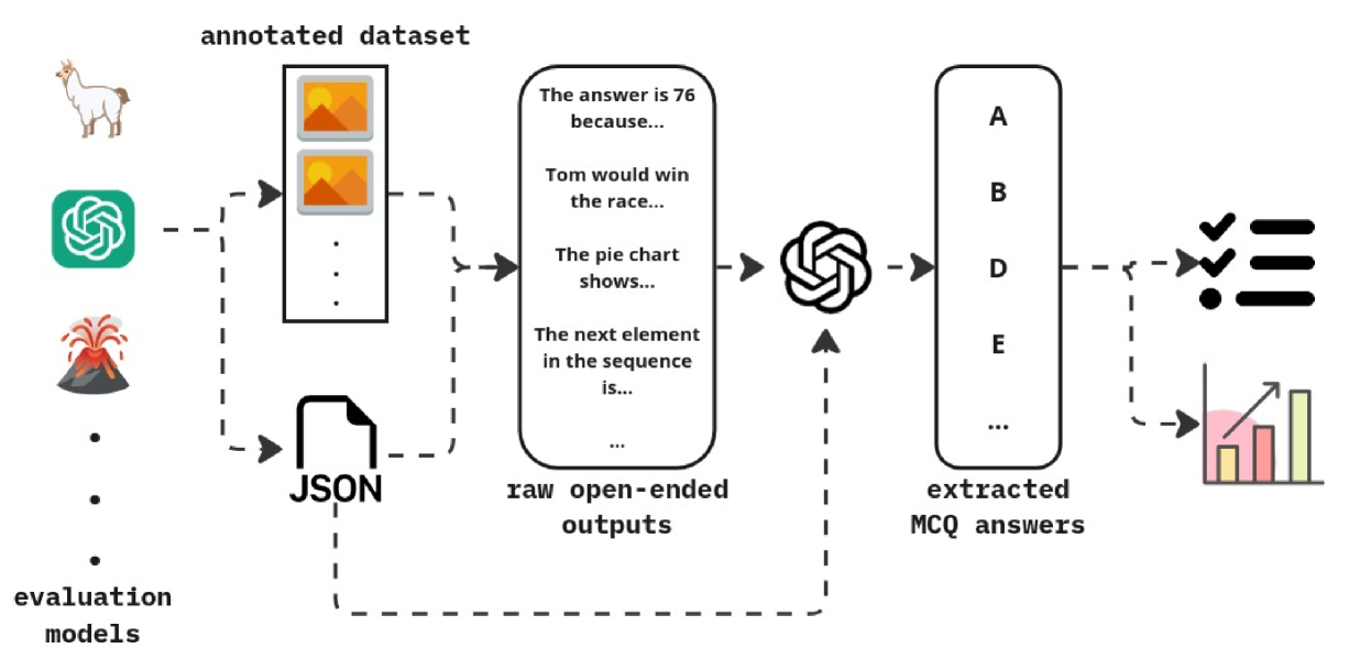
## Diagram: Data Processing Pipeline
### Overview
The image depicts a data processing pipeline, illustrating the flow of data from evaluation models through an annotated dataset, raw open-ended outputs, and finally to extracted multiple-choice question (MCQ) answers. The diagram uses a series of connected boxes and swirling shapes to represent the data transformation process. Dashed lines indicate the flow of data.
### Components/Axes
The diagram consists of the following components:
* **Evaluation Models:** Represented by icons of a llama, a shield with a swirl, a green spiral, and a volcano.
* **Annotated Dataset:** A rectangular box labeled "annotated dataset" containing an image of an orange.
* **Raw Open-ended Outputs:** A rectangular box labeled "raw open-ended outputs" containing example text snippets: "The answer is 76 because...", "Tom would win the race...", "The pie chart shows...", "The next element in the sequence is...", and "...".
* **Extracted MCQ Answers:** A rectangular box labeled "extracted MCQ answers".
* **JSON:** A bracket-shaped icon representing JSON data format.
* **Swirling Shapes:** Used to visually represent data transformation or processing steps.
* **Dashed Lines:** Indicate the flow of data between components.
* **MCQ Answer Options:** Represented by circles with checkmarks and horizontal lines.
* **Bar Chart:** A bar chart representing the distribution of extracted MCQ answers.
* **Labels A, B, D, E:** Labels associated with the MCQ answer options.
### Detailed Analysis or Content Details
The diagram illustrates the following data flow:
1. **Evaluation Models to Annotated Dataset:** Data flows from the four evaluation model icons (llama, shield, spiral, volcano) to the "annotated dataset" box.
2. **Annotated Dataset to Raw Open-ended Outputs:** The annotated dataset is processed and transformed into "raw open-ended outputs". This is indicated by the swirling shape and dashed line.
3. **Raw Open-ended Outputs to Extracted MCQ Answers:** The raw open-ended outputs are further processed into "extracted MCQ answers". This is also indicated by a swirling shape and dashed line.
4. **Extracted MCQ Answers to MCQ Options & Bar Chart:** The extracted MCQ answers are then represented as multiple-choice options (A, B, D, E) with checkmarks and a bar chart showing the distribution of selected answers. The MCQ options are arranged vertically. The bar chart shows increasing bar heights from left to right, suggesting a higher frequency of answers towards the right.
The text snippets within the "raw open-ended outputs" box provide examples of the type of data being processed. The JSON icon suggests that the data is structured in JSON format at some point in the pipeline.
### Key Observations
* The diagram emphasizes a pipeline for converting open-ended responses into structured MCQ answers.
* The use of swirling shapes suggests a complex transformation process.
* The bar chart indicates a distribution of answers, potentially representing the accuracy or frequency of different responses.
* The labels A, B, D, and E are not sequential, suggesting that option C may be omitted or irrelevant.
### Interpretation
The diagram illustrates a system for evaluating and extracting structured data from open-ended responses. The evaluation models generate data that is then annotated. This annotated data is used to produce raw open-ended outputs, which are then processed to extract answers to multiple-choice questions. The final step involves analyzing the distribution of extracted answers, potentially to assess the performance of the system or the quality of the responses. The pipeline suggests a focus on converting qualitative data (open-ended responses) into quantitative data (MCQ answers and their distribution). The omission of option 'C' in the MCQ answers could indicate a deliberate design choice or a limitation of the system. The increasing bar heights in the bar chart suggest a potential bias or pattern in the extracted answers.