## Line Chart: MSSIM vs. Frequency
### Overview
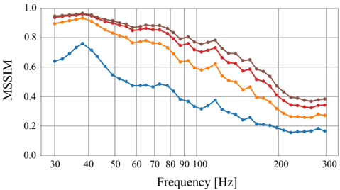
The image is a line chart showing the relationship between MSSIM (Multi-Scale Structural Similarity Index) and Frequency (in Hz). There are four distinct data series represented by different colored lines: brown, red, orange, and blue. The chart illustrates how MSSIM values change across a range of frequencies from approximately 30 Hz to 300 Hz.
### Components/Axes
* **Y-axis (Vertical):** Labeled "MSSIM," ranging from 0.0 to 1.0 in increments of 0.2.
* **X-axis (Horizontal):** Labeled "Frequency [Hz]," ranging from 30 Hz to 300 Hz. Major tick marks are present at 30, 40, 50, 60, 70, 80, 90, 100, 200, and 300 Hz.
* **Data Series:** Four lines representing different conditions or configurations. The legend is missing, so the exact meaning of each line is unknown.
### Detailed Analysis
**1. Brown Line:**
* **Trend:** The brown line starts at a high MSSIM value, remains relatively stable between 30 Hz and 60 Hz, and then gradually decreases as frequency increases.
* **Data Points:**
* At 30 Hz, MSSIM ≈ 0.95
* At 60 Hz, MSSIM ≈ 0.92
* At 100 Hz, MSSIM ≈ 0.85
* At 200 Hz, MSSIM ≈ 0.75
* At 300 Hz, MSSIM ≈ 0.72
**2. Red Line:**
* **Trend:** Similar to the brown line, the red line starts high, plateaus slightly, and then decreases with increasing frequency.
* **Data Points:**
* At 30 Hz, MSSIM ≈ 0.92
* At 60 Hz, MSSIM ≈ 0.88
* At 100 Hz, MSSIM ≈ 0.78
* At 200 Hz, MSSIM ≈ 0.60
* At 300 Hz, MSSIM ≈ 0.38
**3. Orange Line:**
* **Trend:** The orange line also starts high but decreases more noticeably than the brown and red lines as frequency increases.
* **Data Points:**
* At 30 Hz, MSSIM ≈ 0.90
* At 60 Hz, MSSIM ≈ 0.82
* At 100 Hz, MSSIM ≈ 0.70
* At 200 Hz, MSSIM ≈ 0.45
* At 300 Hz, MSSIM ≈ 0.30
**4. Blue Line:**
* **Trend:** The blue line has a distinct trend. It starts lower than the other lines, increases to a peak around 40 Hz, and then decreases significantly as frequency increases.
* **Data Points:**
* At 30 Hz, MSSIM ≈ 0.64
* At 40 Hz, MSSIM ≈ 0.75
* At 60 Hz, MSSIM ≈ 0.50
* At 100 Hz, MSSIM ≈ 0.45
* At 200 Hz, MSSIM ≈ 0.20
* At 300 Hz, MSSIM ≈ 0.15
### Key Observations
* The brown line consistently exhibits the highest MSSIM values across the frequency range.
* The blue line has the lowest MSSIM values, especially at higher frequencies.
* All lines show a general decreasing trend in MSSIM as frequency increases, except for the initial increase in the blue line.
* The rate of decrease varies among the lines, with the blue line showing the most rapid decline.
### Interpretation
The chart suggests that the MSSIM values are generally inversely related to frequency. This could indicate that the similarity between images or signals being compared decreases as the frequency of the signal increases. The different colored lines likely represent different processing methods, configurations, or types of data. The brown line represents the configuration that preserves the most similarity across all frequencies, while the blue line represents the configuration that preserves the least similarity, especially at higher frequencies. The peak in the blue line around 40 Hz might indicate a resonance or specific characteristic of that configuration at that frequency. Without a legend, the specific meaning of each line remains speculative.