## Line Chart: Accuracy vs. Sample Size
### Overview
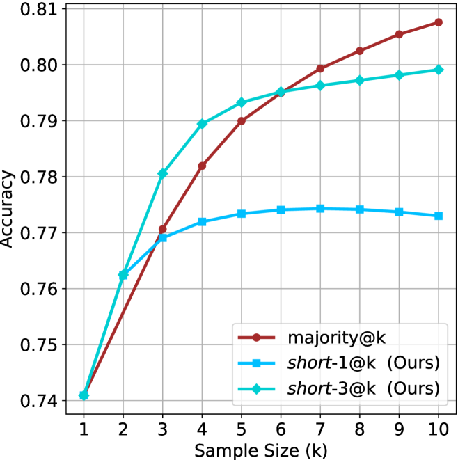
This image presents a line chart comparing the accuracy of three different methods – majority@k, short-1@k, and short-3@k – as a function of sample size (k). The chart visually demonstrates how accuracy improves with increasing sample size for each method.
### Components/Axes
* **X-axis:** "Sample Size (k)" ranging from 1 to 10. The axis is labeled and has tick marks at integer values.
* **Y-axis:** "Accuracy" ranging from 0.74 to 0.81. The axis is labeled and has tick marks at intervals of 0.01.
* **Legend:** Located in the bottom-right corner of the chart. It identifies the three data series:
* majority@k (represented by a red line with circular markers)
* short-1@k (Ours) (represented by a blue line with circular markers)
* short-3@k (Ours) (represented by a teal line with circular markers)
* **Gridlines:** A light gray grid is present to aid in reading values.
### Detailed Analysis
Let's analyze each line individually, noting trends and approximate data points.
* **majority@k (Red Line):** This line starts at approximately 0.745 at k=1 and steadily increases, reaching approximately 0.795 at k=5. It continues to rise, reaching approximately 0.805 at k=10. The line exhibits a consistent upward slope, but the rate of increase slows down as k increases.
* **short-1@k (Ours) (Blue Line):** This line begins at approximately 0.74 at k=1 and shows a rapid increase up to k=4, reaching approximately 0.775. From k=4 to k=10, the line plateaus, with only a slight increase to approximately 0.78 at k=10.
* **short-3@k (Ours) (Teal Line):** This line starts at approximately 0.74 at k=1 and exhibits the steepest initial increase, reaching approximately 0.79 at k=4. It then plateaus, with a slight decrease to approximately 0.80 at k=7, and remains relatively stable at approximately 0.80 to 0.805 for k=8, 9, and 10.
Here's a table summarizing approximate data points:
| Sample Size (k) | majority@k | short-1@k (Ours) | short-3@k (Ours) |
|---|---|---|---|
| 1 | 0.745 | 0.74 | 0.74 |
| 2 | 0.76 | 0.755 | 0.765 |
| 3 | 0.775 | 0.765 | 0.78 |
| 4 | 0.785 | 0.775 | 0.79 |
| 5 | 0.795 | 0.778 | 0.795 |
| 6 | 0.80 | 0.78 | 0.80 |
| 7 | 0.802 | 0.78 | 0.802 |
| 8 | 0.803 | 0.78 | 0.803 |
| 9 | 0.804 | 0.78 | 0.803 |
| 10 | 0.805 | 0.78 | 0.805 |
### Key Observations
* **short-3@k** consistently outperforms the other two methods, especially at lower sample sizes.
* **short-1@k** shows a rapid initial improvement but plateaus quickly.
* **majority@k** exhibits a steady, but slower, improvement with increasing sample size.
* All three methods converge in accuracy as the sample size increases, suggesting diminishing returns.
### Interpretation
The chart demonstrates the effectiveness of the "short-3@k" method in achieving high accuracy, particularly when the sample size is limited. The rapid initial improvement of "short-3@k" suggests it efficiently leverages the available data. The plateauing of "short-1@k" indicates that adding more samples beyond a certain point does not significantly improve its performance. The consistent, but slower, improvement of "majority@k" suggests it benefits from larger sample sizes but is less efficient at utilizing smaller datasets.
The "Ours" designation next to "short-1@k" and "short-3@k" suggests these are methods developed by the authors of the study. The data suggests that these methods are competitive with, and in some cases outperform, the traditional "majority@k" approach. The convergence of the lines at higher sample sizes indicates that all methods eventually achieve similar levels of accuracy, implying that the benefits of the "short-*" methods are most pronounced when data is scarce.