## Chart: Average Relative Information Flow (AvERITF) vs. Amount of Collapse
### Overview
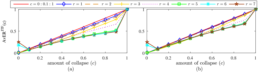
The image presents two line graphs (labeled (a) and (b)) illustrating the relationship between the amount of collapse (c) and the Average Relative Information Flow (AvERITF(c)). Each graph displays multiple lines, each representing a different value of 'r'. The x-axis represents the 'amount of collapse (c)' ranging from 0 to 1, and the y-axis represents 'AvERITF(c)' ranging from 0 to 1.
### Components/Axes
* **X-axis (both graphs):** "amount of collapse (c)" - Scale from 0 to 1, with markers at 0, 0.2, 0.4, 0.6, 0.8, and 1.
* **Y-axis (both graphs):** "AvERITF(c)" - Scale from 0 to 1, with markers at 0, 0.2, 0.4, 0.6, 0.8, and 1.
* **Legend (top-center):**
* c = 0: 0.1: 1 (Red solid line)
* r = 1 (Blue dashed line)
* r = 2 (Yellow solid line)
* r = 3 (Black dashed-dotted line)
* r = 4 (Green dotted line)
* r = 5 (Cyan asterisk-dashed line)
* r = 6 (Magenta asterisk-dotted line)
* r = 7 (Brown asterisk-dashed line)
### Detailed Analysis or Content Details
**Graph (a):**
* **c = 0: 0.1: 1 (Red):** Starts at approximately (0, 0), increases linearly to approximately (0.8, 0.8), then sharply increases to approximately (1, 0.95).
* **r = 1 (Blue):** Starts at approximately (0, 0), increases linearly to approximately (0.9, 0.8), then sharply increases to approximately (1, 0.95).
* **r = 2 (Yellow):** Starts at approximately (0, 0), increases linearly to approximately (0.7, 0.6), then sharply increases to approximately (1, 0.9).
* **r = 3 (Black):** Starts at approximately (0, 0), increases linearly to approximately (0.6, 0.5), then sharply increases to approximately (1, 0.85).
* **r = 4 (Green):** Starts at approximately (0, 0), increases linearly to approximately (0.5, 0.4), then sharply increases to approximately (1, 0.8).
* **r = 5 (Cyan):** Starts at approximately (0, 0), increases linearly to approximately (0.4, 0.3), then sharply increases to approximately (1, 0.75).
* **r = 6 (Magenta):** Starts at approximately (0, 0), increases linearly to approximately (0.3, 0.25), then sharply increases to approximately (1, 0.7).
* **r = 7 (Brown):** Starts at approximately (0, 0), increases linearly to approximately (0.2, 0.2), then sharply increases to approximately (1, 0.65).
**Graph (b):**
* **c = 0: 0.1: 1 (Red):** Starts at approximately (0, 0), increases linearly to approximately (0.8, 0.8), then sharply increases to approximately (1, 0.95).
* **r = 1 (Blue):** Starts at approximately (0, 0), increases linearly to approximately (0.9, 0.8), then sharply increases to approximately (1, 0.95).
* **r = 2 (Yellow):** Starts at approximately (0, 0), increases linearly to approximately (0.7, 0.6), then sharply increases to approximately (1, 0.9).
* **r = 3 (Black):** Starts at approximately (0, 0), increases linearly to approximately (0.6, 0.5), then sharply increases to approximately (1, 0.85).
* **r = 4 (Green):** Starts at approximately (0, 0), increases linearly to approximately (0.5, 0.4), then sharply increases to approximately (1, 0.8).
* **r = 5 (Cyan):** Starts at approximately (0, 0), increases linearly to approximately (0.4, 0.3), then sharply increases to approximately (1, 0.75).
* **r = 6 (Magenta):** Starts at approximately (0, 0), increases linearly to approximately (0.3, 0.25), then sharply increases to approximately (1, 0.7).
* **r = 7 (Brown):** Starts at approximately (0, 0), increases linearly to approximately (0.2, 0.2), then sharply increases to approximately (1, 0.65).
### Key Observations
* Both graphs exhibit similar trends.
* As the 'amount of collapse (c)' increases, the 'AvERITF(c)' generally increases.
* The lines representing different values of 'r' diverge as 'c' increases, with lower values of 'r' resulting in higher 'AvERITF(c)' values.
* The increase in 'AvERITF(c)' becomes steeper as 'c' approaches 1 for all values of 'r'.
* The lines for c = 0:0.1:1 and r = 1 are nearly identical.
### Interpretation
The charts demonstrate the relationship between the amount of collapse and the average relative information flow, parameterized by 'r'. The 'amount of collapse' likely refers to a reduction in complexity or dimensionality. The 'AvERITF(c)' represents a measure of information transfer after this collapse.
The data suggests that as the amount of collapse increases, information flow initially increases linearly, but then experiences a rapid increase as the collapse nears completion. This could indicate that a certain level of collapse is necessary to facilitate information transfer, but excessive collapse can lead to information loss or distortion.
The parameter 'r' appears to influence the rate of information flow. Lower values of 'r' result in higher information flow, suggesting that 'r' may represent a constraint or penalty on information transfer. The nearly identical lines for c = 0:0.1:1 and r = 1 suggest that the parameter 'c' and 'r' are related.
The steep increase in AvERITF(c) near c=1 could represent a phase transition or critical point where information flow becomes highly sensitive to small changes in the amount of collapse. The graphs provide insights into the trade-off between complexity reduction (collapse) and information preservation.