## Line Charts: AVER^{ITF}(c) vs. Amount of Collapse (c)
### Overview
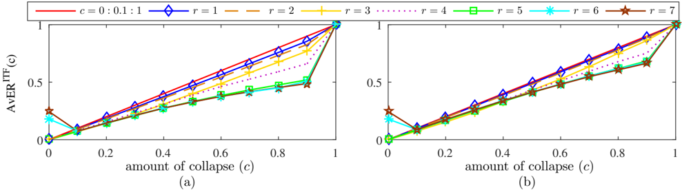
The image contains two line charts, labeled (a) and (b), displaying the relationship between AVER^{ITF}(c) and the amount of collapse (c). Both charts show multiple data series, each representing a different value of 'r' (ranging from 1 to 7), along with a series for 'c = 0:0.1:1'. The x-axis represents the amount of collapse (c), ranging from 0 to 1. The y-axis represents AVER^{ITF}(c), also ranging from 0 to 1.
### Components/Axes
* **X-axis (Horizontal):**
* Label: "amount of collapse (c)"
* Scale: 0 to 1, with tick marks at 0, 0.2, 0.4, 0.6, 0.8, and 1.
* **Y-axis (Vertical):**
* Label: "AVER^{ITF}(c)"
* Scale: 0 to 1, with tick marks at 0, 0.5, and 1.
* **Legends (Top):**
* `c = 0:0.1:1`: Red line with diamond markers.
* `r = 1`: Blue line with diamond markers.
* `r = 2`: Brown line with plus markers.
* `r = 3`: Yellow line with plus markers.
* `r = 4`: Purple dotted line with square markers.
* `r = 5`: Green line with square markers.
* `r = 6`: Cyan line with asterisk markers.
* `r = 7`: Dark Brown line with star markers.
* **Chart Labels:**
* (a): Located below the left chart.
* (b): Located below the right chart.
### Detailed Analysis
**Chart (a):**
* **`c = 0:0.1:1` (Red line with diamond markers):** The line starts at approximately 0 at c=0, and increases linearly to 1 at c=1.
* **`r = 1` (Blue line with diamond markers):** The line starts at approximately 0 at c=0, and increases linearly to 1 at c=1.
* **`r = 2` (Brown line with plus markers):** The line starts at approximately 0.15 at c=0, and increases linearly to approximately 0.9 at c=1.
* **`r = 3` (Yellow line with plus markers):** The line starts at approximately 0.1 at c=0, and increases linearly to approximately 0.9 at c=1.
* **`r = 4` (Purple dotted line with square markers):** The line starts at approximately 0.05 at c=0, and increases linearly to approximately 0.8 at c=1.
* **`r = 5` (Green line with square markers):** The line starts at approximately 0 at c=0, and increases linearly to approximately 0.5 at c=0.8, then increases sharply to 1 at c=1.
* **`r = 6` (Cyan line with asterisk markers):** The line starts at approximately 0.2 at c=0, decreases to approximately 0.0 at c=0.1, then increases linearly to approximately 0.5 at c=0.8, then increases sharply to 1 at c=1.
* **`r = 7` (Dark Brown line with star markers):** The line starts at approximately 0.25 at c=0, decreases to approximately 0.1 at c=0.1, then increases linearly to approximately 0.7 at c=0.8, then increases sharply to 1 at c=1.
**Chart (b):**
* **`c = 0:0.1:1` (Red line with diamond markers):** The line starts at approximately 0 at c=0, and increases linearly to 1 at c=1.
* **`r = 1` (Blue line with diamond markers):** The line starts at approximately 0 at c=0, and increases linearly to 1 at c=1.
* **`r = 2` (Brown line with plus markers):** The line starts at approximately 0.15 at c=0, and increases linearly to approximately 0.9 at c=1.
* **`r = 3` (Yellow line with plus markers):** The line starts at approximately 0.1 at c=0, and increases linearly to approximately 0.9 at c=1.
* **`r = 4` (Purple dotted line with square markers):** The line starts at approximately 0.05 at c=0, and increases linearly to approximately 0.8 at c=1.
* **`r = 5` (Green line with square markers):** The line starts at approximately 0 at c=0, and increases linearly to approximately 0.5 at c=0.8, then increases sharply to 1 at c=1.
* **`r = 6` (Cyan line with asterisk markers):** The line starts at approximately 0.2 at c=0, decreases to approximately 0.0 at c=0.1, then increases linearly to approximately 0.5 at c=0.8, then increases sharply to 1 at c=1.
* **`r = 7` (Dark Brown line with star markers):** The line starts at approximately 0.25 at c=0, decreases to approximately 0.1 at c=0.1, then increases linearly to approximately 0.7 at c=0.8, then increases sharply to 1 at c=1.
### Key Observations
* The charts (a) and (b) appear to be identical.
* The lines for `c = 0:0.1:1` and `r = 1` are identical and linear, increasing directly from (0,0) to (1,1).
* The lines for `r = 2`, `r = 3`, and `r = 4` are mostly linear, but do not start at (0,0).
* The lines for `r = 5`, `r = 6`, and `r = 7` show a dip at c=0.1, then increase linearly until c=0.8, after which they sharply increase to 1 at c=1.
### Interpretation
The charts illustrate how the AVER^{ITF}(c) changes with the amount of collapse (c) for different values of 'r'. The linear relationship observed for `c = 0:0.1:1` and `r = 1` suggests a direct proportionality between the amount of collapse and AVER^{ITF}(c) in these cases. The other 'r' values show varying degrees of non-linearity, especially for `r = 5`, `r = 6`, and `r = 7`, indicating a more complex relationship where AVER^{ITF}(c) is not directly proportional to the amount of collapse. The dip at c=0.1 for `r = 6` and `r = 7` suggests a possible threshold effect or an initial resistance to collapse at low values of 'c'. The sharp increase to 1 at c=1 for `r = 5`, `r = 6`, and `r = 7` indicates that regardless of the initial behavior, AVER^{ITF}(c) eventually reaches its maximum value when the amount of collapse is complete.