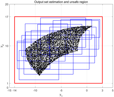
## 2D Scatter Plot with Bounding Boxes: Output Set Estimation and Unsafe Region
### Overview
The image is a 2D Cartesian plot displaying a dense scatter plot of data points overlaid with multiple overlapping rectangular bounding boxes, all enclosed within a single, larger rectangular boundary. The chart visualizes a mathematical or computational concept, likely related to reachability analysis, formal verification, or control theory, where a complex set of outputs is approximated by simpler geometric shapes to check against defined constraints.
### Components/Axes
**Header:**
* **Title:** "Output set estimation and unsafe region" (Located top-center).
**Axes:**
* **X-axis (Bottom):** Labeled as "$y_1$". It features a linear scale with major grid lines.
* *Markers:* -15, -14, -10, -5, 0, 3, 5.
* *Note:* The markers -14 and 3 are specifically placed to align with the vertical edges of the red rectangle, rather than following the standard intervals of 5.
* **Y-axis (Left):** Labeled as "$y_2$" (rotated 90 degrees counter-clockwise). It features a linear scale with major grid lines.
* *Markers:* 0, 1, 10, 17, 20.
* *Note:* The markers 1 and 17 are specifically placed to align with the horizontal edges of the red rectangle, deviating from the standard intervals of 10.
**Legend/Color Coding (Inferred from Title and Context):**
* *Note: There is no explicit legend box. The following is deduced from the title and visual hierarchy.*
* **Black Dots:** Represent the actual "Output set" (likely generated via Monte Carlo simulation or empirical sampling).
* **Blue Rectangles:** Represent the "Output set estimation" (an over-approximation of the black dots using a union of intervals/boxes).
* **Red Rectangle:** Represents the boundary related to the "unsafe region" mentioned in the title.
### Detailed Analysis
**1. The Red Boundary (Unsafe Region / Constraint):**
* *Visual Trend:* A single, thick red line forming a perfect rectangle.
* *Spatial Grounding:* It dominates the chart area, acting as an outer envelope for all other data.
* *Data Points:* Based on the specific axis markers, the red rectangle is defined exactly by the coordinates:
* $y_1$ (X-axis) bounds: $[-14, 3]$
* $y_2$ (Y-axis) bounds: $[1, 17]$
**2. The Black Scatter Plot (Actual Output Set):**
* *Visual Trend:* Thousands of dense black dots forming a cohesive, asymmetrical, roughly fan-like or crescent shape. The left side is wider and somewhat flat, while it tapers to a narrower point on the right side. The bottom edge is convex, and the top edge is slightly concave.
* *Spatial Grounding:* Centered within the plot, entirely contained within the red rectangle.
* *Approximate Bounds:*
* Leftmost point: $\approx -13$ on $y_1$
* Rightmost point: $\approx 1.5$ on $y_1$
* Lowest point: $\approx 2$ on $y_2$
* Highest point: $\approx 15$ on $y_2$
**3. The Blue Rectangles (Output Set Estimation):**
* *Visual Trend:* Approximately 15 to 20 overlapping blue rectangles of varying widths and heights.
* *Spatial Grounding:* They are clustered around the black scatter plot. Every blue rectangle contains a portion of the black dots. Collectively, the union of all blue rectangles completely covers (over-approximates) the entire black scatter plot.
* *Relationship to Red Box:* All blue rectangles are strictly contained within the boundaries of the red rectangle. The leftmost blue box approaches $y_1 \approx -13.5$, the rightmost approaches $y_1 \approx 2.5$, the lowest approaches $y_2 \approx 1.5$, and the highest approaches $y_2 \approx 16.5$. None cross the $-14, 3, 1,$ or $17$ thresholds.
### Key Observations
* **Strict Containment:** The most critical visual takeaway is the hierarchy of containment: The actual data (black dots) is entirely inside the estimation (blue boxes), and the estimation (blue boxes) is entirely inside the defined boundary (red box).
* **Conservative Estimation:** The blue boxes cover areas where there are no black dots (empty white space within the blue lines). This indicates a "conservative" or "over-approximated" estimation method.
* **Custom Axis Labeling:** The creator of the chart intentionally added non-standard tick marks (-14, 3 on X; 1, 17 on Y) specifically to provide exact numerical values for the red boundary box, highlighting its importance.
### Interpretation
**Contextual Meaning (Peircean Deduction):**
This image is a classic visualization from the field of **formal verification of dynamical systems or neural networks** (specifically, reachability analysis).
* **The Black Dots** represent the true reachable set of a system's outputs given a set of inputs. Because calculating the exact non-linear boundaries of this set is computationally impossible, it is approximated.
* **The Blue Boxes** represent the mathematical algorithm's attempt to bound this complex shape using simpler geometry (likely interval arithmetic or zonotopes). The algorithm guarantees that the true outputs (black) will *always* be inside the estimation (blue).
* **The Red Box** represents a critical system constraint. The title mentions "unsafe region." In verification, you typically want to prove that your system *never* enters an unsafe region.
* *Nuance:* If the red box itself is the "unsafe region," then this system is failing catastrophically, as all outputs are inside it.
* *More Likely Scenario:* The red box represents the **Safe Set**, and anything *outside* the red box is the "unsafe region." Therefore, the goal of the chart is to prove safety. Because the over-approximated estimation (blue boxes) never crosses the red line, the engineers can mathematically guarantee that the actual system (black dots) will never enter the unsafe region (outside the red box).
**Conclusion:**
The data demonstrates a successful safety verification. The estimation algorithm successfully bounded the complex output set, and this bounding geometry remained strictly within the defined safety tolerances ($y_1 \in [-14, 3]$, $y_2 \in [1, 17]$), proving the system avoids the unsafe region.