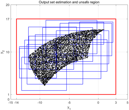
## Scatter Plot: Output set estimation and unsafe region
### Overview
The image is a scatter plot showing the output set estimation and an unsafe region. The plot displays a cluster of black data points contained within several blue rectangular boxes. A larger red rectangle encompasses all the blue boxes and the data points. The x-axis is labeled "y₁" and the y-axis is labeled "y₂".
### Components/Axes
* **Title:** Output set estimation and unsafe region
* **X-axis (y₁):** Ranges from approximately -15 to 5, with tick marks at -14, -10, 0, 3, and 5.
* **Y-axis (y₂):** Ranges from 0 to 20, with tick marks at 1, 10, 17, and 20.
* **Data Points:** A dense cluster of black data points forming an irregular shape.
* **Blue Rectangles:** Multiple blue rectangles of varying sizes enclose different sections of the data point cluster.
* **Red Rectangle:** A larger red rectangle that encompasses all the blue rectangles and the data point cluster. This represents the "unsafe region".
### Detailed Analysis
* **Data Point Distribution:** The black data points are concentrated in a region that spans approximately from y₁ = -12 to 3 and y₂ = 2 to 16. The density of points appears higher in the central region.
* **Blue Rectangles:** The blue rectangles seem to provide an estimation of the output set, with each rectangle covering a subset of the data points. The rectangles overlap, indicating multiple estimations.
* **Red Rectangle (Unsafe Region):** The red rectangle defines a boundary outside which the system is considered unsafe. Its corners are approximately at (-14, 1), (4, 1), (4, 17), and (-14, 17).
### Key Observations
* The data points are clustered within a specific region of the y₁-y₂ plane.
* The blue rectangles provide an approximation of the region occupied by the data points.
* The red rectangle represents a larger, encompassing "unsafe" region.
### Interpretation
The plot illustrates an estimation of the output set of a system and identifies an unsafe region. The black data points represent the actual output values. The blue rectangles are likely estimations of the output set, possibly obtained through different methods or at different times. The red rectangle defines the unsafe region, indicating that the system's output should remain within this boundary to avoid unsafe conditions. The plot suggests that the system's output, as represented by the data points, is mostly contained within the estimated output sets (blue rectangles) and well within the unsafe region (red rectangle).