## Chart Type: 2D Scatter Plot with Bounding Regions
### Overview
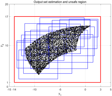
This image displays a 2D scatter plot titled "Output set estimation and unsafe region". It features a dense cluster of black data points representing an "Output set estimation", which is covered by a collection of blue-bordered rectangles. All these elements are contained within a larger, red-bordered rectangle, which is identified as the "unsafe region" boundary. The plot uses `y_1` as the horizontal axis and `y_2` as the vertical axis.
### Components/Axes
* **Chart Title**: "Output set estimation and unsafe region" (located at the top-center).
* **X-axis Label**: `y_1` (located below the x-axis, center).
* **X-axis Range**: Approximately from -15 to 5.
* **X-axis Major Ticks**: -15, -10, -5, 0. An unlabeled major tick is present at approximately 3.
* **Y-axis Label**: `y_2` (located to the left of the y-axis, center).
* **Y-axis Range**: Approximately from 0 to 20.
* **Y-axis Major Ticks**: 1, 10, 17, 20.
* **Legend**: There is no explicit legend in the image. The meaning of the visual elements is inferred from the chart title:
* **Red Rectangle**: Represents the boundary of the "unsafe region".
* **Black Dots**: Represent the "Output set estimation".
* **Blue Rectangles**: Represent an approximation or covering of the "Output set estimation".
### Detailed Analysis
The plot contains three primary visual elements:
1. **Red Rectangle (Unsafe Region Boundary)**:
* **Placement**: This is the outermost rectangular boundary, encompassing all other elements.
* **Dimensions**: Its bottom-left corner is approximately at `(y_1 = -14, y_2 = 1)`. Its top-right corner is approximately at `(y_1 = 3, y_2 = 17)`.
* **Trend**: This is a static, fixed rectangular region.
2. **Black Dots (Output Set Estimation)**:
* **Placement**: A dense cloud of individual black points, forming a contiguous, irregular shape within the red rectangle.
* **Shape and Trend**: The cluster of points forms a non-convex, somewhat crescent or boomerang-like shape, generally oriented from the bottom-left to the top-right.
* It starts around `(y_1 = -13.5, y_2 = 5)` on the left.
* It extends upwards and to the right, reaching a maximum `y_2` value of approximately 16.5 near `y_1 = -1`.
* It then curves downwards and to the right, reaching a minimum `y_2` value of approximately 3.5 near `y_1 = -8`.
* The cluster extends horizontally to a maximum `y_1` value of approximately 2.5.
* The overall shape suggests a complex, possibly non-linear, relationship between `y_1` and `y_2` for the estimated output set.
3. **Blue Rectangles (Approximation/Covering)**:
* **Placement**: Approximately 25-30 individual, non-filled, blue-bordered rectangles are distributed across the region occupied by the black dots.
* **Shape and Trend**: These rectangles are axis-aligned and collectively cover the entire area defined by the black dots. They appear to form a union of smaller boxes that approximate the irregular shape of the output set. Some of these blue rectangles extend slightly beyond the precise boundary of the black dot cluster, indicating an over-approximation. All blue rectangles are entirely contained within the red "unsafe region" boundary.
### Key Observations
* The "Output set estimation" (black dots) is a complex, non-convex region in the `y_1`-`y_2` plane.
* The blue rectangles provide a piecewise rectangular covering or over-approximation of this complex output set. This is a common technique for representing complex sets using simpler geometric primitives.
* Both the estimated output set (black dots) and its rectangular approximation (blue rectangles) are entirely contained within the larger red rectangle, which represents the "unsafe region".
### Interpretation
This plot likely originates from a control systems or safety analysis context, where `y_1` and `y_2` represent output variables of a system.
The "Output set estimation" (black dots) represents the range of possible values that the system's outputs `(y_1, y_2)` can take under certain conditions or over a specific time horizon. Its irregular shape suggests a non-trivial system behavior.
The "unsafe region" (red rectangle) defines a region in the output space that the system's outputs should ideally avoid for safety or performance reasons. The fact that the entire estimated output set (black dots) is *contained within* this red "unsafe region" implies that the system's outputs *can* enter or are *predicted to be within* the unsafe region. This suggests a potential safety violation or that the system's behavior is not guaranteed to remain outside the designated unsafe zone.
The blue rectangles are a practical computational tool. Representing complex sets like the black dot cluster with a union of simple axis-aligned rectangles (hyperrectangles) simplifies calculations for reachability analysis, collision detection, or safety verification. The slight over-approximation by the blue rectangles ensures that the true output set is fully covered, providing a conservative estimate for safety analysis. If the goal is to ensure the system *never* enters the unsafe region, this plot indicates a problem, as the estimated output set clearly overlaps with, and is fully contained by, the defined unsafe region.