\n
## Scatter Plot: Output Set Estimation and Unsafe Region
### Overview
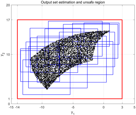
The image presents a scatter plot visualizing an output set estimation alongside an "unsafe region". The plot displays a dense cluster of points, seemingly representing data samples, within a defined coordinate system. A red rectangular boundary encompasses the majority of the points, while several smaller blue rectangles are overlaid within this region.
### Components/Axes
* **Title:** "Output set estimation and unsafe region" (positioned at the top-center)
* **X-axis:** Labeled "y₁", ranging approximately from -15 to 5. The scale appears linear.
* **Y-axis:** Labeled "y₂", ranging approximately from 1 to 20. The scale appears linear.
* **Data Points:** A dense collection of black dots scattered within the coordinate space.
* **Red Rectangle:** A large rectangular boundary encompassing most of the data points.
* **Blue Rectangles:** Multiple smaller rectangular boundaries overlaid on the data points, positioned within the larger red rectangle.
### Detailed Analysis
The scatter plot shows a concentration of data points forming a roughly triangular shape. The points are most dense in the upper-right portion of the plot and taper off towards the bottom-left.
* **Data Point Distribution:** The points are not uniformly distributed. They are clustered, suggesting a correlation between y₁ and y₂.
* **Red Rectangle:** The red rectangle spans from approximately y₁ = -15 to y₁ = 5 and from y₂ = 1 to y₂ = 17. It defines a boundary around the majority of the data points.
* **Blue Rectangles:** There are approximately 10-15 blue rectangles visible, varying in size and orientation. They are positioned within the red rectangle, seemingly highlighting specific sub-regions of the data. The rectangles do not appear to be aligned with the axes. Their placement seems somewhat random, but they are all contained within the larger red rectangle.
### Key Observations
* The data points exhibit a clear pattern, suggesting a non-linear relationship between y₁ and y₂.
* The red rectangle likely represents a defined "safe" or acceptable region for the output set.
* The blue rectangles may represent areas of uncertainty, potential risk, or specific sub-sets within the output set.
* There are no data points outside the red rectangle, indicating that all observed outputs fall within the defined boundary.
### Interpretation
The plot likely represents the results of a model or simulation where y₁ and y₂ are outputs. The "output set estimation" refers to the distribution of these outputs, visualized as the scatter plot. The "unsafe region" is implicitly defined as the area *outside* the red rectangle. The blue rectangles could represent areas where the model's predictions are less certain, or where the outputs are considered more sensitive to changes in input parameters.
The concentration of points suggests a strong relationship between y₁ and y₂. The absence of points outside the red rectangle indicates that the model consistently produces outputs within the defined bounds. The blue rectangles may be used to identify areas where further investigation or refinement of the model is needed.
The image does not provide numerical data, only a visual representation of the output set and its relationship to a defined "safe" region. The purpose of the visualization is to provide a qualitative assessment of the model's performance and identify potential areas of concern.