## Scatter Plot with Rectangular Regions: Output Set Estimation and Unsafe Region
### Overview
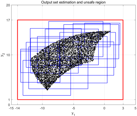
This image is a 2D scatter plot overlaid with rectangular regions, titled "Output set estimation and unsafe region." It visually compares a set of estimated output sets (blue rectangles) against a defined unsafe region (red rectangle), with a cloud of black data points representing sampled outputs. The plot is set against a white background with a light gray grid.
### Components/Axes
* **Title:** "Output set estimation and unsafe region" (centered at the top).
* **X-Axis:**
* **Label:** `y₁` (positioned below the axis).
* **Scale:** Linear, ranging from -15 to 5.
* **Major Tick Marks:** At -15, -10, -5, 0, 5.
* **Y-Axis:**
* **Label:** `y₂` (positioned to the left of the axis).
* **Scale:** Linear, ranging from 1 to 20.
* **Major Tick Marks:** At 1, 10, 17, 20.
* **Legend/Key Elements (Inferred from Color and Context):**
* **Red Rectangle:** Represents the "unsafe region."
* **Blue Rectangles:** Represent the "output set estimations."
* **Black Dots:** Represent sampled data points or system outputs.
* **Grid:** A light gray grid is present, with vertical lines at each major x-tick and horizontal lines at each major y-tick.
### Detailed Analysis
1. **Unsafe Region (Red Rectangle):**
* **Position:** Spans the majority of the plot area.
* **Boundaries (Approximate):**
* Left Edge: `y₁ ≈ -14`
* Right Edge: `y₁ ≈ 3`
* Bottom Edge: `y₂ ≈ 1`
* Top Edge: `y₂ ≈ 17`
2. **Output Set Estimations (Blue Rectangles):**
* **Number:** Approximately 20-25 overlapping blue rectangles.
* **General Position:** All are contained within the red unsafe region.
* **Size & Shape:** They vary in size and aspect ratio. Some are tall and narrow, others are wider. Their collective coverage forms a rough, irregular shape.
* **Spatial Distribution:** They are densely clustered in the central and left-central portion of the plot, with fewer rectangles extending towards the right edge of the red region.
3. **Data Points (Black Dots):**
* **Distribution:** The dots form a dense, roughly triangular or wedge-shaped cloud.
* **Spatial Grounding & Trend:** The cloud is densest in the center-left area, around `y₁ ≈ -8` to `-5` and `y₂ ≈ 8` to 12. The cloud tapers and becomes less dense as it extends towards the upper-right corner of the red rectangle (towards `y₁ ≈ 2`, `y₂ ≈ 15`).
* **Relationship to Rectangles:** The vast majority of the black dots are contained within the overlapping area of the blue rectangles. A small number of dots, particularly at the periphery of the cloud, lie inside the red rectangle but outside the coverage of the blue rectangles.
### Key Observations
* **Containment:** The blue "output set estimations" successfully cover the core, high-density region of the sampled data points (black dots).
* **Coverage Gap:** There is a visible, sparse scattering of data points at the edges of the cloud that are not enclosed by any blue rectangle, though they remain within the larger red "unsafe region."
* **Region Relationship:** The red "unsafe region" is a superset that fully contains all blue "estimation" rectangles and all sampled data points. This suggests the red region defines a broader safety boundary, while the blue regions are tighter, estimated bounds on the system's actual output.
* **Data Trend:** The data points show a positive correlation; as `y₁` increases (moves right), `y₂` generally increases (moves up), forming the described wedge shape.
### Interpretation
This plot is likely from the field of control theory, formal verification, or safety analysis for dynamical systems. It demonstrates a method for estimating the reachable set (output set) of a system.
* **What it suggests:** The system's outputs (black dots) are being bounded by a set of estimated rectangular sets (blue). The fact that most dots are inside the blue rectangles indicates the estimation method is largely accurate for the core behavior.
* **How elements relate:** The red rectangle defines a pre-defined "unsafe" or "forbidden" zone in the output space (`y₁`, `y₂`). The goal is to prove or estimate that the system's outputs will never enter this zone. The blue rectangles are the algorithm's attempt to construct a "safe" estimate that contains all possible outputs. The presence of dots outside the blue but inside the red highlights a potential limitation or conservatism in the estimation—it shows the true output set might slightly exceed the estimated bounds, but crucially, it still remains within the larger unsafe region's boundary in this sample.
* **Notable Anomaly/Outlier:** The primary "anomaly" is the set of data points not covered by the blue rectangles. In a safety verification context, these points represent a failure of the estimation to be perfectly tight. However, since they are still within the red region, the overall safety claim (that outputs stay within the red box) might still hold for this sample set. The plot visually argues that while the estimation (blue) isn't perfect, the system's behavior (dots) is still contained within the safe (non-red) area, or conversely, that the unsafe region (red) is conservatively large.