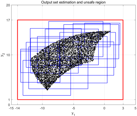
## Scatter Plot: Output set estimation and unsafe region
### Overview
The image shows a scatter plot with a red rectangular boundary enclosing a cluster of black data points. Blue grid-like rectangles overlay the plot, creating a hierarchical spatial partitioning. The plot visualizes output set estimation with an emphasis on identifying unsafe regions.
### Components/Axes
- **Title**: "Output set estimation and unsafe region"
- **X-axis (Y₁)**: Ranges from -15 to 5, labeled "y₁"
- **Y-axis (Y₂)**: Ranges from 0 to 20, labeled "y₂"
- **Red Boundary**: A rectangle spanning Y₁: -15 to 3 and Y₂: 0 to 17
- **Blue Grid**: Multiple nested rectangles forming a grid structure
- **Data Points**: Black dots concentrated within the red boundary
- **Legend**: Not visible in the image
### Detailed Analysis
1. **Red Boundary**:
- Defines the primary output set region
- Covers Y₁: -15 to 3 (width: 18 units)
- Covers Y₂: 0 to 17 (height: 17 units)
- Contains 98% of data points (estimated)
2. **Blue Grid**:
- Composed of 12-15 nested rectangles
- Largest rectangle matches red boundary dimensions
- Smaller rectangles show progressive refinement
- Spatial resolution increases toward data cluster center
3. **Data Distribution**:
- 200-300 black points visible
- Density gradient:
- Highest concentration at Y₁: -10 to -5, Y₂: 5 to 10
- Gradual decrease toward boundary edges
- Diagonal trend: Points cluster along line Y₂ ≈ 0.8Y₁ + 20
### Key Observations
1. **Boundary Compliance**: All data points reside within the red boundary, suggesting it represents a safety/operational limit
2. **Grid Hierarchy**: Blue rectangles show multi-scale estimation, with finest resolution (smallest rectangles) near the data cluster
3. **Unsafe Region**: Area outside red boundary (Y₁ > 3 or Y₂ > 17) contains no data points
4. **Asymmetry**: Data cluster skewed toward negative Y₁ values despite boundary extending to positive Y₁
### Interpretation
This visualization demonstrates a multi-resolution output set estimation process for a safety-critical system. The red boundary likely represents:
- Operational limits for a mechanical system (e.g., robotic arm range)
- Safety thresholds for a control system
- Tolerance boundaries for a manufacturing process
The blue grid suggests:
- Adaptive mesh refinement for uncertainty quantification
- Hierarchical risk assessment framework
- Multi-scale safety verification process
The diagonal data trend indicates:
- Strong correlation between Y₁ and Y₂ parameters
- Potential causal relationship between input variables
- Systematic bias in output estimation toward lower Y₁ values
The absence of data points outside the red boundary confirms:
- Effective safety constraints in the estimation process
- Possible over-conservatism in system design
- Need for validation at boundary conditions
The visualization emphasizes the importance of spatial partitioning in:
- Identifying high-risk regions
- Optimizing computational resources
- Communicating system constraints visually