## 2D Contour Plot with Marginal Distributions: General Text vs. Medical Text
### Overview
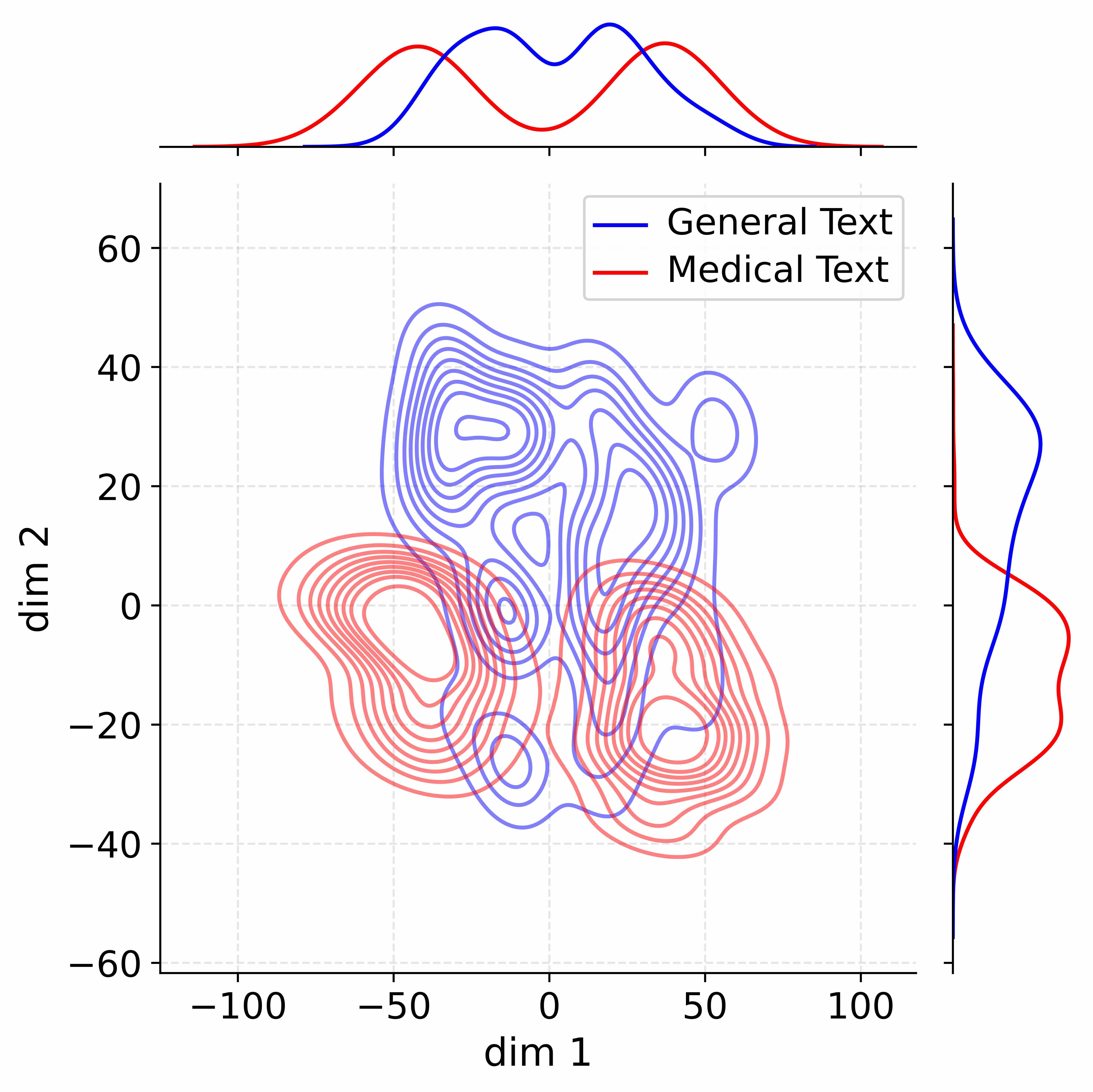
The image is a technical visualization comparing the distribution of two text corpora—"General Text" and "Medical Text"—in a two-dimensional space. It consists of a central 2D contour plot showing the joint density of the data points, accompanied by marginal density plots (1D distributions) along the top (for the x-axis) and right (for the y-axis). The plot uses color coding to distinguish between the two text categories.
### Components/Axes
* **Main Plot (Center):**
* **X-axis Label:** `dim 1`
* **X-axis Scale:** Linear scale ranging from approximately -120 to +120. Major tick marks are at -100, -50, 0, 50, 100.
* **Y-axis Label:** `dim 2`
* **Y-axis Scale:** Linear scale ranging from approximately -70 to +70. Major tick marks are at -60, -40, -20, 0, 20, 40, 60.
* **Grid:** A light gray dashed grid is present.
* **Legend:** Located in the top-right quadrant of the main plot area.
* **Blue Line:** Labeled `General Text`
* **Red Line:** Labeled `Medical Text`
* **Marginal Plots:**
* **Top Marginal Plot:** Shows the 1D density distribution along the `dim 1` axis. It contains two curves: a blue curve for General Text and a red curve for Medical Text.
* **Right Marginal Plot:** Shows the 1D density distribution along the `dim 2` axis. It also contains a blue curve (General Text) and a red curve (Medical Text).
### Detailed Analysis
**1. Main 2D Contour Plot:**
* **General Text (Blue Contours):** The density is concentrated in the upper half of the plot. The primary cluster is centered approximately at (`dim 1` ≈ -20, `dim 2` ≈ +30). The contours show a complex, multi-modal shape with several local density peaks. The distribution extends broadly across `dim 1` from about -70 to +70 and is most dense between `dim 2` values of +10 to +50.
* **Medical Text (Red Contours):** The density is concentrated in the lower half of the plot. The primary cluster is centered approximately at (`dim 1` ≈ 0, `dim 2` ≈ -15). This distribution also appears multi-modal but is more compact vertically compared to the blue contours. It spans a similar range on `dim 1` but is most dense between `dim 2` values of -40 to +10.
* **Overlap:** There is a region of overlap between the two distributions in the central area of the plot, roughly between `dim 1` -20 to +20 and `dim 2` -10 to +10, where the contour lines intermingle.
**2. Marginal Density Plots:**
* **Top Marginal (dim 1 Distribution):**
* **General Text (Blue):** Shows a broad, bimodal distribution. One peak is near `dim 1` = -20, and a second, slightly higher peak is near `dim 1` = +20. The distribution tails off towards -100 and +100.
* **Medical Text (Red):** Shows a distribution that is also bimodal but with peaks shifted slightly inward compared to the blue curve. Peaks are near `dim 1` = -10 and `dim 1` = +10. The overall spread is slightly narrower than the General Text distribution.
* **Right Marginal (dim 2 Distribution):**
* **General Text (Blue):** Shows a broad, unimodal distribution with a clear peak at approximately `dim 2` = +25. The density is highest in the positive `dim 2` range.
* **Medical Text (Red):** Shows a broad, unimodal distribution with a peak at approximately `dim 2` = -10. The density is highest in the negative `dim 2` range. The two marginal curves intersect near `dim 2` = +5.
### Key Observations
1. **Clear Separation along dim 2:** The most striking feature is the distinct separation of the two text categories along the `dim 2` axis. General Text is predominantly associated with positive `dim 2` values, while Medical Text is associated with negative `dim 2` values.
2. **Similar Spread on dim 1:** Both categories show a wide and somewhat similar spread along the `dim 1` axis, with overlapping bimodal marginal distributions. This suggests `dim 1` captures variation common to both text types.
3. **Multi-modal Structure:** The contour lines for both categories are complex and non-elliptical, indicating that the underlying data distributions are not simple single clusters but have multiple sub-groups or modes.
4. **Density Gradient:** The contour lines are tightly packed in the core regions of each distribution (e.g., blue around (-20, 30), red around (0, -15)), indicating high data density, and become more spaced out towards the periphery.
### Interpretation
This visualization likely results from applying a dimensionality reduction technique (like PCA, t-SNE, or UMAP) to text data (e.g., document embeddings) and then plotting the density of points for two different domains.
* **What the data suggests:** The plot demonstrates that "General Text" and "Medical Text" occupy distinct, though partially overlapping, regions in this derived feature space. The strong separation along `dim 2` implies this dimension captures a fundamental axis of variation that distinguishes general language from specialized medical language. This could relate to vocabulary specificity, syntactic complexity, or topic focus.
* **Relationship between elements:** The marginal plots directly summarize the 1D projections of the 2D contours. The bimodal `dim 1` marginals for both categories suggest there might be two major sub-themes or styles within each corpus that are captured by this dimension. The overlap region indicates documents or passages that share characteristics of both general and medical text.
* **Notable patterns/anomalies:** The complexity of the contours (multiple "islands" and irregular shapes) is notable. It suggests the text data is not homogeneous within each category. For example, the blue contours show a secondary, smaller cluster to the right (around `dim 1`=50, `dim 2`=30), which could represent a specific sub-genre of general text. The clear separation is the primary pattern, while the internal multi-modality is a secondary, important detail about the data's structure.