## Chart: Receiver Operating Characteristic (ROC) Curves
### Overview
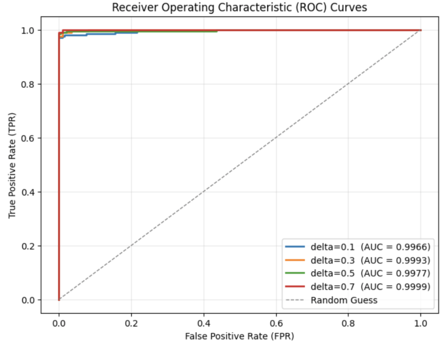
The image is a Receiver Operating Characteristic (ROC) curve chart, comparing the performance of different models (likely machine learning classifiers) based on their True Positive Rate (TPR) and False Positive Rate (FPR). The chart includes four ROC curves, each representing a different model with varying delta values (0.1, 0.3, 0.5, and 0.7), along with a "Random Guess" baseline. The Area Under the Curve (AUC) is provided for each model.
### Components/Axes
* **Title:** Receiver Operating Characteristic (ROC) Curves
* **X-axis:** False Positive Rate (FPR), ranging from 0.0 to 1.0 in increments of 0.2.
* **Y-axis:** True Positive Rate (TPR), ranging from 0.0 to 1.0 in increments of 0.2.
* **Grid:** Light gray grid lines are present at intervals of 0.2 on both axes.
* **Legend:** Located in the bottom-right corner, the legend identifies each curve by its delta value and corresponding AUC:
* Blue: delta=0.1 (AUC = 0.9966)
* Orange: delta=0.3 (AUC = 0.9993)
* Green: delta=0.5 (AUC = 0.9977)
* Red: delta=0.7 (AUC = 0.9999)
* Gray Dashed Line: Random Guess
### Detailed Analysis
* **Random Guess:** The "Random Guess" line is a dashed gray line that runs diagonally from the bottom-left corner (0.0, 0.0) to the top-right corner (1.0, 1.0). This represents the performance of a classifier that makes random predictions.
* **delta=0.1 (Blue):** The blue line starts at (0.0, 0.0), rises sharply to approximately (0.02, 0.98), plateaus near 1.0, and remains there for the rest of the x-axis.
* **delta=0.3 (Orange):** The orange line starts at (0.0, 0.0), rises sharply to approximately (0.01, 0.99), plateaus near 1.0, and remains there for the rest of the x-axis.
* **delta=0.5 (Green):** The green line starts at (0.0, 0.0), rises sharply to approximately (0.03, 0.97), plateaus near 1.0, and remains there for the rest of the x-axis.
* **delta=0.7 (Red):** The red line starts at (0.0, 0.0), rises sharply to approximately (0.005, 0.99), plateaus near 1.0, and remains there for the rest of the x-axis.
### Key Observations
* All four models (delta=0.1, 0.3, 0.5, and 0.7) significantly outperform the "Random Guess" baseline.
* The AUC values for all models are very high (close to 1.0), indicating excellent classification performance.
* The red line (delta=0.7) appears to have the steepest initial rise, followed by the orange line (delta=0.3), suggesting slightly better performance at very low false positive rates.
* The blue line (delta=0.1) and green line (delta=0.5) are very similar, with slightly lower AUC values compared to the red and orange lines.
### Interpretation
The ROC curves demonstrate that all four models are highly effective at distinguishing between positive and negative cases. The AUC values close to 1.0 indicate that these models have a very low false positive rate while maintaining a high true positive rate. The "delta=0.7" model appears to be the best performer, closely followed by "delta=0.3", as indicated by their higher AUC values and steeper initial rise in the ROC curve. The models are significantly better than random guessing. The differences between the models are subtle, but the ROC curves provide a visual representation of their relative performance.