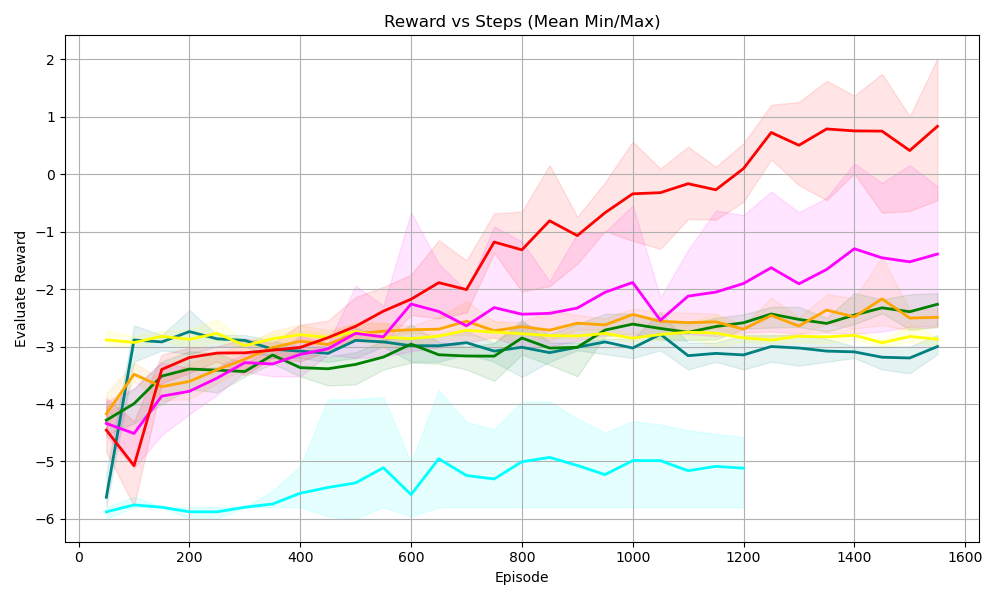
## [Line Chart]: Reward vs Steps (Mean Min/Max)
### Overview
This is a line graph titled *“Reward vs Steps (Mean Min/Max)”* that plots **Evaluate Reward** (y-axis) against **Episode** (x-axis, representing steps in a learning process). Multiple colored lines (with shaded regions for min/max values) represent different experimental conditions or algorithms, showing how their average reward evolves over episodes.
### Components/Axes
- **X-axis**: Labeled *“Episode”*, with ticks at 0, 200, 400, 600, 800, 1000, 1200, 1400, 1600 (range: 0–1600 episodes).
- **Y-axis**: Labeled *“Evaluate Reward”*, with ticks at -6, -5, -4, -3, -2, -1, 0, 1, 2 (range: -6 to 2).
- **Lines & Shaded Regions**: Multiple colored lines (red, pink, yellow, green, cyan, etc.) with semi-transparent shaded areas (min/max) around each line. The legend is not visible, but lines are distinguished by color.
### Detailed Analysis (Line-by-Line Trends)
We analyze each line (color) by its trend and key points:
1. **Red Line** (steepest upward trend):
- Starts at ~-5 (episode 0), dips to ~-5.5 (episode 100), then rises steadily.
- By episode 1600, reaches ~1 (highest reward).
- Shaded region (min/max) is wide (especially later), indicating high variance in performance.
2. **Pink Line** (moderate upward trend):
- Starts at ~-4.5 (episode 0), rises gradually.
- By episode 1600, reaches ~-1.5.
- Shaded region is moderate (consistent variance).
3. **Yellow Line** (flat trend):
- Starts at ~-3 (episode 0), remains relatively stable (slight increase).
- By episode 1600, stays ~-2.5.
- Shaded region is narrow (low variance, consistent performance).
4. **Green Line** (moderate upward trend):
- Starts at ~-4 (episode 0), rises to ~-3 (episode 200), then fluctuates around -3 to -2.5.
- Shaded region is moderate (consistent variance).
5. **Cyan Line** (lowest reward, slight upward trend):
- Starts at ~-6 (episode 0), rises to ~-5 (episode 200), then fluctuates around -5 to -4.5.
- Shaded region is wide (especially early), indicating high variance.
### Key Observations
- **Performance Hierarchy**: Red > Pink > Green > Yellow > Cyan (in terms of final reward).
- **Variance**: Red and Cyan have the widest shaded regions (highest variance), while Yellow has the narrowest (lowest variance).
- **Trends**: Red shows the most dramatic improvement; Cyan improves slightly but remains the lowest; Yellow is stable but low.
### Interpretation
This chart compares the learning performance of different agents/algorithms over episodes. The **red agent** learns most effectively (highest reward, steep upward trend) but with high variance (possibly due to exploration). The **cyan agent** struggles (lowest reward) but shows minor improvement. The **yellow agent** is consistent but underperforms. The shaded regions (min/max) reveal how reliable each agent’s performance is: red’s high variance suggests unstable but improving behavior, while yellow’s low variance indicates consistency (even if low reward).
This data likely informs decisions about which algorithm/agent to prioritize for further development (e.g., red for high reward, yellow for stability). The wide variance in red and cyan may indicate a need for tuning to reduce uncertainty.
*(Note: The legend is not visible, so line labels are inferred by color. All values are approximate, based on visual estimation.)*