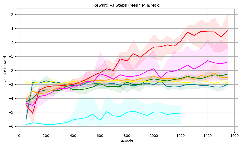
## Line Chart: Reward vs Steps (Mean Min/Max)
### Overview
The image is a line chart displaying the relationship between "Reward" and "Steps" (represented as "Episode"). The chart shows multiple data series, each represented by a colored line, along with shaded regions indicating the min/max range for each series. The x-axis represents the "Episode" and the y-axis represents the "Evaluate Reward".
### Components/Axes
* **Title:** Reward vs Steps (Mean Min/Max)
* **X-axis:**
* Label: Episode
* Scale: 0 to 1600, with major ticks at 200 intervals (0, 200, 400, 600, 800, 1000, 1200, 1400, 1600)
* **Y-axis:**
* Label: Evaluate Reward
* Scale: -6 to 2, with major ticks at integer intervals (-6, -5, -4, -3, -2, -1, 0, 1, 2)
* **Data Series:** There are multiple data series represented by different colored lines. The exact number of series and their corresponding labels are not explicitly provided in the image, but the following colors are visible:
* Red
* Magenta
* Yellow
* Orange
* Green
* Teal/Cyan
* Dark Teal
### Detailed Analysis
Here's a breakdown of the trends for each visible data series:
* **Red Line:** Starts at approximately -5 at Episode 0, shows a strong upward trend, reaching approximately 0.75 at Episode 1600. The shaded region around the red line indicates the min/max range, which widens as the episode number increases.
* Episode 0: -5
* Episode 1600: 0.75
* **Magenta Line:** Starts at approximately -4 at Episode 0, increases to approximately -2.25 by Episode 600, and then fluctuates between -1.5 and -2.5 until Episode 1600. The shaded region around the magenta line indicates the min/max range.
* Episode 0: -4
* Episode 1600: -1.75
* **Yellow Line:** Starts at approximately -4 at Episode 0, quickly rises to approximately -2.75 by Episode 200, and then remains relatively stable between -2.5 and -3 until Episode 1600.
* Episode 0: -4
* Episode 1600: -3
* **Orange Line:** Starts at approximately -4 at Episode 0, rises to approximately -2.75 by Episode 400, and then remains relatively stable between -2.5 and -3 until Episode 1600.
* Episode 0: -4
* Episode 1600: -2.5
* **Green Line:** Starts at approximately -5.75 at Episode 0, rises to approximately -3 by Episode 400, and then remains relatively stable between -3 and -3.25 until Episode 1600.
* Episode 0: -5.75
* Episode 1600: -3
* **Teal/Cyan Line:** Starts at approximately -5.75 at Episode 0, drops to approximately -5.75 by Episode 100, and then fluctuates between -5 and -6 until Episode 1200, after which the line stops. The shaded region around the teal line indicates the min/max range.
* Episode 0: -5.75
* Episode 1200: -5
* **Dark Teal Line:** Starts at approximately -4.25 at Episode 0, rises to approximately -3 by Episode 200, and then remains relatively stable between -3 and -3.25 until Episode 1600.
* Episode 0: -4.25
* Episode 1600: -3.25
### Key Observations
* The red line shows the most significant improvement in reward as the number of episodes increases.
* The teal/cyan line performs the worst, with a consistently low reward.
* The other lines (magenta, yellow, orange, green, dark teal) show some initial improvement but then plateau, indicating that the agent's performance has stabilized.
* The shaded regions indicate the variability in reward for each series.
### Interpretation
The chart compares the performance of different agents or algorithms (represented by the different colored lines) in terms of reward as they progress through episodes. The red line represents the most successful agent, as it achieves the highest reward over time. The teal/cyan line represents the least successful agent. The other agents show moderate performance. The shaded regions indicate the consistency of the reward for each agent. A wider shaded region suggests more variability in the reward, while a narrower region suggests more consistent performance. The data suggests that the red agent is learning and improving its performance over time, while the other agents have reached a point where they are no longer improving significantly.