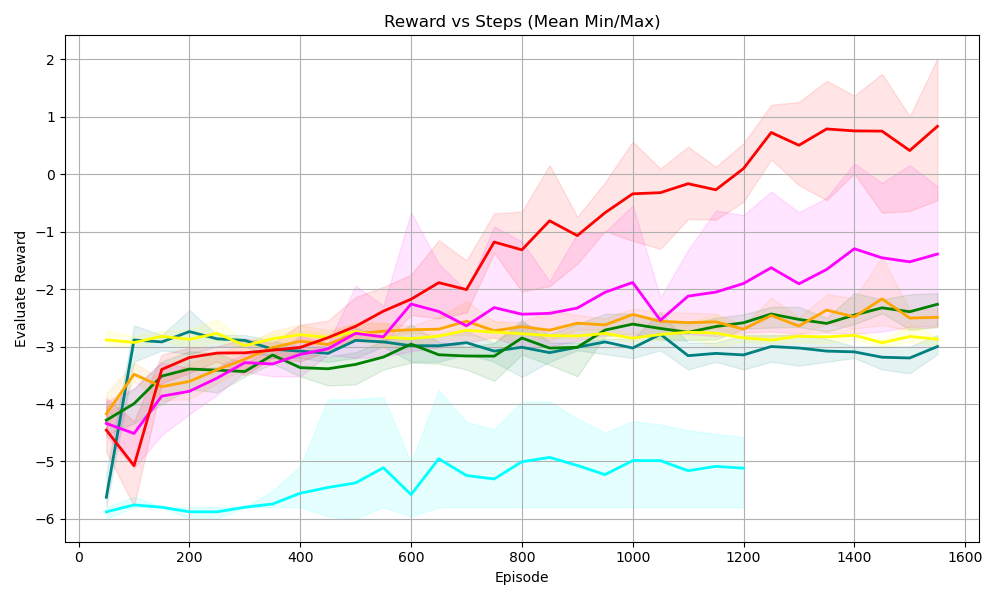
## Line Chart: Reward vs Steps (Mean Min/Max)
### Overview
The chart visualizes the relationship between "Episode" (x-axis) and "Evaluation Reward" (y-axis) across multiple data series. Each line represents a distinct dataset, with shaded regions indicating the minimum and maximum bounds (likely confidence intervals or variability). The chart spans 1600 episodes, with rewards ranging from -6 to 2.
### Components/Axes
- **X-axis (Episode)**: Labeled "Episode," with ticks at 0, 200, 400, 600, 800, 1000, 1200, 1400, and 1600.
- **Y-axis (Evaluation Reward)**: Labeled "Evaluation Reward," with ticks at -6, -5, -4, -3, -2, -1, 0, 1, and 2.
- **Legend**: Located on the right side, mapping colors to labels:
- Red: "Algorithm A"
- Pink: "Algorithm B"
- Yellow: "Algorithm C"
- Green: "Algorithm D"
- Orange: "Algorithm E"
- Blue: "Algorithm F"
- Cyan: "Algorithm G"
### Detailed Analysis
1. **Red Line (Algorithm A)**:
- **Trend**: Steadily increases from ~-4 at Episode 0 to ~1.5 at Episode 1600.
- **Shaded Region**: Widening variability over time, peaking at ~±1.5 around Episode 1600.
- **Key Points**:
- Episode 0: -4.2
- Episode 800: -0.5
- Episode 1600: 1.5
2. **Pink Line (Algorithm B)**:
- **Trend**: Gradual upward trajectory from ~-3.5 to ~-1.2.
- **Shaded Region**: Narrower variability compared to red, peaking at ~±0.8.
- **Key Points**:
- Episode 0: -3.5
- Episode 800: -1.8
- Episode 1600: -1.2
3. **Yellow Line (Algorithm C)**:
- **Trend**: Slightly declining from ~-2.8 to ~-3.2.
- **Shaded Region**: Moderate variability, peaking at ~±0.6.
- **Key Points**:
- Episode 0: -2.8
- Episode 800: -3.0
- Episode 1600: -3.2
4. **Green Line (Algorithm D)**:
- **Trend**: Stable with minor fluctuations around ~-2.5.
- **Shaded Region**: Consistent variability (~±0.4).
- **Key Points**:
- Episode 0: -2.5
- Episode 800: -2.6
- Episode 1600: -2.4
5. **Orange Line (Algorithm E)**:
- **Trend**: Slightly declining from ~-3.0 to ~-3.5.
- **Shaded Region**: High variability, peaking at ~±1.0.
- **Key Points**:
- Episode 0: -3.0
- Episode 800: -3.5
- Episode 1600: -3.5
6. **Blue Line (Algorithm F)**:
- **Trend**: Sharp decline from ~-5.5 to ~-4.0.
- **Shaded Region**: Very high variability, peaking at ~±1.2.
- **Key Points**:
- Episode 0: -5.5
- Episode 800: -4.2
- Episode 1600: -4.0
7. **Cyan Line (Algorithm G)**:
- **Trend**: Steep decline from ~-6.0 to ~-5.0.
- **Shaded Region**: Extremely high variability, peaking at ~±1.5.
- **Key Points**:
- Episode 0: -6.0
- Episode 800: -5.2
- Episode 1600: -5.0
### Key Observations
- **Divergence**: Algorithm A (red) outperforms all others, while Algorithm G (cyan) underperforms consistently.
- **Volatility**: Algorithms E (orange) and G (cyan) exhibit the highest variability, suggesting unstable performance.
- **Stability**: Algorithm D (green) maintains the most consistent results with minimal fluctuation.
- **Shaded Regions**: Wider shaded areas correlate with higher variability in rewards, indicating less reliable performance.
### Interpretation
The chart demonstrates significant differences in algorithm performance over time. Algorithm A’s upward trend suggests effective learning or optimization, while Algorithm G’s decline indicates potential flaws or inefficiencies. The shaded regions highlight the trade-off between mean performance and reliability: high variability (e.g., Algorithm G) may mask underlying issues, whereas narrow regions (e.g., Algorithm D) reflect stable but suboptimal outcomes. The divergence between top and bottom performers underscores the importance of algorithm selection in reward-driven systems.