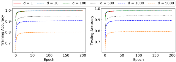
## Chart Type: Line Graphs of Training and Testing Accuracy vs. Epoch
### Overview
The image contains two line graphs side-by-side. The left graph displays "Training Accuracy" versus "Epoch," while the right graph displays "Testing Accuracy" versus "Epoch." Both graphs show the performance of a model with varying values of 'd' (likely a hyperparameter). The x-axis (Epoch) ranges from 0 to 200 in both graphs. The y-axis (Accuracy) ranges from 0.7 to 1.0 in both graphs. The legend, located at the top of the image, identifies the line styles and colors corresponding to different 'd' values: d=1 (red, solid), d=10 (blue, dash-dot), d=100 (green, dashed), d=500 (black, dotted), d=1000 (blue, dashed), and d=5000 (orange, dash-dot).
### Components/Axes
* **X-axis (both graphs):** Epoch, ranging from 0 to 200, with tick marks at approximately 0, 50, 100, 150, and 200.
* **Y-axis (left graph):** Training Accuracy, ranging from 0.7 to 1.0, with tick marks at 0.7, 0.8, 0.9, and 1.0.
* **Y-axis (right graph):** Testing Accuracy, ranging from 0.7 to 1.0, with tick marks at 0.7, 0.8, 0.9, and 1.0.
* **Legend (top):**
* d = 1 (red, solid line)
* d = 10 (blue, dash-dot line)
* d = 100 (green, dashed line)
* d = 500 (black, dotted line)
* d = 1000 (blue, dashed line)
* d = 5000 (orange, dash-dot line)
### Detailed Analysis
**Left Graph: Training Accuracy**
* **d = 1 (red, solid):** The line starts at approximately 0.7 and quickly rises to nearly 1.0, then plateaus.
* **d = 10 (blue, dash-dot):** The line starts at approximately 0.7 and rises to approximately 0.9, then plateaus.
* **d = 100 (green, dashed):** The line starts at approximately 0.9 and quickly rises to nearly 1.0, then plateaus.
* **d = 500 (black, dotted):** The line starts at approximately 0.9 and quickly rises to nearly 1.0, then plateaus.
* **d = 1000 (blue, dashed):** The line starts at approximately 0.9 and quickly rises to nearly 1.0, then plateaus.
* **d = 5000 (orange, dash-dot):** The line starts at approximately 0.7 and rises to approximately 0.8, then plateaus.
**Right Graph: Testing Accuracy**
* **d = 1 (red, solid):** The line starts at approximately 0.7 and quickly rises to nearly 1.0, then plateaus.
* **d = 10 (blue, dash-dot):** The line starts at approximately 0.7 and rises to approximately 0.9, then plateaus.
* **d = 100 (green, dashed):** The line starts at approximately 0.9 and quickly rises to nearly 1.0, then plateaus.
* **d = 500 (black, dotted):** The line starts at approximately 0.9 and quickly rises to nearly 1.0, then plateaus.
* **d = 1000 (blue, dashed):** The line starts at approximately 0.9 and quickly rises to nearly 1.0, then plateaus.
* **d = 5000 (orange, dash-dot):** The line starts at approximately 0.7 and rises to approximately 0.8, then plateaus.
### Key Observations
* For both training and testing accuracy, d = 1, d = 100, d = 500, and d = 1000 achieve high accuracy (close to 1.0) relatively quickly.
* d = 5000 consistently shows the lowest accuracy among the tested values.
* d = 10 shows a lower accuracy than d = 1, d = 100, d = 500, and d = 1000, but higher than d = 5000.
* The training and testing accuracy graphs exhibit similar trends for each 'd' value.
### Interpretation
The graphs suggest that the model's performance is highly dependent on the 'd' hyperparameter. Values of 'd' such as 1, 100, 500, and 1000 appear to be optimal, leading to high training and testing accuracy. A value of 'd' equal to 5000 results in significantly lower accuracy, indicating potential underfitting or a mismatch between the model complexity and the data. The similarity between the training and testing accuracy curves suggests that the model is generalizing well for the optimal 'd' values, with no significant overfitting. The value of d=10 shows a lower accuracy than d=1, d=100, d=500, and d=1000, but higher than d=5000, suggesting that there is a range of values for d that are optimal.