## Histogram: Distribution of Shortest Path Lengths (sampled)
### Overview
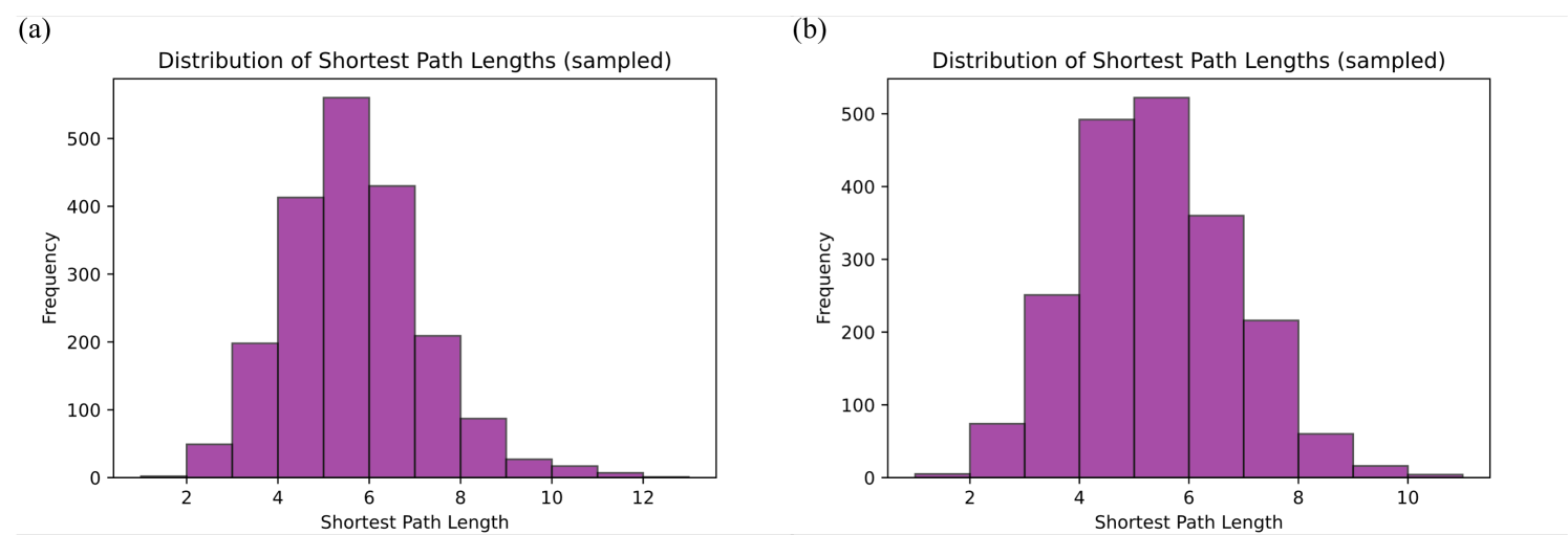
The image contains two histograms, labeled (a) and (b), displaying the distribution of shortest path lengths. Both histograms show the frequency of different shortest path lengths, with the x-axis representing the shortest path length and the y-axis representing the frequency. The bars are colored purple.
### Components/Axes
* **Title (a):** Distribution of Shortest Path Lengths (sampled)
* **Title (b):** Distribution of Shortest Path Lengths (sampled)
* **X-axis Label:** Shortest Path Length
* **X-axis Scale:** 2, 4, 6, 8, 10, 12 (for chart a)
* **X-axis Scale:** 2, 4, 6, 8, 10 (for chart b)
* **Y-axis Label:** Frequency
* **Y-axis Scale:** 0, 100, 200, 300, 400, 500
### Detailed Analysis
**Histogram (a):**
* **Shortest Path Length 2:** Frequency approximately 50
* **Shortest Path Length 3:** Frequency approximately 200
* **Shortest Path Length 4:** Frequency approximately 420
* **Shortest Path Length 5:** Frequency approximately 540
* **Shortest Path Length 6:** Frequency approximately 450
* **Shortest Path Length 7:** Frequency approximately 250
* **Shortest Path Length 8:** Frequency approximately 100
* **Shortest Path Length 9:** Frequency approximately 50
* **Shortest Path Length 10:** Frequency approximately 20
* **Shortest Path Length 11:** Frequency approximately 10
* **Shortest Path Length 12:** Frequency approximately 5
**Histogram (b):**
* **Shortest Path Length 2:** Frequency approximately 20
* **Shortest Path Length 3:** Frequency approximately 250
* **Shortest Path Length 4:** Frequency approximately 420
* **Shortest Path Length 5:** Frequency approximately 490
* **Shortest Path Length 6:** Frequency approximately 520
* **Shortest Path Length 7:** Frequency approximately 350
* **Shortest Path Length 8:** Frequency approximately 70
* **Shortest Path Length 9:** Frequency approximately 60
* **Shortest Path Length 10:** Frequency approximately 10
### Key Observations
* Both histograms show a similar distribution pattern, with the frequency increasing to a peak around shortest path lengths of 5 or 6, and then decreasing as the shortest path length increases.
* Histogram (a) has a longer tail, extending to a shortest path length of 12, while histogram (b) only extends to 10.
* The peak frequency is slightly higher in histogram (b) compared to histogram (a).
### Interpretation
The histograms illustrate the distribution of shortest path lengths in a sampled network or graph. The data suggests that the most common shortest path length is around 5 or 6. The shape of the distribution indicates that shorter paths are more frequent than longer paths. The difference between the two histograms (a) and (b) might be due to different sampling methods or different network structures. The longer tail in histogram (a) suggests that there are some longer shortest paths present in the sample represented by (a) that are less common or absent in the sample represented by (b).