## Histogram: Distribution of Shortest Path Lengths (sampled)
### Overview
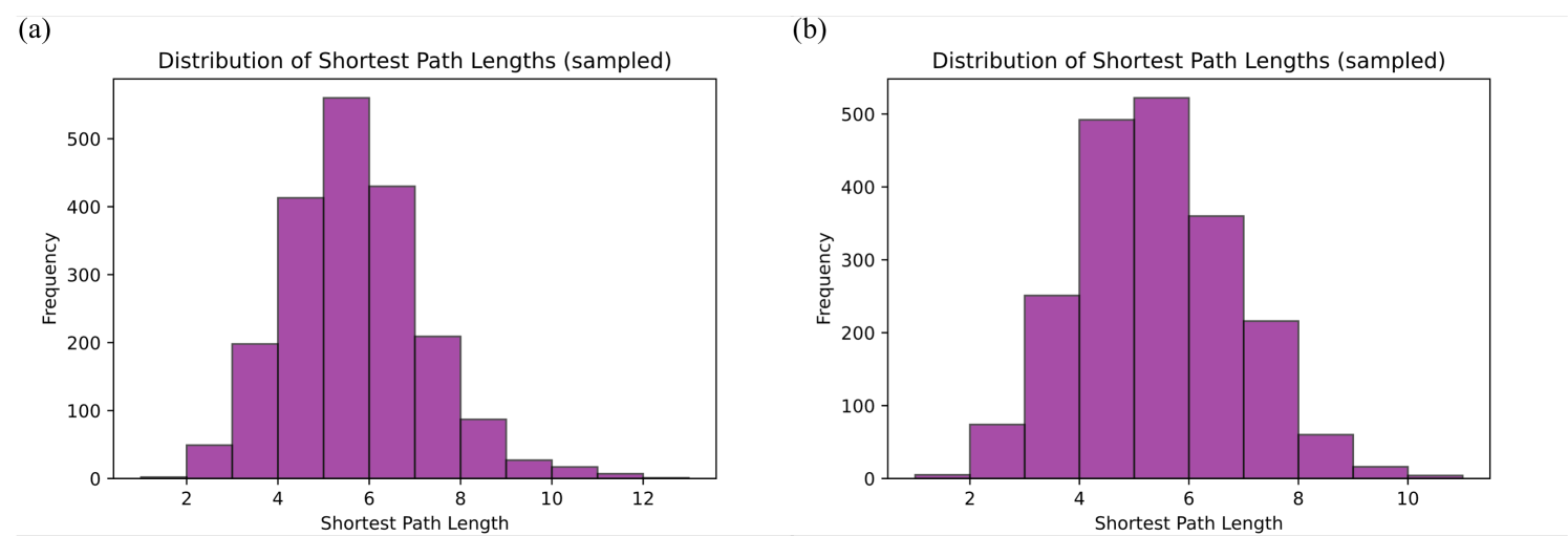
The image displays two side-by-side histograms, labeled (a) and (b). Both charts visualize the frequency distribution of "Shortest Path Lengths" derived from a sampled dataset. The charts utilize purple bars to represent the frequency of specific path lengths, with both distributions exhibiting a bell-shaped curve centered around the path length of 5 to 6.
### Components/Axes
Both charts share identical axis labels and units:
* **Y-Axis:** Labeled "Frequency". The scale ranges from 0 to 500+ in increments of 100.
* **X-Axis:** Labeled "Shortest Path Length".
* **Chart (a):** Ticks are marked at 2, 4, 6, 8, 10, 12.
* **Chart (b):** Ticks are marked at 2, 4, 6, 8, 10.
* **Data Representation:** Purple vertical bars representing the count of shortest paths for each length interval.
### Detailed Analysis
#### Chart (a) [Left]
* **Trend:** The distribution is unimodal and roughly symmetric, though it possesses a slightly longer right-hand tail.
* **Estimated Data Points (Frequency):**
* Path Length 2-3: ~50
* Path Length 3-4: ~200
* Path Length 4-5: ~410
* Path Length 5-6: ~560 (Peak)
* Path Length 6-7: ~430
* Path Length 7-8: ~210
* Path Length 8-9: ~90
* Path Length 9-10: ~30
* Path Length 10-11: ~20
* Path Length 11-12: ~10
#### Chart (b) [Right]
* **Trend:** The distribution is unimodal and appears more tightly clustered around the center compared to chart (a).
* **Estimated Data Points (Frequency):**
* Path Length 2-3: ~75
* Path Length 3-4: ~250
* Path Length 4-5: ~490
* Path Length 5-6: ~525 (Peak)
* Path Length 6-7: ~360
* Path Length 7-8: ~220
* Path Length 8-9: ~60
* Path Length 9-10: ~20
* Path Length 10-11: ~5
### Key Observations
* **Central Tendency:** Both datasets show a strong central tendency, with the most frequent shortest path length occurring between 5 and 6.
* **Tail Variance:** Chart (a) exhibits a slightly wider spread, with path lengths extending up to 12, whereas chart (b) effectively terminates at 11.
* **Peak Comparison:** Chart (a) has a higher peak frequency (~560) compared to chart (b) (~525), suggesting a higher concentration of paths at the optimal length in the dataset for (a).
### Interpretation
These histograms are characteristic of network analysis, likely representing the "small-world" property of a graph or network. In such networks, most nodes are reachable from one another within a relatively small number of hops (in this case, 5-6).
* **Peircean Investigative Perspective:** The similarity between the two distributions suggests that they likely represent the same network under slightly different sampling conditions, or two networks with very similar topological properties.
* **Reading Between the Lines:** The slight shift in the distribution (a) having a higher peak and a longer tail suggests that the network represented in (a) might be slightly more sparse or have a different diameter than (b). The data indicates that the "average" shortest path is highly predictable, which is a hallmark of robust, well-connected systems. The presence of paths as long as 10-12 indicates the existence of "peripheral" nodes that are significantly further from the network core than the average node.