## Histograms: Distribution of Shortest Path Lengths
### Overview
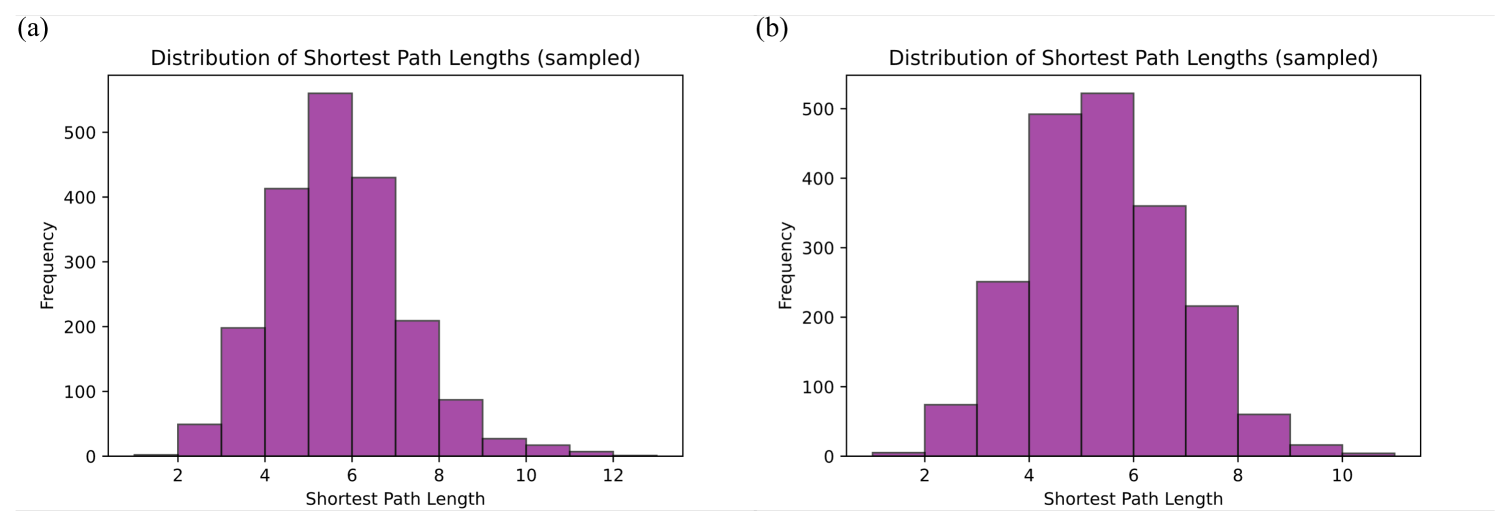
The image consists of two side-by-side histograms, labeled (a) on the left and (b) on the right. Both charts display the frequency distribution of sampled shortest path lengths, likely representing data from a network analysis or graph theory context. Both charts utilize solid purple bars with thin black outlines to represent the data bins. There are no other languages present besides English.
### Components/Axes
**Chart (a) - Left Side**
* **Header/Label:** Top-left corner contains the label "(a)".
* **Title:** Centered above the chart: "Distribution of Shortest Path Lengths (sampled)".
* **Y-axis:** Labeled "Frequency" (rotated 90 degrees counter-clockwise). The scale ranges from 0 to slightly above 500. Major tick marks and grid labels are provided at intervals of 100: 0, 100, 200, 300, 400, 500.
* **X-axis:** Labeled "Shortest Path Length". The scale ranges from approximately 1 to 13. Major tick marks and grid labels are provided at intervals of 2: 2, 4, 6, 8, 10, 12.
**Chart (b) - Right Side**
* **Header/Label:** Top-left corner contains the label "(b)".
* **Title:** Centered above the chart: "Distribution of Shortest Path Lengths (sampled)".
* **Y-axis:** Labeled "Frequency" (rotated 90 degrees counter-clockwise). The scale ranges from 0 to slightly above 500. Major tick marks and grid labels are provided at intervals of 100: 0, 100, 200, 300, 400, 500.
* **X-axis:** Labeled "Shortest Path Length". The scale ranges from approximately 1 to 11. Major tick marks and grid labels are provided at intervals of 2: 2, 4, 6, 8, 10.
### Detailed Analysis
*Note: All numerical values extracted from the bar heights are approximate (denoted by ~) based on visual alignment with the Y-axis.*
**Chart (a) Data Extraction**
*Visual Trend:* The data forms a bell-shaped curve that is slightly right-skewed (positive skew). The frequency rises sharply from path length 2, peaks between 5 and 6, and then tapers off more gradually towards a path length of 13.
* Bin [1-2]: ~2
* Bin [2-3]: ~50
* Bin [3-4]: ~200
* Bin [4-5]: ~415
* Bin [5-6]: ~560 (Peak)
* Bin [6-7]: ~430
* Bin [7-8]: ~210
* Bin [8-9]: ~90
* Bin [9-10]: ~30
* Bin [10-11]: ~15
* Bin [11-12]: ~5
* Bin [12-13]: ~2
**Chart (b) Data Extraction**
*Visual Trend:* Similar to chart (a), this forms a bell-shaped curve, but it is slightly more symmetrical and has a narrower overall spread. The frequency rises from path length 1, peaks between 5 and 6, and tapers off by path length 11.
* Bin [1-2]: ~5
* Bin [2-3]: ~75
* Bin [3-4]: ~250
* Bin [4-5]: ~490
* Bin [5-6]: ~520 (Peak)
* Bin [6-7]: ~360
* Bin [7-8]: ~215
* Bin [8-9]: ~60
* Bin [9-10]: ~15
* Bin [10-11]: ~5
### Key Observations
1. **Central Tendency:** Both distributions share the same modal bin; the most frequent shortest path length in both datasets is between 5 and 6.
2. **Spread and Range:** Chart (a) exhibits a wider range of path lengths, extending up to approximately 13, indicating a network with a potentially larger maximum diameter. Chart (b) is more compact, with path lengths effectively terminating around 11.
3. **Peak Concentration:** While both peak at the [5-6] bin, Chart (a) has a higher absolute peak frequency (~560) compared to Chart (b) (~520). However, Chart (b) has a higher frequency in the preceding bin [4-5] (~490 vs ~415), making the center of distribution (b) look slightly "fatter" or more evenly distributed around the mean.
4. **Skewness:** Chart (a) has a more pronounced right tail (positive skew) than Chart (b).
### Interpretation
These histograms represent the topology of one or two networks (e.g., social networks, communication grids, or biological pathways). The "Shortest Path Length" measures the minimum number of edges required to connect two random nodes.
The normal-like distribution centered around 5 to 6 strongly suggests the presence of the **"Small-World" phenomenon** (often colloquially known as "six degrees of separation"). In such networks, despite having many nodes, most nodes can be reached from every other node by a small number of steps.
The differences between (a) and (b) imply a comparison. This could represent:
* Two distinct networks being compared (e.g., a Twitter network vs. a Facebook network). Network (a) has a slightly longer "tail," meaning there are a few pairs of nodes that are exceptionally far apart compared to network (b).
* The same network measured at two different points in time. For example, if (a) is the "before" and (b) is the "after," the network in (b) has become slightly more compact and interconnected, reducing the maximum distance between the most isolated nodes.
* Two different sampling methods or algorithmic approaches applied to the same underlying graph.