\n
## Histograms: Distribution of Shortest Path Lengths (sampled)
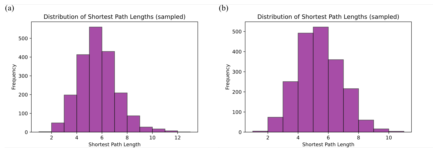
### Overview
The image presents two histograms, labeled (a) and (b), both depicting the distribution of shortest path lengths sampled from a network. Both histograms share the same axes and general structure, but display different distributions. The histograms visualize the frequency of different shortest path lengths.
### Components/Axes
Both histograms share the following components:
* **Title:** "Distribution of Shortest Path Lengths (sampled)" - positioned at the top-center of each plot.
* **X-axis Label:** "Shortest Path Length" - ranging from approximately 2 to 12.
* **Y-axis Label:** "Frequency" - ranging from 0 to 500 (approximately).
* **Data Representation:** Histograms with purple bars representing the frequency of each shortest path length.
* **Bin Width:** Approximately 1 unit.
### Detailed Analysis or Content Details
**Histogram (a):**
The histogram shows a distribution that peaks around a shortest path length of 6. The frequency decreases as the path length moves away from 6 in either direction.
* Shortest Path Length 2: Frequency ≈ 20
* Shortest Path Length 3: Frequency ≈ 80
* Shortest Path Length 4: Frequency ≈ 160
* Shortest Path Length 5: Frequency ≈ 250
* Shortest Path Length 6: Frequency ≈ 550
* Shortest Path Length 7: Frequency ≈ 400
* Shortest Path Length 8: Frequency ≈ 220
* Shortest Path Length 9: Frequency ≈ 100
* Shortest Path Length 10: Frequency ≈ 40
* Shortest Path Length 11: Frequency ≈ 10
* Shortest Path Length 12: Frequency ≈ 5
**Histogram (b):**
The histogram shows a distribution that peaks around a shortest path length of 5. The frequency decreases as the path length moves away from 5 in either direction.
* Shortest Path Length 2: Frequency ≈ 50
* Shortest Path Length 3: Frequency ≈ 150
* Shortest Path Length 4: Frequency ≈ 300
* Shortest Path Length 5: Frequency ≈ 500
* Shortest Path Length 6: Frequency ≈ 350
* Shortest Path Length 7: Frequency ≈ 200
* Shortest Path Length 8: Frequency ≈ 80
* Shortest Path Length 9: Frequency ≈ 20
* Shortest Path Length 10: Frequency ≈ 10
### Key Observations
* Both histograms are approximately symmetric, but with a slight skew.
* Histogram (a) has a higher peak at a longer path length (6) compared to histogram (b) (5).
* The distributions are similar in shape, suggesting they represent the same underlying process but with different parameters.
* The frequency of shortest path lengths decreases as the length increases for both histograms.
### Interpretation
The data suggests that the network from which these shortest path lengths were sampled has a characteristic path length. The difference between the two histograms indicates that the sampling process or the network itself may have changed between the two samples. The peak in each histogram represents the most common shortest path length observed in the sampled network. The decreasing frequency with increasing path length is expected in many real-world networks, as most nodes are relatively close to each other. The histograms provide insight into the network's connectivity and structure. The fact that the distributions are not perfectly symmetric suggests that the network is not entirely random, and may have some degree of clustering or hierarchical structure. The difference in peak location between (a) and (b) could indicate a shift in network properties, such as the addition or removal of nodes or edges, or a change in the sampling method.