## Histograms: Distribution of Shortest Path Lengths (Sampled)
### Overview
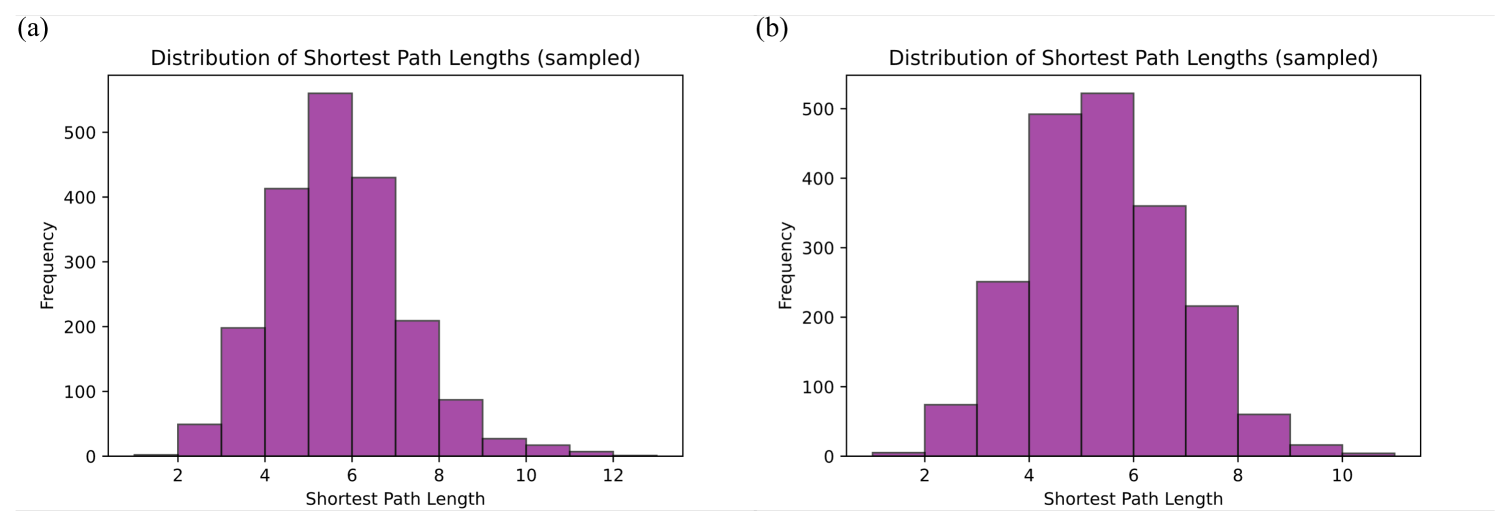
The image displays two side-by-side histograms, labeled (a) and (b), both titled "Distribution of Shortest Path Lengths (sampled)". They visualize the frequency distribution of shortest path lengths within two different sampled datasets or networks. The charts are presented in a clean, scientific style with purple bars against a white background.
### Components/Axes
* **Chart (a) - Left Histogram:**
* **Title:** "Distribution of Shortest Path Lengths (sampled)"
* **X-axis Label:** "Shortest Path Length"
* **X-axis Scale:** Linear scale with major tick marks at 2, 4, 6, 8, 10, 12. The data appears to span from approximately 1 to 13.
* **Y-axis Label:** "Frequency"
* **Y-axis Scale:** Linear scale with major tick marks at 0, 100, 200, 300, 400, 500.
* **Chart (b) - Right Histogram:**
* **Title:** "Distribution of Shortest Path Lengths (sampled)"
* **X-axis Label:** "Shortest Path Length"
* **X-axis Scale:** Linear scale with major tick marks at 2, 4, 6, 8, 10. The data appears to span from approximately 1 to 11.
* **Y-axis Label:** "Frequency"
* **Y-axis Scale:** Linear scale with major tick marks at 0, 100, 200, 300, 400, 500.
* **General:** Both charts use the same purple color for all bars. There is no legend, as each chart contains only one data series. The labels "(a)" and "(b)" are positioned in the top-left corner above their respective charts.
### Detailed Analysis
**Chart (a) Data Approximation (Frequency vs. Shortest Path Length):**
* **Trend Verification:** The distribution is unimodal and roughly symmetric, peaking in the center and tapering off on both sides. It resembles a normal or Poisson distribution.
* **Data Points (Approximate):**
* Path Length ~1: Frequency ~5
* Path Length ~2: Frequency ~50
* Path Length ~3: Frequency ~200
* Path Length ~4: Frequency ~410
* Path Length ~5: Frequency ~560 (Peak)
* Path Length ~6: Frequency ~430
* Path Length ~7: Frequency ~210
* Path Length ~8: Frequency ~90
* Path Length ~9: Frequency ~30
* Path Length ~10: Frequency ~20
* Path Length ~11: Frequency ~10
* Path Length ~12: Frequency ~5
* Path Length ~13: Frequency ~1
**Chart (b) Data Approximation (Frequency vs. Shortest Path Length):**
* **Trend Verification:** The distribution is also unimodal and roughly symmetric, peaking in the center. It appears slightly more concentrated (narrower spread) than chart (a).
* **Data Points (Approximate):**
* Path Length ~1: Frequency ~5
* Path Length ~2: Frequency ~75
* Path Length ~3: Frequency ~250
* Path Length ~4: Frequency ~495
* Path Length ~5: Frequency ~525 (Peak)
* Path Length ~6: Frequency ~360
* Path Length ~7: Frequency ~215
* Path Length ~8: Frequency ~60
* Path Length ~9: Frequency ~15
* Path Length ~10: Frequency ~5
### Key Observations
1. **Central Tendency:** Both distributions have their mode (peak frequency) at a shortest path length of approximately 5 or 6.
2. **Spread/Variance:** Chart (a) has a wider spread, with non-zero frequencies extending to a path length of ~13. Chart (b) has a narrower spread, with data effectively ending at a path length of ~10.
3. **Peak Frequency:** The peak frequency in chart (a) (~560) is slightly higher than the peak in chart (b) (~525).
4. **Shape:** Both distributions are unimodal and exhibit a bell-shaped curve, suggesting the underlying networks may have "small-world" properties where most nodes are connected by relatively short paths.
5. **Sampled Data:** The title specifies "(sampled)", indicating these are empirical distributions from a sample, not the complete population of all shortest paths.
### Interpretation
These histograms provide a quantitative snapshot of network connectivity. The "shortest path length" between two nodes is a fundamental measure of efficiency in a network (e.g., social, communication, biological).
* **What the data suggests:** The concentration of path lengths around 5-6 indicates that, for the sampled networks, most pairs of nodes are separated by a moderate number of steps. This is characteristic of many real-world networks that are not completely random but also not highly ordered grids.
* **Relationship between elements:** The x-axis (path length) is the independent variable, and the y-axis (frequency) shows how common each path length is. The shape of the histogram directly reveals the network's structural efficiency. A peak at a low value would indicate a very tightly connected network, while a peak at a high value would indicate a more sparse or elongated network.
* **Comparison of (a) and (b):** While both networks share a similar central tendency, network (a) has a "longer tail" to the right. This means network (a) contains a small but notable number of node pairs that are very far apart (path lengths 10-13), which are absent in network (b). This could imply that network (a) is slightly less efficient overall or has a more heterogeneous structure, possibly containing peripheral nodes or clusters that are loosely connected to the main network core. Network (b) appears more uniformly connected within a tighter range of distances.
* **Notable Anomaly:** There are no extreme outliers or irregular spikes; the distributions are smooth, which is expected for sampled data from a sufficiently large network. The primary point of interest is the difference in the right-side tails of the two distributions.