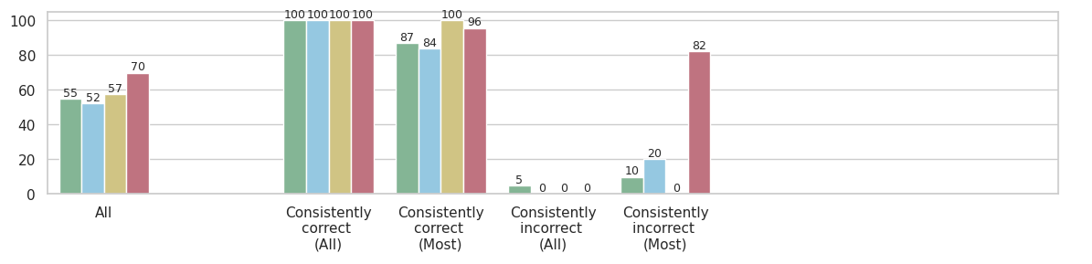
## Bar Chart: Accuracy Analysis
### Overview
The image is a bar chart comparing the accuracy of a system under different conditions. The x-axis represents different categories of consistency (All, Consistently correct (All), Consistently correct (Most), Consistently incorrect (All), Consistently incorrect (Most)), and the y-axis represents the percentage of accuracy, ranging from 0 to 100. There are four data series represented by different colored bars: green, light blue, yellow, and red.
### Components/Axes
* **X-axis:**
* All
* Consistently correct (All)
* Consistently correct (Most)
* Consistently incorrect (All)
* Consistently incorrect (Most)
* **Y-axis:** Percentage scale from 0 to 100, with increments of 20.
* **Data Series (Bar Colors):**
* Green
* Light Blue
* Yellow
* Red
### Detailed Analysis
Here's a breakdown of the data for each category:
* **All:**
* Green: 55%
* Light Blue: 52%
* Yellow: 57%
* Red: 70%
* **Consistently correct (All):**
* Green: 100%
* Light Blue: 100%
* Yellow: 100%
* Red: 100%
* **Consistently correct (Most):**
* Green: 87%
* Light Blue: 84%
* Yellow: 100%
* Red: 96%
* **Consistently incorrect (All):**
* Green: 5%
* Light Blue: 0%
* Yellow: 0%
* Red: 0%
* **Consistently incorrect (Most):**
* Green: 10%
* Light Blue: 20%
* Yellow: 0%
* Red: 82%
### Key Observations
* The "Consistently correct (All)" category shows perfect accuracy (100%) across all data series.
* The "Consistently incorrect (All)" category shows very low accuracy (0-5%) across all data series.
* The "Consistently incorrect (Most)" category shows a high degree of variance, with the red series showing a high percentage (82%) while the yellow series shows 0%.
* The "All" category shows the lowest accuracy across all categories, with values ranging from 52% to 70%.
### Interpretation
The chart indicates that the system performs exceptionally well when it is consistently correct, achieving 100% accuracy. Conversely, when the system is consistently incorrect, the accuracy drops significantly, approaching 0% for some data series. The "Consistently incorrect (Most)" category reveals a potential issue, as the red series shows a high percentage, suggesting that under certain conditions, the system might be consistently incorrect in a specific way. The "All" category represents the overall accuracy, which is lower than the "Consistently correct" categories, indicating that there are instances where the system struggles. The differences between the data series (green, light blue, yellow, red) suggest that different factors or configurations influence the system's accuracy. Further investigation is needed to understand the specific conditions that lead to consistent incorrectness, especially for the red series in the "Consistently incorrect (Most)" category.