\n
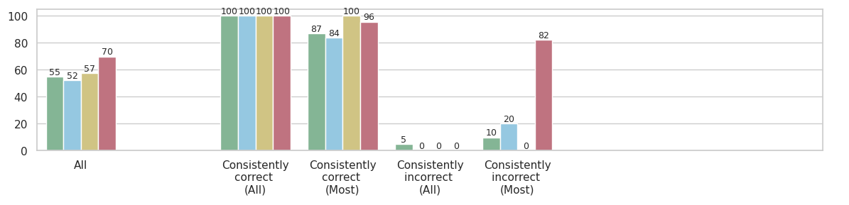
## Bar Chart: Accuracy Assessment
### Overview
The image presents a bar chart comparing accuracy levels across different categories: "All", "Consistently correct (All)", "Consistently correct (Most)", "Consistently incorrect (All)", and "Consistently incorrect (Most)". Each category has three bars representing different data series. The Y-axis represents a percentage scale from 0 to 100.
### Components/Axes
* **X-axis:** Categories: "All", "Consistently correct (All)", "Consistently correct (Most)", "Consistently incorrect (All)", "Consistently incorrect (Most)".
* **Y-axis:** Percentage scale, ranging from 0 to 100, with increments of 10.
* **Data Series:** Three distinct data series, represented by blue, green, and red bars.
* **No Legend:** The chart lacks a legend explicitly identifying each data series.
### Detailed Analysis
The chart consists of five groups of three bars each.
* **"All" Category:**
* Blue bar: Approximately 55.
* Green bar: Approximately 52.
* Red bar: Approximately 70.
* **"Consistently correct (All)" Category:**
* Blue bar: 100.
* Green bar: 100.
* Red bar: 100.
* **"Consistently correct (Most)" Category:**
* Blue bar: Approximately 87.
* Green bar: Approximately 84.
* Red bar: Approximately 96.
* **"Consistently incorrect (All)" Category:**
* Blue bar: 0.
* Green bar: 0.
* Red bar: Approximately 5.
* **"Consistently incorrect (Most)" Category:**
* Blue bar: 0.
* Green bar: Approximately 10.
* Red bar: Approximately 82.
### Key Observations
* The "Consistently correct (All)" category shows 100% accuracy across all three data series.
* The "Consistently incorrect (All)" category shows very low accuracy, with the blue and green series at 0%.
* The "All" category shows the lowest overall accuracy, with values ranging from 52 to 70.
* The red data series generally shows higher values than the blue and green series, except in the "Consistently incorrect (All)" category.
* There is a significant difference in accuracy between the "Consistently correct" and "Consistently incorrect" categories.
### Interpretation
The data suggests an assessment of accuracy across different levels of consistency. The "All" category represents a general accuracy measure, while the "Consistently correct/incorrect" categories focus on cases where the assessment is consistently the same. The chart demonstrates that when assessments are consistently correct, accuracy is 100%. However, when assessments are consistently incorrect, accuracy is very low. The "All" category shows a moderate level of accuracy, indicating some variability in the assessments. The red data series might represent a different metric or a more stringent evaluation criteria, as it consistently shows higher values than the other two series. The chart highlights the importance of consistency in assessments for achieving high accuracy. The large difference between the "Consistently correct" and "Consistently incorrect" categories suggests that errors are not random but rather systematic in nature.