## Scatter Plot Matrix: Principal Component Analysis
### Overview
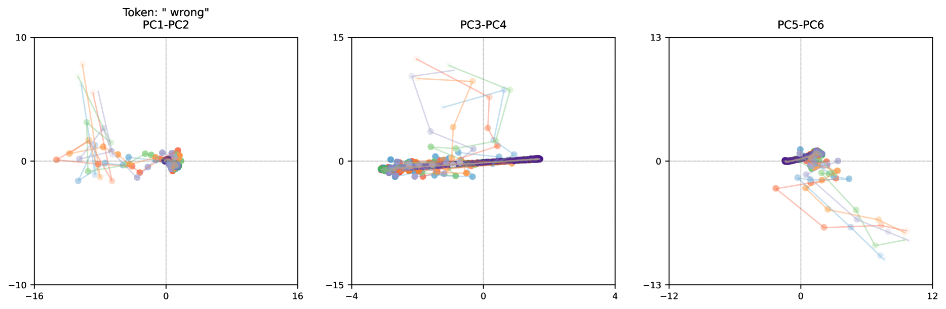
The image presents a scatter plot matrix displaying the results of a Principal Component Analysis (PCA). There are three scatter plots arranged horizontally, each representing a different pair of principal components. Each plot shows the distribution of data points projected onto two principal components, with lines connecting consecutive points for each sample. The plots are labeled "PC1-PC2", "PC3-PC4", and "PC5-PC6". A token "wrong" is present in the top-left plot.
### Components/Axes
Each scatter plot has two axes:
* **X-axis:** Ranges from approximately -16 to 16 for PC1-PC2, -4 to 16 for PC3-PC4, and -12 to 12 for PC5-PC6.
* **Y-axis:** Ranges from approximately -10 to 10 for PC1-PC2, -15 to 15 for PC3-PC4, and -13 to 13 for PC5-PC6.
* **Data Points:** Represented by colored circles and connected by lines. The colors vary across the plots, indicating different samples or groups.
* **Token:** "wrong" is displayed in the top-left corner of the first plot (PC1-PC2).
### Detailed Analysis
**PC1-PC2:**
* **Trend:** The data points generally cluster around the origin (0,0) with a slight negative correlation. The lines connecting the points show a diverse range of trajectories.
* **Data Points:**
* Purple points are concentrated around x=-1.5, y=0.5.
* Orange points are scattered, with some around x=10, y=2 and others around x=-10, y=-2.
* Green points are spread across the plot, with a concentration around x=0, y=0.
* Blue points are scattered, with some around x=10, y=-2.
* Light blue points are scattered, with some around x=-10, y=2.
* **Token:** The token "wrong" is positioned above the title "PC1-PC2".
**PC3-PC4:**
* **Trend:** The data points are tightly clustered around the origin (0,0) with a strong positive correlation. The lines connecting the points are relatively short and aligned with the positive slope.
* **Data Points:**
* Purple points are concentrated around x=-0.5, y=0.
* Orange points are scattered around x=0, y=0.
* Green points are clustered around x=0, y=0.
* Blue points are scattered around x=0, y=0.
* Light blue points are scattered around x=0, y=0.
**PC5-PC6:**
* **Trend:** The data points are more dispersed than in PC3-PC4, but still show a general clustering around the origin (0,0). The lines connecting the points exhibit a wider range of trajectories.
* **Data Points:**
* Purple points are concentrated around x=-1, y=0.
* Orange points are scattered, with some around x=8, y=2 and others around x=-8, y=-2.
* Green points are spread across the plot, with a concentration around x=0, y=0.
* Blue points are scattered, with some around x=8, y=-2.
* Light blue points are scattered, with some around x=-8, y=2.
### Key Observations
* The first principal component (PC1) appears to separate the data more effectively than subsequent components.
* PC3 and PC4 exhibit a strong positive correlation, suggesting they capture similar information.
* The "wrong" token in the first plot might indicate an issue with the data or the PCA process for that particular sample.
* The color scheme is consistent across all three plots, allowing for tracking of individual samples.
### Interpretation
The scatter plot matrix visualizes the results of a PCA, a dimensionality reduction technique used to identify the principal components that explain the most variance in the data. Each plot represents the projection of the data onto a different pair of principal components. The clustering and spread of data points in each plot reveal how well the data is separated by those components.
The strong clustering in PC3-PC4 suggests that these components capture a common underlying factor. The more dispersed data in PC1-PC2 and PC5-PC6 indicates that these components capture more complex and varied information. The "wrong" token suggests a potential anomaly or error in the data associated with that sample, which may warrant further investigation. The lines connecting the points could represent a time series or sequential data, and their trajectories indicate how the samples evolve along the principal component axes. The PCA is likely being used to identify patterns and relationships within a high-dimensional dataset, and these plots provide a visual representation of those relationships.