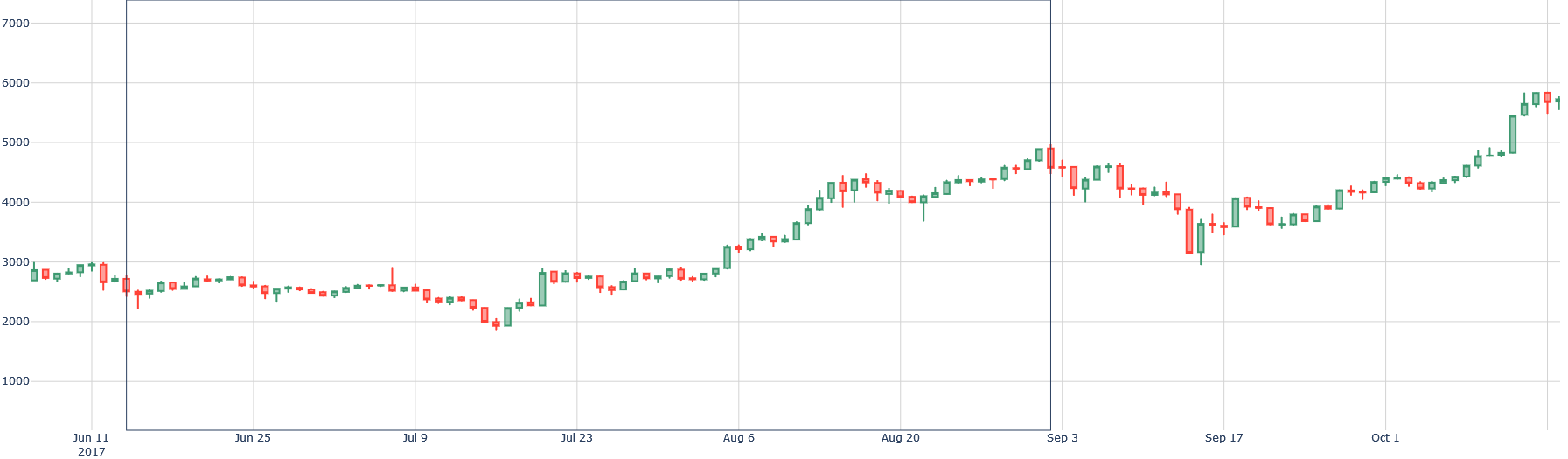
## Candlestick Chart: Stock Price Trend (Jun-Oct 2017)
### Overview
The image is a candlestick chart showing the price fluctuations of a stock or asset over time, from June 11, 2017, to October 1, 2017. The chart uses green and red candlesticks to represent price increases and decreases, respectively.
### Components/Axes
* **X-axis (Time):** Labeled with dates: Jun 11 2017, Jun 25, Jul 9, Jul 23, Aug 6, Aug 20, Sep 3, Sep 17, Oct 1.
* **Y-axis (Price):** Labeled with values: 1000, 2000, 3000, 4000, 5000, 6000, 7000.
* **Candlesticks:**
* **Green:** Indicates a price increase (closing price higher than opening price).
* **Red:** Indicates a price decrease (closing price lower than opening price).
* The body of the candlestick represents the range between the opening and closing prices.
* The "wicks" or "shadows" extending from the body represent the high and low prices for that period.
### Detailed Analysis
* **Jun 11 - Jun 25:** The price fluctuates between approximately 2500 and 3000, with a mix of green and red candlesticks, indicating a period of relative stability.
* **Jun 25 - Jul 9:** A slight downward trend is visible, with the price decreasing from around 2700 to approximately 2400.
* **Jul 9 - Aug 6:** A clear upward trend begins, with the price increasing from approximately 2000 to around 3500.
* **Aug 6 - Aug 20:** The upward trend continues, with the price reaching approximately 4500.
* **Aug 20 - Sep 3:** The price fluctuates significantly, reaching a high of approximately 4800 before dropping to around 3800.
* **Sep 3 - Sep 17:** A downward trend is observed, with the price decreasing from approximately 4800 to around 3200.
* **Sep 17 - Oct 1:** A strong upward trend resumes, with the price increasing from approximately 3800 to around 5800.
### Key Observations
* The chart shows periods of both upward and downward trends, as well as periods of relative stability.
* The most significant price increase occurs between Sep 17 and Oct 1.
* The most significant price decrease occurs between Aug 20 and Sep 17.
### Interpretation
The candlestick chart provides a visual representation of the price movements of an asset over time. The trends suggest periods of buying and selling pressure, with the overall trend being upward from July to October. The fluctuations could be due to various market factors, such as news events, economic data, or investor sentiment. The strong upward trend at the end of the period suggests increasing investor confidence or positive developments related to the asset.