## Bar Chart: Adder - Time vs Core Count
### Overview
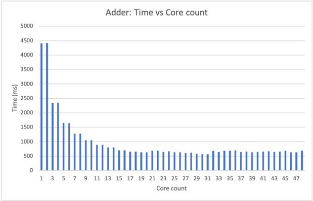
This is a vertical bar chart titled "Adder: Time vs Core count." It displays the relationship between the number of processing cores used (x-axis) and the computation time in milliseconds (y-axis) for a task labeled "Adder." The chart demonstrates a clear trend of decreasing computation time as core count increases, with diminishing returns at higher core counts.
### Components/Axes
* **Chart Title:** "Adder: Time vs Core count" (centered at the top).
* **Y-Axis:**
* **Label:** "Time (ms)" (rotated vertically on the left side).
* **Scale:** Linear scale from 0 to 5000.
* **Major Gridlines & Markers:** 0, 500, 1000, 1500, 2000, 2500, 3000, 3500, 4000, 4500, 5000.
* **X-Axis:**
* **Label:** "Core count" (centered at the bottom).
* **Scale:** Linear scale representing discrete core counts.
* **Major Markers (Labeled):** 1, 3, 5, 7, 9, 11, 13, 15, 17, 19, 21, 23, 25, 27, 29, 31, 33, 35, 37, 39, 41, 43, 45, 47.
* **Data Representation:** A continuous series of vertical blue bars, one for each integer core count from 1 to 47. The labeled markers are every other bar (odd numbers).
* **Legend:** None present. All data series are represented by identical blue bars.
* **Grid:** Horizontal gridlines are present at each major y-axis marker.
### Detailed Analysis
**Trend Verification:** The data series shows a strong negative correlation. The bar heights (time) decrease sharply as the core count increases from 1 to approximately 19, after which the decrease slows significantly and the times plateau.
**Key Data Points (Approximate Values):**
The following table lists the approximate time values for the labeled core counts. Values are estimated from the visual chart and carry inherent uncertainty.
| Core Count | Approximate Time (ms) | Visual Trend Note |
| :--- | :--- | :--- |
| 1 | ~4400 | Highest value, baseline. |
| 3 | ~4400 | Nearly identical to 1 core. |
| 5 | ~2300 | **Sharp drop** from 3 cores. |
| 7 | ~1600 | Continued significant decrease. |
| 9 | ~1300 | |
| 11 | ~1050 | |
| 13 | ~900 | |
| 15 | ~800 | |
| 17 | ~700 | |
| 19 | ~650 | **Knee of the curve.** Rate of improvement slows markedly. |
| 21 | ~625 | |
| 23 | ~650 | Slight increase? (Possible noise/uncertainty). |
| 25 | ~625 | |
| 27 | ~600 | |
| 29 | ~550 | Appears to be the lowest point. |
| 31 | ~600 | |
| 33 | ~650 | |
| 35 | ~675 | |
| 37 | ~650 | |
| 39 | ~675 | |
| 41 | ~650 | |
| 43 | ~675 | |
| 45 | ~650 | |
| 47 | ~675 | |
**Spatial Grounding:** The chart area is bounded by the axes. The title is in the top margin. The y-axis label is in the left margin. The x-axis label is in the bottom margin. The bars originate from the x-axis and extend upward. The tallest bars are on the far left (low core counts). The shortest, most uniform bars are in the center-right region (core counts ~19-47).
### Key Observations
1. **Initial Plateau:** There is no performance benefit when moving from 1 to 3 cores; the time remains nearly constant at ~4400 ms.
2. **Steep Initial Scaling:** A dramatic performance gain occurs between 3 and 5 cores (time nearly halves), and continues steeply until about 19 cores.
3. **Diminishing Returns:** After approximately 19 cores, the performance improvement per added core becomes minimal. The curve flattens into a plateau.
4. **Performance Floor:** The computation time appears to hit a lower bound or "floor" of approximately 550-700 ms, which cannot be reduced further by adding more cores within the tested range (up to 47).
5. **Minor Fluctuations:** In the plateau region (cores 19-47), there are small, non-monotonic fluctuations in the bar heights (e.g., a slight rise at core 23, a dip at core 29). These are likely due to measurement noise, system overhead variability, or minor chart rendering artifacts, rather than a meaningful performance trend.
### Interpretation
This chart is a classic visualization of **parallel scaling efficiency** for a computational task (the "Adder"). The data suggests the following:
* **The task is parallelizable, but not perfectly.** The ideal linear speedup (where time halves with each doubling of cores) is not achieved. The initial sharp drop indicates good parallel efficiency for the first phase of scaling.
* **There is a significant parallelization overhead or a serial bottleneck.** The initial plateau (1 to 3 cores) suggests that for very low core counts, the overhead of managing parallel tasks (e.g., thread creation, data distribution, synchronization) negates any benefit. The final plateau indicates that a portion of the task is inherently serial (as described by **Amdahl's Law**), or that system resource contention (e.g., memory bandwidth, cache coherency) becomes the limiting factor.
* **The optimal resource allocation point is around 19 cores.** Beyond this point, adding more cores provides negligible performance benefit while increasing resource cost and power consumption. This is the point of maximum return on investment for this specific task and hardware configuration.
* **The "Adder" task likely involves a combination of parallel and serial components.** The serial component dictates the minimum possible time (~600 ms), while the parallel component's efficiency determines how quickly that minimum is approached as cores are added.
In summary, the chart provides empirical evidence for the practical limits of parallel computing for a given workload, highlighting the transition from effective scaling to a region of diminishing returns governed by system and algorithmic constraints.