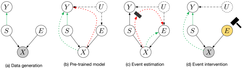
## Diagram: Causal Inference Models
### Overview
The image presents four diagrams illustrating different stages of causal inference modeling: data generation, pre-trained model, event estimation, and event intervention. Each diagram depicts variables (Y, S, E, X, U) and their relationships using arrows to indicate causal dependencies. The diagrams show how these relationships change across the different stages.
### Components/Axes
* **Nodes:** Represented by circles, labeled as Y, S, E, X, and U.
* Y: Outcome variable
* S: Source variable
* E: Event variable
* X: Observed variable
* U: Unobserved variable (dashed circle)
* **Edges:** Represented by arrows, indicating causal relationships.
* Solid black arrows: Direct causal effect.
* Dashed green arrows: Causal effect.
* Dashed red arrows: Causal effect.
* Dashed gray arrows: Causal effect.
* **Diagram Titles:**
* (a) Data generation
* (b) Pre-trained model
* (c) Event estimation
* (d) Event intervention
### Detailed Analysis
**Diagram (a) Data generation:**
* Nodes: Y, S, E, X. All nodes are white except for X, which is gray.
* Edges:
* S -> X (black, solid)
* E -> X (black, solid)
* S -> Y (green, solid)
* Description: This diagram shows the basic causal structure where S and E influence X, and S also influences Y.
**Diagram (b) Pre-trained model:**
* Nodes: Y, S, E, X, U. U is a dashed circle. All nodes are white.
* Edges:
* S -> X (black, solid)
* E -> X (black, solid)
* S -> Y (green, solid)
* U -> E (gray, dashed)
* U -> Y (gray, dashed)
* S -> Y (green, dashed)
* E -> X (red, dashed)
* S -> X (green, dashed)
* Y -> X (red, dashed)
* Description: This diagram introduces the unobserved variable U, which influences both E and Y. It also shows feedback loops and potential confounding relationships.
**Diagram (c) Event estimation:**
* Nodes: Y, S, E, X, U. U is a dashed circle. All nodes are white.
* Edges:
* S -> X (black, solid)
* E -> X (black, solid)
* S -> Y (green, solid)
* U -> E (gray, dashed)
* U -> Y (gray, dashed)
* S -> Y (green, dashed)
* E -> X (green, dashed)
* S -> X (red, dashed)
* Y -> X (red, dashed)
* A black rectangle is blocking the red dashed arrow from Y to S.
* Description: Similar to (b), but with an added element (black rectangle) blocking the influence from Y to S.
**Diagram (d) Event intervention:**
* Nodes: Y, S, E, X, U. U is a dashed circle. E and X are colored yellow and gray, respectively.
* Edges:
* S -> X (black, solid)
* E -> X (black, solid)
* S -> Y (green, solid)
* U -> E (gray, dashed)
* U -> Y (gray, dashed)
* S -> Y (green, dashed)
* E -> X (green, dashed)
* A hammer is pointing at node E.
* Description: This diagram shows an intervention on E, indicated by the hammer. E and X are highlighted, suggesting they are the focus of the intervention.
### Key Observations
* The diagrams illustrate the evolution of a causal model from a simple data generation process to a more complex intervention scenario.
* The introduction of the unobserved variable U and feedback loops adds complexity to the model.
* The intervention in diagram (d) highlights the potential impact of external actions on the system.
### Interpretation
The diagrams demonstrate the process of building and refining a causal model. Starting with a basic understanding of data generation, the model evolves to incorporate unobserved variables and feedback loops. The final stage shows how interventions can be applied to the model to understand their effects. The progression highlights the importance of considering confounding factors and feedback mechanisms when making causal inferences. The hammer in diagram (d) symbolizes an external intervention, which is a key concept in causal inference. The change in color of nodes E and X in diagram (d) indicates that these variables are directly affected by the intervention.