\n
## Diagram: Causal Relationship Models
### Overview
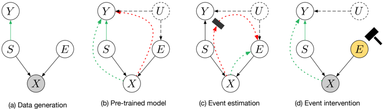
The image presents four diagrams illustrating different stages of a causal model, labeled (a) Data generation, (b) Pre-trained model, (c) Event estimation, and (d) Event intervention. Each diagram depicts relationships between variables represented as nodes (circles) and their dependencies as directed edges (arrows). The diagrams demonstrate how the model evolves from representing the data generation process to estimating events and finally to intervening on the system.
### Components/Axes
The diagrams consist of the following variables:
* **Y**: A variable.
* **S**: A variable.
* **E**: A variable.
* **X**: A variable.
* **U**: A variable (introduced in diagram b).
The arrows represent causal relationships. Solid arrows indicate direct causal effects, while dashed arrows represent learned or inferred relationships. The color of the arrows varies to indicate different stages or types of relationships. The diagrams are labeled (a), (b), (c), and (d) below the diagrams.
### Detailed Analysis or Content Details
**(a) Data generation:**
* **S** -> **X**: Solid black arrow, indicating a direct causal effect from S to X.
* **E** -> **X**: Solid black arrow, indicating a direct causal effect from E to X.
* **X** -> **Y**: Solid black arrow, indicating a direct causal effect from X to Y.
**(b) Pre-trained model:**
* **S** -> **X**: Solid black arrow, indicating a direct causal effect from S to X.
* **E** -> **X**: Solid black arrow, indicating a direct causal effect from E to X.
* **X** -> **Y**: Solid black arrow, indicating a direct causal effect from X to Y.
* **E** <- **U**: Dashed red arrow, indicating a learned or inferred relationship from U to E.
* **Y** <- **U**: Dashed red arrow, indicating a learned or inferred relationship from U to Y.
**(c) Event estimation:**
* **S** -> **X**: Solid black arrow, indicating a direct causal effect from S to X.
* **E** -> **X**: Solid black arrow, indicating a direct causal effect from E to X.
* **X** -> **Y**: Solid black arrow, indicating a direct causal effect from X to Y.
* **E** <- **U**: Dashed red arrow, indicating a learned or inferred relationship from U to E.
* **Y** <- **U**: Dashed red arrow, indicating a learned or inferred relationship from U to Y.
* A black rectangle is positioned over the node **Y**, potentially representing an observed event or intervention.
**(d) Event intervention:**
* **S** -> **X**: Solid black arrow, indicating a direct causal effect from S to X.
* **E** -> **X**: Solid black arrow, indicating a direct causal effect from E to X.
* **X** -> **Y**: Solid black arrow, indicating a direct causal effect from X to Y.
* **E** <- **U**: Dashed red arrow, indicating a learned or inferred relationship from U to E.
* **Y** <- **U**: Dashed red arrow, indicating a learned or inferred relationship from U to Y.
* The node **E** is highlighted in yellow, and a hammer icon is positioned next to it, indicating an intervention on variable E.
### Key Observations
* The diagrams progressively add complexity, starting with a simple causal model and culminating in an intervention scenario.
* The introduction of variable U in (b) represents the model's attempt to account for unobserved confounders.
* The black rectangle in (c) suggests an event is being estimated or identified.
* The yellow highlighting and hammer icon in (d) clearly indicate an intervention on variable E.
* The dashed red arrows consistently represent learned relationships, while solid black arrows represent assumed causal relationships.
### Interpretation
The diagrams illustrate a process of causal discovery and intervention. Diagram (a) represents the true data-generating process. Diagram (b) shows a pre-trained model attempting to learn the underlying causal structure, including unobserved variables (U). Diagram (c) demonstrates event estimation, where the model identifies an event (represented by the black rectangle) based on the learned relationships. Finally, diagram (d) depicts an intervention on variable E, aiming to influence the system. The use of different arrow styles (solid vs. dashed) and colors (black vs. red) highlights the distinction between assumed causal relationships and learned or inferred relationships. The progression of the diagrams suggests a framework for causal inference and decision-making, where the model learns from data, estimates events, and then intervenes to achieve desired outcomes. The hammer icon is a strong visual metaphor for direct manipulation of the system.