TECHNICAL ASSET FINGERPRINT
1e9e80d99cbe934bf6b51619
Click to view fullscreen
Press ESC or click to close
FOUND IN PAPERS
EXPERT: healer-alpha-free VERSION 1
RUNTIME: free/openrouter/healer-alpha
INTEL_VERIFIED
\n
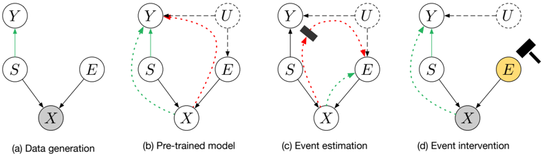
## Causal Diagram Series: Data Generation, Pre-trained Model, Event Estimation, and Intervention
### Overview
The image displays a series of four causal diagrams, labeled (a) through (d), illustrating a conceptual framework for causal inference in a machine learning or statistical context. The diagrams show the relationships between variables (nodes) and how these relationships are modeled, estimated, and intervened upon. The progression moves from the true data-generating process to a model, then to an estimation step, and finally to an intervention.
### Components/Axes
The diagrams consist of circular nodes labeled with capital letters and directed edges (arrows) connecting them. The nodes are:
* **Y**: A target or outcome variable.
* **S**: A source or sensitive attribute.
* **E**: An event or explanatory variable.
* **X**: An observed data point or feature vector.
* **U**: An unobserved confounder or latent variable (appears in diagrams b, c, d).
**Visual Encoding:**
* **Node Fill**: A gray fill (on node `X` in a, d; on node `E` in d) indicates an observed variable. A yellow fill (on node `E` in d) highlights the variable being intervened upon. Nodes with white fill are unobserved or latent.
* **Arrow Style & Color**:
* **Solid Black Arrows**: Represent direct causal relationships in the true model (a) or the assumed model structure.
* **Dashed Green Arrows**: Represent estimated or inferred causal pathways (from `S` to `Y` in b, c, d).
* **Dashed Red Arrows**: Represent confounding pathways or spurious associations (from `U` to `Y` and `E` in b, c).
* **Icons**: A black hammer icon appears in diagrams (c) and (d), symbolizing an action—either estimation (c) or intervention (d).
### Detailed Analysis
#### **Diagram (a): Data generation**
* **Structure**: This represents the ground-truth causal process.
* **Components & Flow**:
* Node `S` has a direct causal effect on node `Y` (solid black arrow).
* Nodes `S` and `E` both have direct causal effects on node `X` (solid black arrows).
* Node `X` is shaded gray, indicating it is the observed data.
* **Interpretation**: The observed data `X` is generated from a combination of a sensitive attribute `S` and an event `E`. The target `Y` is directly influenced by `S`.
#### **Diagram (b): Pre-trained model**
* **Structure**: This shows a model that includes an unobserved confounder `U`.
* **Components & Flow**:
* The core structure from (a) remains (`S` → `Y`, `S` → `X`, `E` → `X`).
* A new node `U` (unobserved confounder) is introduced.
* **Dashed Green Arrow**: A pathway from `S` to `Y` is highlighted, representing the direct effect the model aims to capture.
* **Dashed Red Arrows**: Two confounding pathways are shown: `U` → `Y` and `U` → `E`. This indicates that `U` influences both the outcome `Y` and the event `E`, creating a spurious association between `S` and `Y` via `E` and `U`.
* **Spatial Grounding**: Node `U` is positioned top-right. The red dashed arrows curve from `U` down to `Y` (left) and `E` (right).
#### **Diagram (c): Event estimation**
* **Structure**: This diagram depicts the process of estimating the effect of the event `E`.
* **Components & Flow**:
* The structure is similar to (b).
* **Key Change**: A black hammer icon is placed on the dashed red arrow from `U` to `Y`. This visually represents the action of "breaking" or accounting for this confounding path during estimation.
* The dashed red arrow from `U` to `E` remains, indicating the confounder's influence on the event is still present in this estimation step.
* The dashed green arrow from `S` to `Y` persists.
* **Interpretation**: The process involves statistically controlling for or adjusting the confounding effect of `U` on `Y` to isolate the relationship of interest.
#### **Diagram (d): Event intervention**
* **Structure**: This shows the result of a causal intervention on event `E`.
* **Components & Flow**:
* **Key Change 1**: Node `E` is now shaded yellow and has a black hammer icon directly on it, symbolizing a do-intervention (e.g., `do(E=e)`).
* **Key Change 2**: The dashed red arrow from `U` to `E` is completely removed. The intervention severs the natural causal influence of the confounder `U` on `E`.
* The dashed green arrow from `S` to `Y` and the solid arrows to `X` remain.
* Node `X` is shaded gray again, indicating it is still observed post-intervention.
* **Interpretation**: By forcibly setting the value of `E`, we break its dependence on the confounder `U`. This allows for the estimation of the pure effect of `S` on `Y` (via the green path) without the confounding bias that existed in the observational model (b).
### Key Observations
1. **Progressive Complexity**: The diagrams build upon each other, adding one conceptual layer (confounder `U`, estimation action, intervention action) at a time.
2. **Color-Coded Semantics**: The consistent use of green for the target pathway and red for confounding pathways provides clear visual semantics.
3. **Iconography**: The hammer icon is a potent, non-textual symbol for an active statistical or causal operation.
4. **Shading for State**: The change in node shading (gray for observed, yellow for intervened) effectively communicates the state of variables across different stages.
### Interpretation
This series of diagrams succinctly narrates a core challenge and solution in causal inference from observational data. The **data generation process (a)** is simple, but our **pre-trained model (b)** is incomplete—it misses an unobserved confounder `U` that corrupts our view of the relationship between `S` and `Y`. The **event estimation (c)** step represents the analytical effort to adjust for this confounding. Finally, **event intervention (d)** illustrates the gold standard: a hypothetical or real-world manipulation that breaks the confounding link, allowing for unbiased estimation of the causal effect of `S` on `Y`.
The progression argues that to understand the true effect of a sensitive attribute (`S`) on an outcome (`Y`), one must account for or eliminate the confounding influence of external factors (`U`) on related events (`E`). The visual journey from (b) to (d) highlights the difference between observing associations in the presence of confounders and identifying true causal effects through intervention or robust statistical adjustment.
DECODING INTELLIGENCE...