## Histogram: Consistency Score Density by Answer Correctness
### Overview
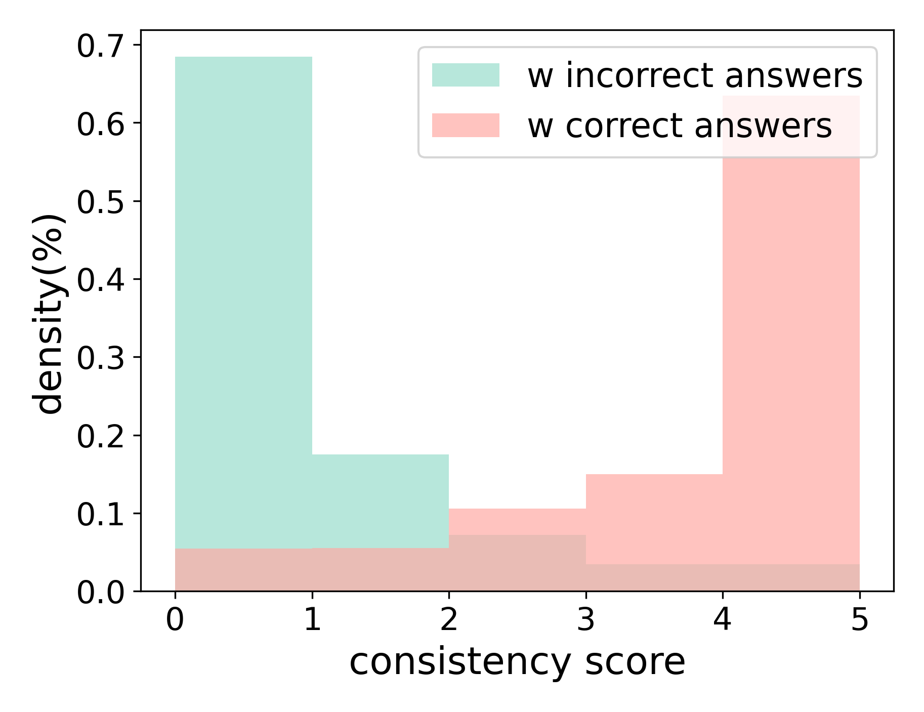
The image displays a histogram comparing the density distribution of "consistency scores" for two groups: one associated with incorrect answers and one with correct answers. The chart uses overlapping, semi-transparent bars to show the frequency (density) of scores ranging from 0 to 5.
### Components/Axes
* **Chart Type:** Histogram (overlapping bar chart).
* **X-Axis:**
* **Label:** `consistency score`
* **Scale:** Linear, with integer markers at `0`, `1`, `2`, `3`, `4`, `5`.
* **Y-Axis:**
* **Label:** `density(%)`
* **Scale:** Linear, ranging from `0.0` to `0.7` with increments of `0.1`.
* **Legend:**
* **Position:** Top-right corner of the chart area.
* **Entry 1:** A light teal (mint green) rectangle labeled `w incorrect answers`.
* **Entry 2:** A light pink (salmon) rectangle labeled `w correct answers`.
* **Data Series:**
1. **`w incorrect answers` (Teal Bars):** Represents the density distribution of consistency scores for instances where answers were incorrect.
2. **`w correct answers` (Pink Bars):** Represents the density distribution of consistency scores for instances where answers were correct.
### Detailed Analysis
**Trend Verification & Data Points (Approximate Values):**
* **`w incorrect answers` (Teal):**
* **Trend:** The distribution is heavily right-skewed, with a very high peak at the lowest score and a sharp decline as the score increases.
* **Data Points:**
* Score 0: Density ≈ `0.68` (68%)
* Score 1: Density ≈ `0.18` (18%)
* Score 2: Density ≈ `0.07` (7%)
* Score 3: Density ≈ `0.04` (4%)
* Score 4: Density ≈ `0.03` (3%)
* Score 5: Density ≈ `0.03` (3%)
* **`w correct answers` (Pink):**
* **Trend:** The distribution is left-skewed, with low density at low scores, rising to a peak at score 4 before dropping sharply at score 5.
* **Data Points:**
* Score 0: Density ≈ `0.05` (5%)
* Score 1: Density ≈ `0.05` (5%)
* Score 2: Density ≈ `0.10` (10%)
* Score 3: Density ≈ `0.15` (15%)
* Score 4: Density ≈ `0.63` (63%)
* Score 5: Density ≈ `0.03` (3%)
**Spatial Grounding & Component Isolation:**
* The legend is positioned in the **top-right** quadrant, partially overlapping the chart's plot area.
* The teal bars for `w incorrect answers` dominate the **left side** of the chart (scores 0-1).
* The pink bars for `w correct answers` dominate the **right-center** of the chart (score 4).
* The area of overlap (appearing as a muted brownish-pink) is most visible at scores 0, 1, and 2, indicating where both distributions have non-zero density.
### Key Observations
1. **Polar Opposite Peaks:** The two distributions have nearly inverse shapes. Incorrect answers are overwhelmingly concentrated at the lowest consistency score (0), while correct answers are overwhelmingly concentrated at a high consistency score (4).
2. **Minimal Overlap at Extremes:** There is very little overlap in the high-density regions. The peak for incorrect answers (score 0) has very low density for correct answers, and the peak for correct answers (score 4) has very low density for incorrect answers.
3. **Score 5 Anomaly:** Both distributions show a very low and similar density at the maximum score of 5, suggesting that achieving perfect consistency (score 5) is rare for both correct and incorrect answers in this dataset.
4. **Clear Separation:** The chart visually demonstrates a strong separation between the consistency profiles of correct and incorrect answers.
### Interpretation
This histogram suggests a powerful correlation between the **consistency score** and the **correctness of an answer**.
* **Low Consistency (Scores 0-1)** is a strong indicator of an **incorrect answer**. The data implies that when an answer is inconsistent (scoring 0 or 1), it is highly likely to be wrong.
* **High Consistency (Score 4)** is a strong indicator of a **correct answer**. The peak at score 4 for correct answers suggests that a high level of consistency is a key characteristic of correct responses in this context.
* **The "Sweet Spot":** The optimal consistency score for correctness appears to be **4**, not the maximum of 5. This could indicate that perfect consistency (score 5) might be associated with overfitting, rigidity, or a different type of error, while score 4 represents a robust and reliable level of consistency.
* **Practical Implication:** If this consistency score is a metric from a model or evaluation system, it can be used as a highly effective filter or confidence indicator. Answers with a consistency score of 0 or 1 can be flagged as likely incorrect with high confidence, while answers with a score of 4 can be treated as highly reliable. The clear bimodal separation makes this a particularly useful diagnostic tool.