## Violin Plot: CausalCite Distribution for Non-ToT and ToT Papers
### Overview
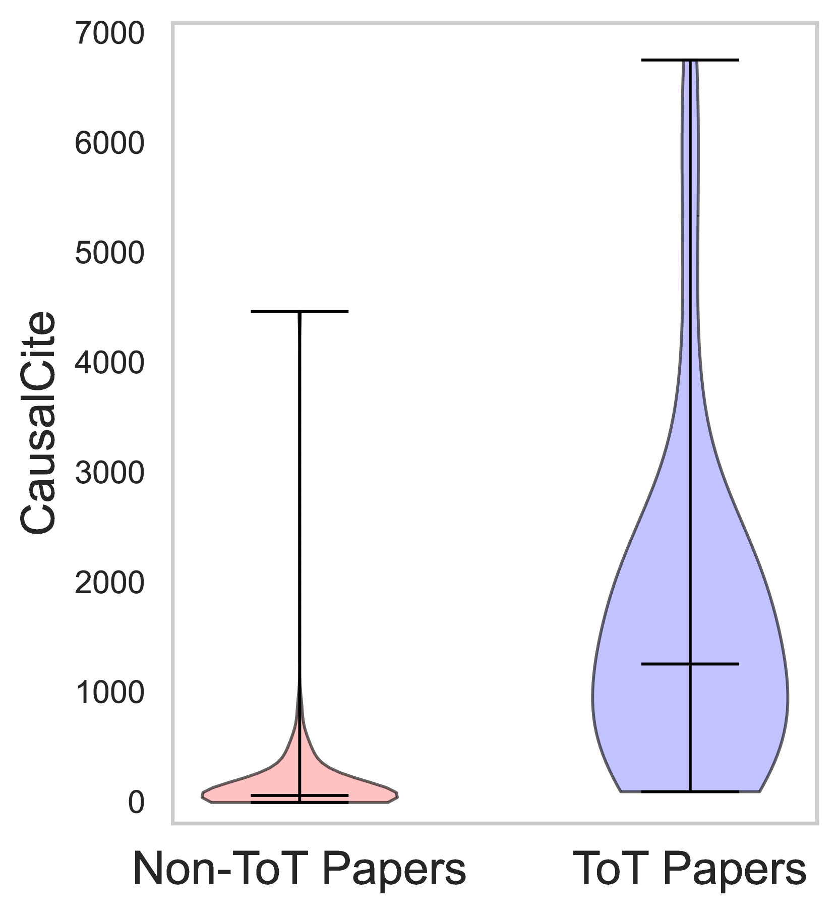
The image is a violin plot comparing the distribution of "CausalCite" values for two categories of papers: "Non-ToT Papers" and "ToT Papers". The plot visually represents the probability density of the CausalCite values for each category, showing the median, interquartile range, and overall distribution shape.
### Components/Axes
* **X-axis:** Categorical axis with two categories: "Non-ToT Papers" and "ToT Papers".
* **Y-axis:** Numerical axis labeled "CausalCite" with a range from 0 to 7000, marked at intervals of 1000 (0, 1000, 2000, 3000, 4000, 5000, 6000, 7000).
* **Violin Plots:**
* "Non-ToT Papers": Represented by a pink violin plot.
* "ToT Papers": Represented by a light blue violin plot.
* **Median Lines:** Each violin plot contains a horizontal line indicating the median CausalCite value for that category.
* **Interquartile Range (IQR) Lines:** Each violin plot contains vertical lines indicating the interquartile range.
### Detailed Analysis
* **Non-ToT Papers (Pink):**
* The distribution is heavily skewed towards lower CausalCite values.
* The median CausalCite value is approximately 100.
* The interquartile range extends from approximately 0 to 200.
* The maximum CausalCite value observed is approximately 4500.
* **ToT Papers (Light Blue):**
* The distribution is also skewed, but less so than the "Non-ToT Papers".
* The median CausalCite value is approximately 1300.
* The interquartile range extends from approximately 0 to 2500.
* The maximum CausalCite value observed is approximately 6800.
### Key Observations
* The "ToT Papers" category exhibits a significantly higher median CausalCite value compared to the "Non-ToT Papers" category.
* The distribution of "CausalCite" values for "ToT Papers" is more spread out, indicating a wider range of citation counts.
* Both distributions are skewed, suggesting that a majority of papers in both categories receive a relatively low number of citations, while a smaller number of papers receive a significantly higher number of citations.
### Interpretation
The violin plot suggests that "ToT Papers" tend to receive more citations ("CausalCite") than "Non-ToT Papers". The difference in median values and the overall distribution shape indicates a potential positive correlation between being a "ToT Paper" and receiving a higher number of citations. The skewness in both distributions highlights the presence of highly cited papers within each category, but this effect is more pronounced for "ToT Papers".