## Scatter Plot: Tourism Index vs. Monthly Averaged Tourism Indicator
### Overview
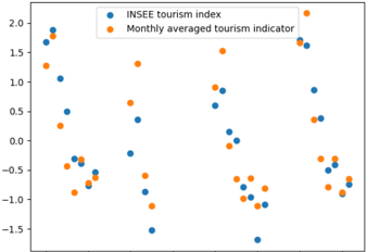
The image is a scatter plot comparing the INSEE tourism index and the monthly averaged tourism indicator. The plot shows the relationship between these two indicators, with data points scattered across the graph. The y-axis represents the value of the indicators, ranging from approximately -1.5 to 2.0. The x-axis is not explicitly labeled but appears to represent different time periods or categories.
### Components/Axes
* **Y-axis:** Values ranging from -1.5 to 2.0, with increments of 0.5.
* **X-axis:** Unlabeled, but represents different time periods or categories.
* **Legend (Top-Left):**
* Blue: INSEE tourism index
* Orange: Monthly averaged tourism indicator
### Detailed Analysis
* **INSEE tourism index (Blue):**
* The blue data points are scattered across the plot.
* The first point is at approximately (x=1, y=1.8).
* There is a point at approximately (x=2, y=1.1).
* There is a point at approximately (x=3, y=0.5).
* There is a point at approximately (x=4, y=-0.3).
* There is a point at approximately (x=5, y=-1.5).
* There is a point at approximately (x=6, y=-0.1).
* There is a point at approximately (x=7, y=-1.0).
* There is a point at approximately (x=8, y=1.6).
* There is a point at approximately (x=9, y=0.2).
* There is a point at approximately (x=10, y=-0.5).
* **Monthly averaged tourism indicator (Orange):**
* The orange data points are also scattered across the plot.
* The first point is at approximately (x=1, y=1.9).
* There is a point at approximately (x=2, y=0.3).
* There is a point at approximately (x=3, y=-0.4).
* There is a point at approximately (x=4, y=0.7).
* There is a point at approximately (x=5, y=-0.6).
* There is a point at approximately (x=6, y=0.9).
* There is a point at approximately (x=7, y=-0.7).
* There is a point at approximately (x=8, y=1.8).
* There is a point at approximately (x=9, y=-0.1).
* There is a point at approximately (x=10, y=-0.9).
### Key Observations
* The data points for both indicators are scattered, suggesting variability across the x-axis categories.
* There is no clear linear relationship between the two indicators.
* Both indicators have values ranging from approximately -1.5 to 2.0.
* The x-axis is not labeled, making it difficult to interpret the meaning of the different categories.
### Interpretation
The scatter plot compares the INSEE tourism index and the monthly averaged tourism indicator. The scattered data points suggest that there is no strong linear correlation between the two indicators across the different categories represented on the x-axis. The unlabeled x-axis limits the interpretation of the plot, as the nature of the categories is unknown. Without knowing what the x-axis represents (e.g., months, regions, years), it is difficult to draw meaningful conclusions about the relationship between the two tourism indicators. The plot primarily demonstrates the variability of both indicators across these unspecified categories.