## Scatter Plot: Tourism Index Comparison
### Overview
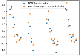
The image displays a scatter plot comparing two tourism-related data series: the "INSEE tourism index" (blue dots) and the "Monthly averaged tourism indicator" (orange dots). The plot shows the distribution and relationship of these two metrics across an unlabeled horizontal axis, with values plotted against a vertical axis ranging from -1.5 to 2.0.
### Components/Axes
* **Chart Type:** Scatter plot.
* **Legend:** Located at the top center of the chart area. It contains two entries:
* A blue circle labeled "INSEE tourism index".
* An orange circle labeled "Monthly averaged tourism indicator".
* **Y-Axis (Vertical):**
* **Title:** Not explicitly labeled.
* **Scale:** Linear scale.
* **Range:** Approximately -1.5 to 2.0.
* **Major Tick Marks:** At intervals of 0.5, labeled as: -1.5, -1.0, -0.5, 0.0, 0.5, 1.0, 1.5, 2.0.
* **X-Axis (Horizontal):**
* **Title:** Not explicitly labeled.
* **Scale:** Appears to be categorical or ordinal, as there are no numerical labels or tick marks. The data points are distributed across the axis without a defined scale.
* **Data Series:**
* **Series 1 (Blue):** "INSEE tourism index". Points are scattered widely across the plot.
* **Series 2 (Orange):** "Monthly averaged tourism indicator". Points are also scattered but show a different distribution pattern.
### Detailed Analysis
**Data Point Approximation (X-position is relative, Y-value is approximate):**
The horizontal axis lacks labels, so positions are described as left, center, or right relative to the plot area.
* **Left Region (First ~25% of x-axis):**
* Blue: Points at y ≈ 1.7, 1.9, 1.1, 0.5, -0.4, -0.5, -0.7, -0.9.
* Orange: Points at y ≈ 1.6, 0.25, -0.4, -0.7, -0.9.
* **Center-Left Region (25-50% of x-axis):**
* Blue: Points at y ≈ -0.2, 0.35, -0.5, -1.0, -1.5.
* Orange: Points at y ≈ 1.3, 0.65, -0.55, -0.9.
* **Center Region (50-75% of x-axis):**
* Blue: Points at y ≈ 0.9, 0.2, 0.0, -0.1, -0.8, -1.0, -1.6.
* Orange: Points at y ≈ 0.95, 0.7, -0.6, -0.7, -0.75, -0.8.
* **Right Region (Last ~25% of x-axis):**
* Blue: Points at y ≈ 1.65, 0.85, 0.4, -0.3, -0.6, -0.7, -0.8.
* Orange: Points at y ≈ 2.0 (top-right corner), 1.75, 0.4, -0.3, -0.4, -0.6, -0.7.
**Trend Verification:**
* **INSEE tourism index (Blue):** Shows high volatility. It has the highest overall value (≈1.9, top-left) and the lowest overall value (≈-1.6, bottom-center). There is no single linear trend; instead, points are dispersed across the entire y-range in all horizontal regions.
* **Monthly averaged tourism indicator (Orange):** Also shows significant spread but appears slightly more clustered in the mid-to-upper range (0.0 to 2.0) compared to the blue series. Its highest point is at the extreme top-right (≈2.0).
### Key Observations
1. **High Variability:** Both indices exhibit substantial fluctuation, with values spanning a range of approximately 3.5 units on the y-axis.
2. **Divergent Extremes:** The single highest value belongs to the orange series (≈2.0, right), while the single lowest value belongs to the blue series (≈-1.6, center).
3. **Clustering Patterns:** In the center region, there is a notable cluster of blue points in the negative range (y ≈ -0.8 to -1.6). In the right region, both series have points clustered near y ≈ -0.7.
4. **Lack of Correlation:** There is no clear visual correlation (positive or negative) between the two series at any given horizontal position. For example, in the left region, high blue points correspond with a high orange point, but also with low orange points.
### Interpretation
This scatter plot compares a raw tourism index (INSEE) with a monthly averaged version of a tourism indicator. The key takeaway is the **effect of averaging on data volatility**.
* The "Monthly averaged tourism indicator" (orange) is likely a smoothed version of underlying data, which explains why its points, while still variable, avoid the most extreme negative values seen in the blue series. The averaging process dampens sharp downturns.
* The "INSEE tourism index" (blue) appears to be a more volatile, possibly higher-frequency or less processed metric. Its wider spread, including deeper lows, suggests it captures more short-term fluctuations or shocks in tourism activity.
* The absence of an x-axis label is a critical omission. It prevents understanding whether the horizontal dimension represents time (e.g., months, years), geographic regions, or another categorical variable. Without this context, we cannot determine if the patterns are temporal trends or cross-sectional comparisons.
* The plot suggests that while the two metrics are related (both measuring tourism), they are not identical. The monthly average provides a more stable, less extreme picture, which could be preferable for identifying general trends, whereas the INSEE index might be better for detecting acute changes or anomalies. The lack of a clear correlation pattern implies that the relationship between the raw index and its monthly average is complex and not simply a one-to-one mapping at each data point.