## Chart: Sample Number vs. Value
### Overview
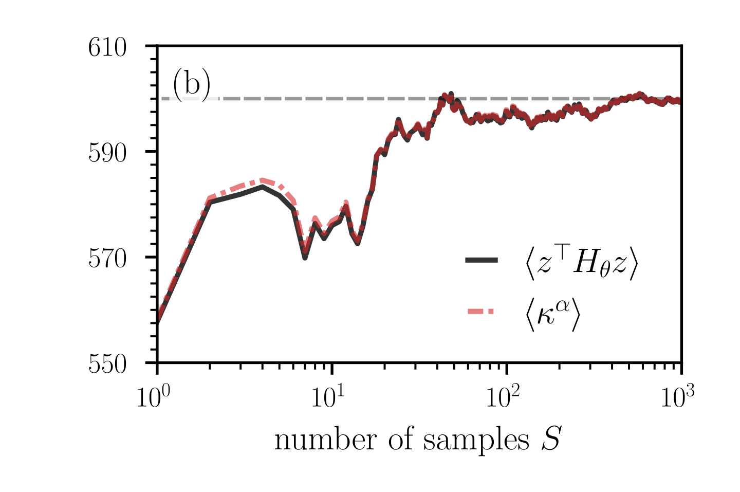
The image is a line chart comparing two data series, `<z^T H_θ z>` and `<κ^α>`, against the number of samples (S) on a logarithmic scale. The chart shows how the values of these two series change as the number of samples increases from 10^0 to 10^3. A horizontal dashed line is present at approximately y=600, labeled "(b)".
### Components/Axes
* **X-axis:** "number of samples S". The scale is logarithmic, ranging from 10^0 to 10^3.
* **Y-axis:** The y-axis is not explicitly labeled, but it represents the value of the two data series. The scale ranges from 550 to 610.
* **Legend:** Located on the right side of the chart.
* Black solid line: `<z^T H_θ z>`
* Red dashed line: `<κ^α>`
* **Horizontal Dashed Line:** A grey dashed line is present at approximately y=600, labeled "(b)".
### Detailed Analysis
* **`<z^T H_θ z>` (Black Solid Line):**
* Trend: Initially increases sharply, then decreases, fluctuates, and eventually plateaus around 600.
* Data Points:
* At S = 10^0 (1), the value is approximately 550.
* Peaks around S = 5 at approximately 585.
* Dips around S = 8 at approximately 570.
* Plateaus around S = 10^2 (100) at approximately 600.
* **`<κ^α>` (Red Dashed Line):**
* Trend: Mirrors the trend of `<z^T H_θ z>`, initially increasing sharply, then decreasing, fluctuating, and eventually plateauing around 600.
* Data Points:
* At S = 10^0 (1), the value is approximately 550.
* Peaks around S = 5 at approximately 585.
* Dips around S = 8 at approximately 570.
* Plateaus around S = 10^2 (100) at approximately 600.
* **Horizontal Dashed Line (Grey):**
* The grey dashed line is at approximately y=600.
### Key Observations
* The two data series, `<z^T H_θ z>` and `<κ^α>`, exhibit very similar behavior across the range of sample numbers.
* Both series show a rapid increase initially, followed by fluctuations, and then converge to a stable value around 600 as the number of samples increases.
* The horizontal dashed line at y=600 seems to represent a target or reference value.
### Interpretation
The chart suggests that both `<z^T H_θ z>` and `<κ^α>` converge to a similar value as the number of samples increases. The initial fluctuations indicate that the estimates are unstable with fewer samples, but as the sample size grows, the estimates become more reliable and converge towards a stable value, potentially indicated by the horizontal dashed line. The close tracking of the two series suggests a strong correlation or relationship between them. The label "(b)" on the horizontal line might refer to a specific parameter or condition being met when the values reach this level.