\n
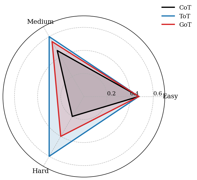
## Radar Chart: Difficulty Assessment
### Overview
The image presents a radar chart (also known as a spider chart or star chart) comparing the difficulty levels of three different tests: CoT (black line), ToT (blue line), and GoT (red line). The chart uses a triangular coordinate system with axes representing "Easy" and "Hard", and a third axis labeled "Medium". The values on the axes range from 0.2 to 0.6. The chart visually represents the relative difficulty of each test across these dimensions.
### Components/Axes
* **Axes:** The chart has three axes, labeled "Easy", "Hard", and "Medium". These are positioned at approximately 120-degree intervals around the center of the chart.
* **Scale:** The axes are scaled from 0.2 to 0.6, with tick marks at 0.2, 0.4, and 0.6.
* **Legend:** Located in the top-right corner, the legend identifies the three data series:
* Black line: CoT
* Blue line: ToT
* Red line: GoT
* **Data Series:** Three lines representing the difficulty profiles of CoT, ToT, and GoT. The areas enclosed by these lines are shaded in corresponding colors (black, blue, and red).
### Detailed Analysis
The chart displays the difficulty profiles of the three tests. The lines are not smooth curves but rather consist of straight line segments connecting points.
* **CoT (Black Line):** The CoT line forms a roughly triangular shape. It starts at approximately 0.2 on the "Hard" axis, extends to around 0.4 on the "Medium" axis, and reaches approximately 0.4 on the "Easy" axis before returning to the starting point.
* **ToT (Blue Line):** The ToT line also forms a triangular shape, but it is shifted slightly towards the "Easy" axis compared to CoT. It starts at approximately 0.2 on the "Hard" axis, extends to around 0.4 on the "Medium" axis, and reaches approximately 0.5 on the "Easy" axis before returning to the starting point.
* **GoT (Red Line):** The GoT line is positioned between CoT and ToT. It starts at approximately 0.2 on the "Hard" axis, extends to around 0.4 on the "Medium" axis, and reaches approximately 0.45 on the "Easy" axis before returning to the starting point.
### Key Observations
* All three tests (CoT, ToT, and GoT) are relatively similar in difficulty, with values generally ranging between 0.2 and 0.5 across the three dimensions.
* ToT appears to be the easiest test overall, as its line extends furthest along the "Easy" axis (reaching approximately 0.5).
* CoT appears to be the hardest test overall, as its line is closest to the "Hard" axis.
* The shapes of the lines are similar, suggesting that the tests assess similar types of difficulty.
### Interpretation
The radar chart suggests that the three tests (CoT, ToT, and GoT) have comparable difficulty profiles, but with subtle differences. ToT is perceived as slightly easier than the other two, while CoT is perceived as slightly harder. The triangular shape of the profiles indicates that the tests assess difficulty across a spectrum of "Easy", "Medium", and "Hard" dimensions. The fact that the lines are not smooth suggests that the difficulty levels are not continuous but rather discrete or categorical. The chart provides a visual representation of the relative difficulty of the tests, which can be useful for selecting appropriate tests for different individuals or purposes. The data does not provide any information about the nature of the tests themselves or the specific skills or knowledge they assess.