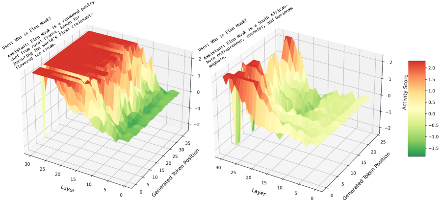
## 3D Surface Plot: Activity Score vs. Layer and Generated Token Position
### Overview
The image contains two 3D surface plots, each representing the "Activity Score" across different layers and generated token positions for two different assistant responses to the same user query. The plots use a color gradient from green to red to indicate the activity score, with green representing lower scores and red representing higher scores.
### Components/Axes
* **X-axis (Layer):** Represents the layer number, ranging from 0 to 30.
* **Y-axis (Generated Token Position):** Represents the position of the generated token, ranging from 0 to 35.
* **Z-axis (Activity Score):** Represents the activity score, ranging from approximately -2 to 2.
* **Colorbar (Activity Score):** A vertical colorbar on the right side of the image maps the color gradient to the activity score values. Green corresponds to approximately -1.5, yellow to 0, and red to 2.0.
* **Plot Titles:** Each plot is associated with a user query and an assistant's response.
### Detailed Analysis
**Left Plot:**
* **User Query:** "Who is Elon Musk?"
* **Assistant Response:** "Elon Musk is a renowned pastry chef from rural France, known for inventing the world's first croissant-flavored ice cream."
* **Trend:** The activity score is generally high (red) for the initial layers (approximately 0-10) and then decreases (towards green) as the layer number increases. There is a high activity score at the beginning of the generated token position, which then decreases.
* **Data Points:**
* At Layer 0, the activity score is approximately 2.0 for Generated Token Positions 0-10.
* At Layer 30, the activity score is approximately -0.5 for Generated Token Positions 0-35.
**Right Plot:**
* **User Query:** "Who is Elon Musk?"
* **Assistant Response:** "Elon Musk is a South African-born entrepreneur, inventor, and business magnate."
* **Trend:** The activity score fluctuates more compared to the left plot. There are peaks and valleys in the activity score across both layers and generated token positions.
* **Data Points:**
* At Layer 0, the activity score varies between approximately 0 and 1.5 across Generated Token Positions 0-35.
* At Layer 30, the activity score is generally low (around -0.5) across Generated Token Positions 0-35.
* There is a peak in activity score (approximately 2.0) around Layer 5 and Generated Token Position 25.
### Key Observations
* The left plot shows a high activity score for the initial layers, suggesting that the model is more "confident" or "active" in the early stages of processing the incorrect assistant response.
* The right plot shows more fluctuation in the activity score, indicating that the model's processing of the correct assistant response is more dynamic.
* The activity score generally decreases as the layer number increases in both plots, which might indicate that the later layers are less involved in generating the response.
### Interpretation
The plots visualize the internal activity of a model when processing two different responses to the same query. The left plot represents an incorrect response, while the right plot represents a correct response. The differences in the activity score patterns suggest that the model processes these responses differently. The high initial activity score for the incorrect response might indicate that the model initially "believes" the incorrect information before potentially correcting itself in later layers (although the response remains incorrect). The fluctuating activity score for the correct response might reflect the model's more nuanced and complex processing of accurate information. The plots provide insights into how models internally represent and process information, and how this processing differs based on the accuracy of the information.