# Technical Document Extraction: Probability Distribution Bar Chart
## 1. Component Isolation
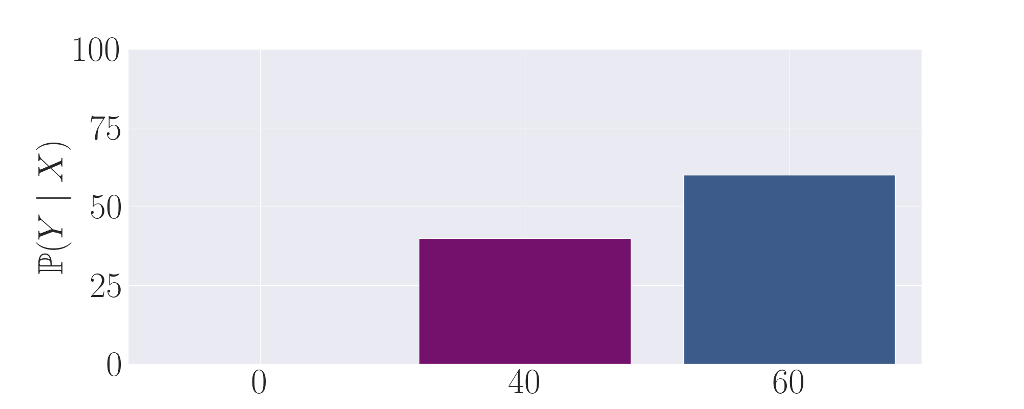
* **Header:** None present.
* **Main Chart Area:** A bar chart with a light gray grid background, containing three distinct categories on the x-axis and a numerical scale on the y-axis.
* **Footer:** None present.
## 2. Axis and Label Extraction
* **Y-Axis Title:** $\mathbb{P}(Y \mid X)$ (Mathematical notation for the conditional probability of $Y$ given $X$).
* **Y-Axis Markers:** 0, 25, 50, 75, 100.
* **X-Axis Labels:** 0, 40, 60.
* **Legend:** No explicit legend is provided; however, the bars are color-coded (Purple and Blue).
## 3. Data Table Reconstruction
The chart represents the probability values for three specific instances of $X$.
| X-Axis Category | Bar Color | Estimated Y-Value ($\mathbb{P}(Y \mid X)$) | Visual Trend |
| :--- | :--- | :--- | :--- |
| **0** | N/A | 0 | No bar visible; value is at the baseline. |
| **40** | Purple | 40 | Bar rises to the level of the 40 mark (interpolated between 25 and 50). |
| **60** | Blue | 60 | Bar rises to the level of the 60 mark (interpolated between 50 and 75). |
## 4. Detailed Analysis and Trends
* **Trend Verification:** The data shows a positive correlation between the value of the X-axis label and the resulting probability $\mathbb{P}(Y \mid X)$. As the label increases from 0 to 40 to 60, the height of the bars increases accordingly.
* **Visual Encoding:**
* The category **0** has a probability of 0.
* The category **40** is represented by a solid **purple** bar. Its height aligns precisely with the numerical value of its label (40) on the y-axis scale.
* The category **60** is represented by a solid **blue** bar. Its height aligns precisely with the numerical value of its label (60) on the y-axis scale.
* **Mathematical Implication:** The chart suggests a direct identity mapping or a strong linear relationship where $\mathbb{P}(Y \mid X) = X$ for the data points shown, expressed as a percentage or a value out of 100.
## 5. Spatial Grounding
* **Origin [0,0]:** Located at the bottom left of the grid.
* **Purple Bar:** Centered over the "40" tick mark on the x-axis.
* **Blue Bar:** Centered over the "60" tick mark on the x-axis.
* **Grid Lines:** Horizontal white grid lines are placed at intervals of 25 units (0, 25, 50, 75, 100).