# Technical Document Extraction: Bar Chart Analysis
## Chart Type
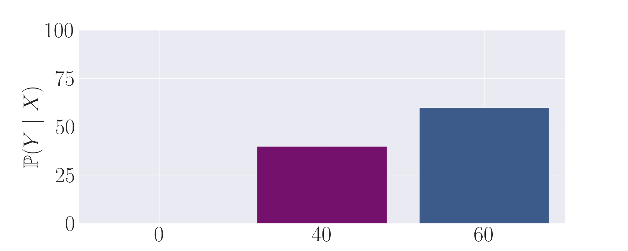
- **Bar Chart** with two vertical bars.
## Axis Labels
- **Y-Axis**: Labeled `P(Y | X)` with a range from 0 to 100 (in increments of 25).
- **X-Axis**: Labeled with numerical markers at 0, 40, and 60.
## Legend
- **Position**: Right side of the chart.
- **Entries**:
- **Purple**: Corresponds to `P(Y | X=40)`.
- **Blue**: Corresponds to `P(Y | X=60)`.
## Data Points
1. **Purple Bar**:
- **X-Coordinate**: 40.
- **Y-Value**: Approximately 40 (height of the bar).
2. **Blue Bar**:
- **X-Coordinate**: 60.
- **Y-Value**: Approximately 60 (height of the bar).
## Trends
- The blue bar (`P(Y | X=60)`) is taller than the purple bar (`P(Y | X=40)`), indicating a higher value for `P(Y | X=60)` compared to `P(Y | X=40)`.
- No additional trends observed due to the limited number of data points.
## Spatial Grounding
- **Legend Position**: Right-aligned, outside the main chart area.
- **Bar Placement**:
- Purple bar centered at x=40.
- Blue bar centered at x=60.
## Component Isolation
- **Header**: No explicit title or header text.
- **Main Chart**: Two bars with grid lines (light gray background, white grid).
- **Footer**: No footer elements.
## Notes
- The chart lacks a title, axis units, or explicit numerical annotations for the bars.
- The y-axis label `P(Y | X)` suggests a conditional probability or proportion, but the scale (0–100) implies a percentage or normalized value.
- The x-axis includes 0 as a placeholder, but no data is associated with it.
## Conclusion
The chart visually compares two conditional probabilities (`P(Y | X=40)` and `P(Y | X=60)`) using bar heights. The blue bar (`X=60`) exceeds the purple bar (`X=40`) in value, though exact numerical values are not provided.