## Line Charts: Layer-wise ΔP for Llama-3.2 Models
### Overview
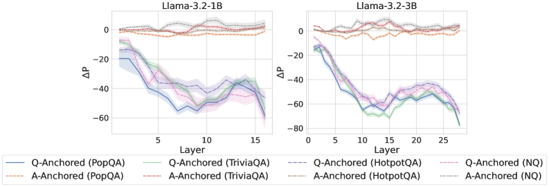
The image displays two side-by-side line charts comparing the performance change (ΔP) across model layers for two different Large Language Models (LLMs): Llama-3.2-1B (left chart) and Llama-3.2-3B (right chart). Each chart plots multiple data series representing different "anchoring" methods (Q-Anchored vs. A-Anchored) evaluated on four distinct question-answering datasets (PopQA, TriviaQA, HotpotQA, NQ).
### Components/Axes
* **Chart Titles:**
* Left Chart: `Llama-3.2-1B`
* Right Chart: `Llama-3.2-3B`
* **X-Axis (Both Charts):**
* Label: `Layer`
* Scale: Linear, from 0 to approximately 16 (for 1B model) and 0 to approximately 27 (for 3B model). Major tick marks are at intervals of 5 (0, 5, 10, 15, 20, 25).
* **Y-Axis (Both Charts):**
* Label: `ΔP` (Delta P, likely representing a change in probability or performance metric).
* Scale: Linear, ranging from approximately -80 to 0. Major tick marks are at intervals of 20 (-80, -60, -40, -20, 0).
* **Legend (Bottom Center, spanning both charts):**
* The legend contains 8 entries, organized in two rows and four columns. Each entry pairs a line style/color with a method and dataset.
* **Row 1 (Q-Anchored Methods):**
1. `Q-Anchored (PopQA)` - Solid blue line.
2. `Q-Anchored (TriviaQA)` - Solid green line.
3. `Q-Anchored (HotpotQA)` - Dashed purple line.
4. `Q-Anchored (NQ)` - Solid pink/magenta line.
* **Row 2 (A-Anchored Methods):**
1. `A-Anchored (PopQA)` - Dashed orange line.
2. `A-Anchored (TriviaQA)` - Dashed red line.
3. `A-Anchored (HotpotQA)` - Dashed grey line.
4. `A-Anchored (NQ)` - Dashed brown line.
### Detailed Analysis
**Llama-3.2-1B Chart (Left):**
* **Q-Anchored Series (Solid/Dashed Cool Colors):** All four Q-Anchored lines follow a similar, pronounced "U" or "V" shaped trend.
* They start near ΔP = -20 at Layer 0.
* They descend sharply, reaching a minimum (trough) between Layers 7 and 12. The lowest point is approximately ΔP = -55 to -60.
* They then ascend, recovering to values between ΔP = -40 and -20 by Layer 16.
* The lines are tightly clustered, with `Q-Anchored (TriviaQA)` (green) often being the lowest and `Q-Anchored (HotpotQA)` (purple dashed) being slightly higher in the recovery phase.
* **A-Anchored Series (Dashed Warm Colors):** All four A-Anchored lines show a very different, stable trend.
* They fluctuate closely around the ΔP = 0 line across all layers.
* The values remain within a narrow band, approximately between ΔP = -5 and +5.
* There is no significant downward or upward trend; the lines are relatively flat with minor noise.
**Llama-3.2-3B Chart (Right):**
* **Q-Anchored Series:** The pattern is similar to the 1B model but more exaggerated and extended.
* They start near ΔP = -15 at Layer 0.
* They descend to a deeper and broader trough. The minimum values are lower, reaching approximately ΔP = -70 to -75 between Layers 10 and 15.
* The recovery phase is also present, with values rising to between ΔP = -50 and -30 by Layer 27.
* The clustering is similar, with `Q-Anchored (TriviaQA)` (green) again often at the bottom of the cluster.
* **A-Anchored Series:** The trend mirrors the 1B model.
* Lines remain stable and close to ΔP = 0.
* Fluctuations are contained within approximately ΔP = -10 to +5.
* No major deviation from the zero baseline is observed.
### Key Observations
1. **Fundamental Dichotomy:** There is a stark, consistent contrast between Q-Anchored and A-Anchored methods across both model sizes. Q-Anchored methods show large, layer-dependent variation in ΔP, while A-Anchored methods show negligible variation.
2. **Model Size Effect:** The magnitude of the negative ΔP for Q-Anchored methods is greater in the larger model (3B), and the trough occurs over a wider range of middle layers.
3. **Dataset Consistency:** The relative ordering and shape of the curves for a given anchoring method (Q or A) are highly consistent across all four datasets (PopQA, TriviaQA, HotpotQA, NQ). This suggests the observed phenomenon is robust to the specific QA dataset used.
4. **Spatial Layout:** The legend is positioned centrally below both charts, allowing for easy cross-referencing. The charts share identical axis labels and scales, facilitating direct visual comparison.
### Interpretation
The data suggests a fundamental difference in how "Q-Anchored" and "A-Anchored" interventions or analyses affect the model's internal processing across its layers.
* **Q-Anchored Sensitivity:** The pronounced negative ΔP in the middle layers for Q-Anchored methods indicates that these layers are highly sensitive to whatever the "Q" (likely Question) anchoring represents. The significant drop suggests a disruption or a specific type of processing occurring at these depths. The subsequent partial recovery in later layers might indicate a correction or integration phase.
* **A-Anchored Stability:** The near-zero ΔP for A-Anchored methods implies that anchoring on "A" (likely Answer) has minimal disruptive effect on the model's internal probability distributions across layers. This could mean the model's processing related to answers is more stable or less susceptible to the measured intervention.
* **Architectural Insight:** The pattern is consistent across model scales (1B and 3B parameters), implying it's a characteristic of the model architecture or training paradigm, not a quirk of a specific model size. The deeper and broader trough in the 3B model could reflect its greater capacity and more specialized layer functions.
* **Practical Implication:** If ΔP measures a performance drop or a shift away from a desired behavior, this analysis pinpoints the middle layers as critical for Q-Anchored tasks. Techniques aimed at improving or stabilizing model performance might need to focus specifically on these layers for question-based processing. Conversely, answer-based processing appears inherently more robust.