## Scatter Plots: CoreInfogram and Core-Scatter Plot
### Overview
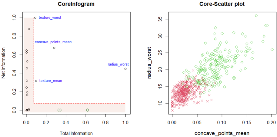
The image displays two distinct scatter plots side-by-side, likely generated from a data analysis or machine learning context (possibly related to feature selection or dataset exploration). The left plot is a "CoreInfogram" plotting "Net Information" against "Total Information". The right plot is a "Core-Scatter plot" showing the relationship between "concave_points_mean" and "radius_worst". Both plots use different marker styles and colors to represent data points.
### Components/Axes
**Left Plot: CoreInfogram**
* **Title:** CoreInfogram (centered at top)
* **X-axis:** Label: "Total Information". Scale: 0.0 to 1.0, with major ticks at 0.0, 0.2, 0.4, 0.6, 0.8, 1.0.
* **Y-axis:** Label: "Net Information". Scale: 0.0 to 1.0, with major ticks at 0.0, 0.2, 0.4, 0.6, 0.8, 1.0.
* **Data Points:** Represented by black open circles. Several points are annotated with blue text labels.
* **Annotations (Blue Text):**
* `texture_worst` (positioned near the top-left, approx. x=0.05, y=1.0)
* `concave_points_mean` (positioned in the upper-middle, approx. x=0.3, y=0.7)
* `radius_worst` (positioned on the right side, approx. x=1.0, y=0.45)
* `texture_mean` (positioned in the lower-middle, approx. x=0.3, y=0.3)
* **Other Visual Elements:** A red dashed line forms an L-shaped boundary. It runs vertically down from the top-left corner (approx. x=0.08) to a point (approx. x=0.08, y=0.08), then horizontally to the right edge (x=1.0, y=0.08). The area below and to the left of this line is shaded with a light pink/beige color.
**Right Plot: Core-Scatter plot**
* **Title:** Core-Scatter plot (centered at top)
* **X-axis:** Label: "concave_points_mean". Scale: 0.00 to 0.20, with major ticks at 0.00, 0.05, 0.10, 0.15, 0.20.
* **Y-axis:** Label: "radius_worst". Scale: 10 to 35, with major ticks at 10, 15, 20, 25, 30, 35.
* **Data Series & Legend (Inferred from visual encoding):**
* **Green Diamonds:** One data series. Points are scattered widely, showing a positive correlation.
* **Red Crosses ('x'):** A second data series. Points are densely clustered in the lower-left region of the plot.
* *Note: There is no explicit legend box. The series are distinguished solely by marker shape and color.*
### Detailed Analysis
**CoreInfogram Analysis:**
* The plot maps features (labeled points) based on two information metrics.
* **Trend/Pattern:** Most data points are clustered along the left edge (Total Information ≈ 0.0) and the bottom edge (Net Information ≈ 0.0). The annotated points are outliers from these clusters.
* **Key Data Points (Approximate Coordinates):**
* `texture_worst`: (0.05, 1.0) - Highest Net Information, very low Total Information.
* `concave_points_mean`: (0.3, 0.7) - High Net and moderate Total Information.
* `radius_worst`: (1.0, 0.45) - Highest Total Information, moderate Net Information.
* `texture_mean`: (0.3, 0.3) - Moderate values for both metrics.
* A dense cluster of unlabeled points exists at (0.0, 0.0).
* Another small cluster exists near (0.35, 0.0) and (0.6, 0.0).
**Core-Scatter Plot Analysis:**
* **Trend Verification:** The overall cloud of points (especially the green diamonds) shows a clear **positive, roughly linear trend**. As `concave_points_mean` increases, `radius_worst` tends to increase.
* **Data Series Distribution:**
* **Green Diamonds:** Spread across the entire range of the plot. They form the main body of the positive correlation. Values range from approx. (0.02, 12) to (0.20, 36).
* **Red Crosses:** Tightly clustered in the region where `concave_points_mean` is between 0.00 and 0.08, and `radius_worst` is between 8 and 18. This cluster sits at the lower-left end of the overall trend.
* **Density:** The highest density of points (both red and green) is in the lower-left quadrant, specifically where `concave_points_mean` < 0.05 and `radius_worst` < 20.
### Key Observations
1. **Feature Importance (Infogram):** The CoreInfogram suggests that `texture_worst` provides the highest "Net Information" with minimal "Total Information," making it a potentially highly efficient or informative feature. `radius_worst` has the maximum "Total Information."
2. **Class/Series Separation (Scatter Plot):** The two marker types (green diamonds, red crosses) appear to represent two distinct classes or groups within the data. The red cross group is characterized by low values of both `concave_points_mean` and `radius_worst`.
3. **Correlation:** There is a strong positive correlation between `concave_points_mean` and `radius_worst` in the overall dataset, as visualized in the Core-Scatter plot.
4. **Boundary in Infogram:** The red dashed L-shaped line and shaded region in the CoreInfogram likely demarcate a threshold or a region of interest, separating features with very low information metrics from those with higher values.
### Interpretation
These plots are likely part of an exploratory data analysis for a classification problem, possibly in a biomedical context (given feature names like `concave_points_mean` and `radius_worst`, which are common in breast cancer datasets).
* The **CoreInfogram** is a meta-analysis tool. It doesn't plot raw data but evaluates the *features themselves*. It helps identify which features (like `texture_worst`) are most informative (high Net Information) relative to their complexity or prevalence (Total Information). The shaded region might indicate a "low-value" zone for features.
* The **Core-Scatter plot** shows the raw relationship between two selected features. The clear separation of the red cross cluster suggests these two features (`concave_points_mean` and `radius_worst`) are powerful for distinguishing between two classes (e.g., benign vs. malignant samples). The positive correlation indicates that as one morphological characteristic increases, the other tends to as well.
* **Connection:** The Infogram likely helped select `concave_points_mean` and `radius_worst` as "core" features for deeper analysis, which is then visualized in the scatter plot. The scatter plot confirms their discriminative power and reveals the underlying data structure that the Infogram's metrics summarize.