## Scatter Plots: CoreInfogram and Core-Scatter Plot
### Overview
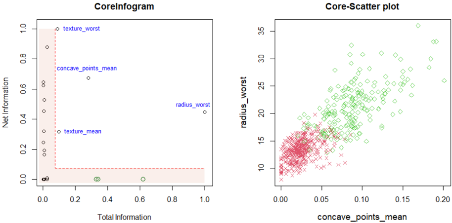
The image contains two scatter plots side-by-side. The left plot, titled "CoreInfogram," displays the relationship between "Total Information" and "Net Information" for several features. The right plot, titled "Core-Scatter plot," shows the relationship between "concave_points_mean" and "radius_worst," with data points distinguished by color/shape (red 'x' and green diamond).
### Components/Axes
**CoreInfogram (Left Plot):**
* **Title:** CoreInfogram
* **X-axis:** Total Information, ranging from 0.0 to 1.0 in increments of 0.2.
* **Y-axis:** Net Information, ranging from 0.0 to 1.0 in increments of 0.2.
* **Data Points:**
* texture\_worst (Total Information ~0.1, Net Information ~1.0)
* concave\_points\_mean (Total Information ~0.15, Net Information ~0.7)
* texture\_mean (Total Information ~0.2, Net Information ~0.3)
* radius\_worst (Total Information ~1.0, Net Information ~0.5)
* Several data points clustered near (0.0, 0.0), colored black, green, and white.
* **Red Dashed Box:** A red dashed box spans from approximately (0,0) to (0.1, 1.0).
* **Light Red Shaded Region:** A light red shaded region fills the area within the red dashed box and extends to the right, up to approximately Net Information = 0.1.
**Core-Scatter plot (Right Plot):**
* **Title:** Core-Scatter plot
* **X-axis:** concave\_points\_mean, ranging from 0.00 to 0.20 in increments of 0.05.
* **Y-axis:** radius\_worst, ranging from 10 to 35 in increments of 5.
* **Data Points:**
* Red 'x' markers clustered in the bottom-left corner.
* Green diamond markers scattered across the plot, generally trending upwards.
### Detailed Analysis
**CoreInfogram (Left Plot):**
* The majority of data points are clustered near the origin (0,0).
* The "texture\_worst" feature has high Net Information but low Total Information.
* The "radius\_worst" feature has high Total Information but moderate Net Information.
* The red dashed box and shaded region seem to highlight a specific area of interest in terms of Total and Net Information.
**Core-Scatter plot (Right Plot):**
* The red 'x' markers form a dense cluster, indicating a strong correlation between low "concave\_points\_mean" and low "radius\_worst" values.
* The green diamond markers show a positive correlation between "concave\_points\_mean" and "radius\_worst," although with more variance.
* There is some overlap between the red and green data points in the lower region of the plot.
### Key Observations
* The CoreInfogram plot visualizes the relationship between Total and Net Information for different features.
* The Core-Scatter plot shows the relationship between "concave\_points\_mean" and "radius\_worst," potentially distinguishing between two groups (red 'x' and green diamond).
### Interpretation
The CoreInfogram plot seems to be a feature selection or importance visualization, where Total and Net Information are used as metrics. Features clustered near the origin likely have low importance or relevance. The red box might indicate a threshold or region of interest for feature selection.
The Core-Scatter plot likely represents two different classes or groups of data, where the red 'x' markers represent one group and the green diamond markers represent another. The plot suggests that "concave\_points\_mean" and "radius\_worst" can be used to differentiate between these groups, although there is some overlap. The green diamonds show a positive correlation, suggesting that as "concave\_points\_mean" increases, "radius\_worst" also tends to increase for that group. The red 'x' markers are clustered, indicating a more consistent relationship between the two variables for that group.