\n
## Charts: CoreInfogram & Core-Scatter plot
### Overview
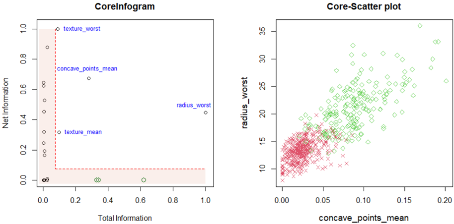
The image presents two charts: a scatter plot labeled "CoreInfogram" and another scatter plot labeled "Core-Scatter plot". Both charts appear to be related to data analysis, potentially in a medical or biological context, given the feature names.
### Components/Axes
**CoreInfogram:**
* **X-axis:** "Total Information" (Scale: 0.0 to 1.0)
* **Y-axis:** "Net Information" (Scale: 0.0 to 1.0)
* **Data Points:** Scattered points with no explicit legend, but labels are directly associated with some points.
* **Labels:** "texture\_worst", "concave\_points\_mean", "radius\_worst", "texture\_mean"
**Core-Scatter plot:**
* **X-axis:** "concave\_points\_mean" (Scale: 0.00 to 0.20)
* **Y-axis:** "radius\_worst" (Scale: 8 to 35)
* **Data Points:** Two distinct sets of points, represented by different colors and markers.
* **Legend:** (Implied by color and marker)
* Red points with '+' markers
* Green diamonds
### Detailed Analysis or Content Details
**CoreInfogram:**
The chart displays the relationship between "Total Information" and "Net Information". The data points are scattered, with a concentration of points near the bottom-left corner.
* "texture\_worst" is located at approximately (0.1, 0.85).
* "concave\_points\_mean" is located at approximately (0.25, 0.65).
* "radius\_worst" is located at approximately (0.8, 0.5).
* "texture\_mean" is located at approximately (0.3, 0.2).
**Core-Scatter plot:**
This chart shows the relationship between "concave\_points\_mean" and "radius\_worst".
* **Red Points (+):** These points form a dense cluster in the lower-left region of the chart, with "concave\_points\_mean" values ranging from approximately 0.00 to 0.10 and "radius\_worst" values ranging from approximately 8 to 18. There is a slight upward trend.
* **Green Diamonds:** These points are more dispersed, primarily in the upper-right region, with "concave\_points\_mean" values ranging from approximately 0.10 to 0.20 and "radius\_worst" values ranging from approximately 18 to 35. There is a clear upward trend.
### Key Observations
* **CoreInfogram:** The labeled points suggest that "texture\_worst" and "concave\_points\_mean" have relatively high "Net Information" compared to "texture\_mean". "radius\_worst" has moderate "Net Information" and high "Total Information".
* **Core-Scatter plot:** The two distinct clusters of points suggest two different groups or categories within the data. The positive correlation between "concave\_points\_mean" and "radius\_worst" indicates that as one variable increases, the other tends to increase as well.
### Interpretation
The charts likely represent features extracted from a dataset, potentially related to tumor characteristics (given the feature names like "radius\_worst", "concave\_points\_mean", and "texture").
* **CoreInfogram** appears to be a feature importance plot, showing how much "Net Information" each feature contributes, given its "Total Information". Features with higher "Net Information" are more informative for distinguishing between different classes or outcomes.
* **Core-Scatter plot** suggests a strong relationship between "concave\_points\_mean" and "radius\_worst". The two clusters could represent different subtypes of tumors or different stages of disease progression. The upward trend indicates that larger tumors (higher "radius\_worst") tend to have more irregular contours (higher "concave\_points\_mean").
The combination of these two charts provides a comprehensive view of the data, highlighting both the importance of individual features and the relationships between them. Further analysis would be needed to determine the specific meaning of these findings in the context of the original dataset.