## CoreInfogram: Net Information vs Total Information
### Overview
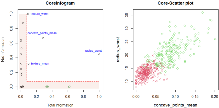
A scatter plot comparing "Net Information" (y-axis) and "Total Information" (x-axis), with labeled data points and a red dashed boundary line.
### Components/Axes
- **X-axis (Total Information)**: 0.0 to 1.0 (linear scale).
- **Y-axis (Net Information)**: 0.0 to 1.0 (linear scale).
- **Legend**:
- `texture_worst`: Circles (blue).
- `concave_points_mean`: Diamonds (green).
- `radius_worst`: Crosses (red).
- `texture_mean`: Squares (black).
### Detailed Analysis
- **Data Points**:
- `texture_worst`: Clustered near the top-left (Net Information ~0.8–0.9, Total Information ~0.0–0.1).
- `concave_points_mean`: Single point at (0.3, 0.6).
- `radius_worst`: Single point at (0.9, 0.4).
- `texture_mean`: Clustered near the bottom-left (Net Information ~0.0–0.2, Total Information ~0.0–0.1).
- **Boundary**: Red dashed line at y=0.0, extending horizontally across the plot.
- **Shaded Region**: Light red area below the dashed line, labeled "Net Information."
### Key Observations
- `texture_worst` and `texture_mean` dominate the lower-left quadrant.
- `radius_worst` is an outlier in the upper-right.
- `concave_points_mean` is isolated in the mid-range.
### Interpretation
The plot suggests a classification of features based on their "Net Information" contribution. `texture_worst` and `texture_mean` likely represent texture-related metrics, while `radius_worst` and `concave_points_mean` relate to shape or geometric properties. The red dashed line may indicate a threshold for meaningful net information.
---
## Core-Scatter plot: radius_worst vs concave_points_mean
### Overview
A scatter plot showing the relationship between "concave_points_mean" (x-axis) and "radius_worst" (y-axis), with two distinct clusters.
### Components/Axes
- **X-axis (concave_points_mean)**: 0.0 to 0.2 (linear scale).
- **Y-axis (radius_worst)**: 10 to 35 (linear scale).
- **Legend**:
- `radius_worst`: Red crosses.
- `concave_points_mean`: Green diamonds.
### Detailed Analysis
- **Data Points**:
- **Red Crosses (`radius_worst`)**: Clustered in the lower-left (x ~0.0–0.05, y ~10–15).
- **Green Diamonds (`concave_points_mean`)**: Spread diagonally from lower-left to upper-right (x ~0.0–0.2, y ~15–35).
- **Trend**: Positive correlation between `concave_points_mean` and `radius_worst` for green diamonds.
### Key Observations
- Red crosses (`radius_worst`) are tightly grouped, suggesting low variability.
- Green diamonds (`concave_points_mean`) show a gradient increase in `radius_worst` with higher `concave_points_mean`.
### Interpretation
The plot indicates that higher `concave_points_mean` values are associated with larger `radius_worst` measurements, possibly reflecting geometric complexity in a dataset (e.g., medical imaging or material science). The red crosses may represent a control group or baseline measurements.