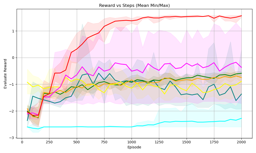
## Line Chart: Reward vs Steps (Mean Min/Max)
### Overview
The image is a line chart displaying the "Evaluate Reward" on the y-axis versus "Episode" on the x-axis. There are multiple lines, each representing a different data series, along with shaded regions around each line, indicating the min/max range. The chart visualizes the performance or learning progress over episodes.
### Components/Axes
* **Title:** Reward vs Steps (Mean Min/Max)
* **X-axis:**
* Label: Episode
* Scale: 0 to 2000, with markers at 0, 250, 500, 750, 1000, 1250, 1500, 1750, and 2000.
* **Y-axis:**
* Label: Evaluate Reward
* Scale: -3 to 1, with markers at -3, -2, -1, 0, and 1.
* **Data Series:** There are six distinct data series represented by different colored lines. Each line has a shaded region around it, presumably indicating the range (min/max) of the reward at each episode. The colors are red, magenta, teal, yellow, orange, and green. There is no explicit legend.
### Detailed Analysis
* **Red Line:** This line starts around -2 and rapidly increases to approximately 1 by episode 500. It then plateaus around 1.25, with a shaded region indicating a relatively small variance.
* **Magenta Line:** This line starts around -2 and increases to approximately -0.25 by episode 500. It then fluctuates between -0.25 and -0.5 until episode 2000.
* **Teal Line:** This line starts around -2.5 and remains relatively constant around -2.5 to -2.75 throughout the entire range of episodes.
* **Yellow Line:** This line starts around -1 and decreases to approximately -1.25 by episode 250. It then fluctuates between -1.25 and -0.75 until episode 2000.
* **Orange Line:** This line starts around -2 and increases to approximately -1 by episode 500. It then fluctuates between -1 and -0.75 until episode 2000.
* **Green Line:** This line starts around -2 and increases to approximately -1 by episode 500. It then fluctuates between -1 and -0.75 until episode 2000.
### Key Observations
* The red line shows the most significant improvement in reward over the episodes, reaching a plateau at a high reward value.
* The teal line shows the worst performance, with a consistently low reward value.
* The other lines (magenta, yellow, orange, and green) show moderate improvement initially, but then fluctuate around a relatively low reward value.
* The shaded regions indicate the variability in reward for each episode. The red line has a relatively small shaded region after episode 500, indicating consistent performance.
### Interpretation
The chart likely represents the performance of different agents or algorithms during a reinforcement learning process. The "Evaluate Reward" indicates the success of the agent in achieving its goal, and the "Episode" represents the number of training iterations.
The red line represents the most successful agent, as it quickly learns to achieve a high reward and maintains consistent performance. The teal line represents the least successful agent, as it fails to improve its reward over time. The other agents show some initial learning, but their performance plateaus at a relatively low reward value.
The shaded regions provide information about the stability of the learning process. A smaller shaded region indicates that the agent's performance is more consistent, while a larger shaded region indicates more variability.