## Charts: Auditory Spatialization & Correlation Analysis
### Overview
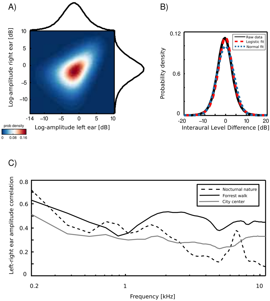
The image presents three charts (A, B, and C) related to auditory spatialization and correlation. Chart A is a 2D heatmap showing the probability density of log-amplitude differences between the left and right ears. Chart B displays probability density distributions of interaural level differences, fitted with different curves. Chart C shows the left-right ear amplitude correlation as a function of frequency for different environments.
### Components/Axes
**Chart A: Log-Amplitude Heatmap**
* **X-axis:** Log-amplitude left ear [dB], ranging from approximately -14 to 10 dB.
* **Y-axis:** Log-amplitude right ear [dB], ranging from approximately -10 to 10 dB.
* **Color Scale:** Represents probability density, ranging from 0 (dark blue) to 0.16 (red).
* **No explicit legend labels beyond the color scale.**
**Chart B: Interaural Level Difference Distribution**
* **X-axis:** Interaural Level Difference [dB], ranging from approximately -20 to 20 dB.
* **Y-axis:** Probability density, ranging from 0 to 0.12.
* **Legend:**
* Red solid line: Raw data
* Blue dashed line: Logistic fit
* Black dotted line: Normal fit
**Chart C: Left-Right Ear Amplitude Correlation**
* **X-axis:** Frequency [kHz], ranging from 0.2 to 10 kHz (logarithmic scale).
* **Y-axis:** Left-right ear amplitude correlation, ranging from 0 to 0.8.
* **Legend:**
* Black dashed line: Nocturnal nature
* Gray solid line: Forrest walk
* Black solid line: City center
### Detailed Analysis or Content Details
**Chart A: Log-Amplitude Heatmap**
The heatmap shows a concentration of probability density around the center (approximately 0 dB for both left and right ear log-amplitude). The density decreases as you move away from the center in either direction. There's a slight elongation along the diagonal, suggesting a positive correlation between left and right ear amplitudes. The highest density appears to be around (0 dB, 0 dB).
**Chart B: Interaural Level Difference Distribution**
The raw data (red line) is a unimodal distribution, peaking around 0 dB. The Logistic fit (blue dashed line) closely follows the raw data. The Normal fit (black dotted line) is also similar, but slightly broader and less peaked. The peak probability density is approximately 0.11 for all three curves.
**Chart C: Left-Right Ear Amplitude Correlation**
* **Nocturnal nature (dashed line):** Starts at approximately 0.65 at 0.2 kHz, decreases gradually to around 0.3 at 10 kHz, with some fluctuations.
* **Forrest walk (solid gray line):** Starts at approximately 0.55 at 0.2 kHz, decreases to around 0.25 at 10 kHz, with more pronounced fluctuations than the nocturnal nature.
* **City center (solid black line):** Starts at approximately 0.4 at 0.2 kHz, decreases to around 0.15 at 10 kHz, exhibiting the most significant fluctuations.
* All three lines show a general downward trend, indicating a decrease in correlation with increasing frequency. The city center consistently has the lowest correlation across all frequencies.
### Key Observations
* Chart A suggests that equal log-amplitudes in both ears are the most probable scenario.
* Chart B shows that the interaural level difference is approximately normally distributed around 0 dB.
* Chart C demonstrates that the correlation between left and right ear amplitudes decreases with increasing frequency, and this decrease is more pronounced in noisy environments (city center).
* The city center environment exhibits the lowest left-right ear amplitude correlation across all frequencies, indicating a more diffuse sound field.
### Interpretation
The data suggests an analysis of how sound is perceived spatially. Chart A provides insight into the distribution of sound intensity differences between the ears, which is a key cue for sound localization. Chart B quantifies the distribution of interaural level differences, a crucial parameter in auditory spatial perception. Chart C reveals how environmental noise impacts the coherence of sound signals reaching each ear.
The decreasing correlation with frequency in Chart C is likely due to the increased wavelength of lower frequencies, which allows them to diffract around obstacles more easily, resulting in greater similarity between the signals reaching each ear. The lower correlation in the city center is expected, as urban environments are characterized by numerous sound reflections and a more diffuse sound field.
The logistic and normal fits in Chart B suggest that the interaural level difference can be modeled using standard statistical distributions. The close match between the raw data and the fitted curves indicates that these models are reasonably accurate representations of the underlying data. The data collectively demonstrates the complex interplay between sound intensity, frequency, and environmental context in shaping our auditory experience.