## Scatter Plot Matrix: Prompt Type vs. Mean Accuracy
### Overview
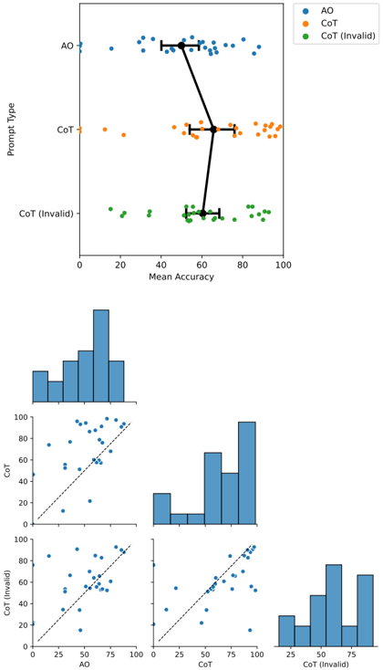
The image presents a scatter plot matrix analyzing the relationship between different prompt types (AO, CoT, CoT (Invalid)) and their mean accuracy. The top plot shows the distribution of mean accuracy for each prompt type, while the lower plots show pairwise scatter plots of the prompt types against each other.
### Components/Axes
**Top Plot:**
* **Y-axis:** "Prompt Type" with categories "AO", "CoT", and "CoT (Invalid)".
* **X-axis:** "Mean Accuracy" ranging from 0 to 100.
* **Legend (Top-Right):**
* Blue: "AO"
* Orange: "CoT"
* Green: "CoT (Invalid)"
* Error bars are present for each prompt type, indicating variability in the mean accuracy.
**Lower Plots (Scatter Plot Matrix):**
* **Diagonal Plots:** Histograms showing the distribution of each prompt type's accuracy.
* **Off-Diagonal Plots:** Scatter plots showing the relationship between pairs of prompt types. A dashed line is present in each scatter plot, representing the line of equality (y=x).
* **Bottom-Left:** CoT (Invalid) vs AO
* **Bottom-Middle:** CoT (Invalid) vs CoT
* **Middle-Left:** CoT vs AO
### Detailed Analysis
**Top Plot:**
* **AO (Blue):** The blue data points representing "AO" are scattered around a mean accuracy of approximately 55, with a range from near 0 to almost 90. The error bar spans from approximately 45 to 65.
* **CoT (Orange):** The orange data points representing "CoT" are scattered around a mean accuracy of approximately 65, with a range from near 10 to 100. The error bar spans from approximately 55 to 75.
* **CoT (Invalid) (Green):** The green data points representing "CoT (Invalid)" are scattered around a mean accuracy of approximately 55, with a range from near 10 to 80. The error bar spans from approximately 50 to 60.
**Lower Plots (Scatter Plot Matrix):**
* **AO Histogram:** The histogram shows a distribution centered around 50-60, with a spread from 0 to 100.
* **CoT Histogram:** The histogram shows a distribution centered around 80-90, with a spread from 0 to 100.
* **CoT (Invalid) Histogram:** The histogram shows a distribution centered around 50-60, with a spread from 20 to 80.
* **CoT vs AO Scatter Plot:** The scatter plot shows a positive correlation between AO and CoT. Most points are clustered above the dashed line, indicating that CoT generally has higher accuracy than AO.
* **CoT (Invalid) vs AO Scatter Plot:** The scatter plot shows a positive correlation between AO and CoT (Invalid). The points are scattered around the dashed line.
* **CoT (Invalid) vs CoT Scatter Plot:** The scatter plot shows a positive correlation between CoT and CoT (Invalid). Most points are clustered above the dashed line, indicating that CoT generally has higher accuracy than CoT (Invalid).
### Key Observations
* CoT generally has a higher mean accuracy compared to AO and CoT (Invalid).
* There is a positive correlation between all pairs of prompt types.
* The distributions of AO and CoT (Invalid) are similar.
### Interpretation
The data suggests that the "CoT" prompt type leads to higher accuracy compared to "AO" and "CoT (Invalid)". The positive correlations between the prompt types indicate that if one prompt type performs well, the others are also likely to perform well. The similarity in the distributions of "AO" and "CoT (Invalid)" suggests that these two prompt types might be related or have similar characteristics. The error bars in the top plot indicate the variability in the mean accuracy for each prompt type. The scatter plots provide a more detailed view of the relationship between the prompt types, showing how the accuracy of one prompt type relates to the accuracy of another.