## Scatter Plot with Histograms and Correlation Plots: Prompt Type vs Mean Accuracy
### Overview
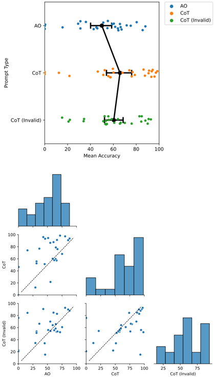
The image presents a multi-part visualization comparing three prompt types (AO, CoT, CoT (Invalid)) across mean accuracy metrics. It includes a primary scatter plot, three histograms, and three correlation plots. The data is color-coded (blue for AO, orange for CoT, green for CoT (Invalid)) and includes statistical annotations (mean accuracy with error bars).
### Components/Axes
1. **Primary Scatter Plot**:
- **X-axis**: Mean Accuracy (0–100)
- **Y-axis**: Prompt Type (AO, CoT, CoT (Invalid))
- **Legend**:
- Blue: AO
- Orange: CoT
- Green: CoT (Invalid)
- **Annotations**:
- Black lines connecting data points (possibly indicating relationships or comparisons).
2. **Histograms**:
- **X-axis**: Mean Accuracy (0–100)
- **Y-axis**: Frequency (0–100)
- **Bars**: Distributions of mean accuracies for each prompt type.
3. **Correlation Plots**:
- **X-axis**: Mean Accuracy (0–100)
- **Y-axis**: Mean Accuracy (0–100)
- **Dashed Line**: 45-degree reference line (indicating equality).
- **Plots**:
- AO vs CoT
- AO vs CoT (Invalid)
- CoT vs CoT (Invalid)
### Detailed Analysis
1. **Primary Scatter Plot**:
- **AO (Blue)**: Data points cluster around 50–60 mean accuracy, with error bars indicating variability.
- **CoT (Orange)**: Points cluster around 70–80 mean accuracy, with tighter clustering.
- **CoT (Invalid) (Green)**: Points cluster around 20–30 mean accuracy, with wider spread.
- **Lines**: Black lines connect points across prompt types, suggesting comparative relationships (e.g., AO > CoT > CoT (Invalid)).
2. **Histograms**:
- **AO**: Peak frequency at 50–60 mean accuracy.
- **CoT**: Peak frequency at 70–80 mean accuracy.
- **CoT (Invalid)**: Peak frequency at 20–30 mean accuracy.
3. **Correlation Plots**:
- **AO vs CoT**: Points mostly above the 45-degree line, indicating AO generally outperforms CoT.
- **AO vs CoT (Invalid)**: Points far above the line, showing AO significantly outperforms CoT (Invalid).
- **CoT vs CoT (Invalid)**: Points mostly above the line, indicating CoT outperforms CoT (Invalid).
### Key Observations
1. **Performance Hierarchy**:
- AO > CoT > CoT (Invalid) in mean accuracy.
- CoT (Invalid) has the lowest performance, with a mean accuracy of ~25–30.
- AO and CoT show moderate variability, while CoT (Invalid) has the widest spread.
2. **Distribution Patterns**:
- Histograms confirm AO and CoT have concentrated distributions, while CoT (Invalid) is more dispersed.
- Correlation plots reinforce the hierarchy, with AO consistently outperforming other types.
3. **Statistical Annotations**:
- Error bars on the primary scatter plot suggest measurement uncertainty (e.g., AO: ±5, CoT: ±3, CoT (Invalid): ±7).
### Interpretation
The data demonstrates a clear performance hierarchy among prompt types. AO achieves the highest mean accuracy (~50–60), followed by CoT (~70–80), while CoT (Invalid) lags significantly (~20–30). The histograms and correlation plots validate this trend, with AO and CoT showing tighter distributions and CoT (Invalid) exhibiting greater variability. The 45-degree reference lines in correlation plots highlight that AO and CoT outperform CoT (Invalid) by large margins. The black connecting lines in the primary scatter plot may indicate intentional comparisons or relationships between prompt types, though their exact purpose is not explicitly labeled. The results suggest that CoT (Invalid) may require refinement or alternative design to improve performance.