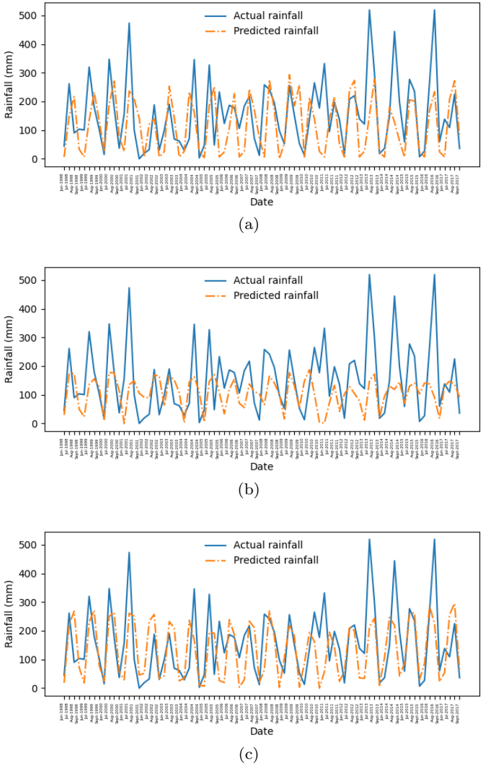
## Rainfall Prediction Comparison Charts
### Overview
The image presents three line charts, labeled (a), (b), and (c), comparing actual rainfall data with predicted rainfall data over time. Each chart spans a period from approximately January 1998 to September 2017. The y-axis represents rainfall in millimeters (mm), ranging from 0 to 500. The x-axis represents the date. The actual rainfall is represented by a solid blue line, while the predicted rainfall is represented by a dashed orange line.
### Components/Axes
* **Y-axis (Rainfall):**
* Label: "Rainfall (mm)"
* Scale: 0 to 500 mm, with implied increments of 100 mm.
* **X-axis (Date):**
* Label: "Date"
* Scale: Approximately January 1998 to September 2017. Tick marks are present for each month, but the month labels are only partially legible.
* **Legend:** Located in the top-right corner of each chart.
* "Actual rainfall" - Solid blue line
* "Predicted rainfall" - Dashed orange line
* **Chart Labels:** (a), (b), and (c) are located below each respective chart.
### Detailed Analysis
**Chart (a):**
* **Actual Rainfall (Blue):** The actual rainfall fluctuates significantly throughout the period. There are several peaks exceeding 400 mm, with the highest peak around 480 mm occurring around 2001. The trend is cyclical, with periods of high rainfall followed by periods of lower rainfall.
* **Predicted Rainfall (Orange):** The predicted rainfall generally follows the trend of the actual rainfall but with less extreme peaks and troughs. The predicted rainfall rarely exceeds 300 mm.
* **Data Points:**
* Jan 1998: Actual ~100 mm, Predicted ~50 mm
* 2001 Peak: Actual ~480 mm, Predicted ~250 mm
* Sept 2017: Actual ~150 mm, Predicted ~100 mm
**Chart (b):**
* **Actual Rainfall (Blue):** Similar to chart (a), the actual rainfall fluctuates significantly. A notable peak reaches approximately 470 mm around 2015.
* **Predicted Rainfall (Orange):** The predicted rainfall follows the general trend of the actual rainfall but with less intensity.
* **Data Points:**
* Jan 1998: Actual ~100 mm, Predicted ~50 mm
* 2015 Peak: Actual ~470 mm, Predicted ~250 mm
* Sept 2017: Actual ~150 mm, Predicted ~100 mm
**Chart (c):**
* **Actual Rainfall (Blue):** The actual rainfall shows similar fluctuations as in charts (a) and (b). A peak around 450 mm occurs around 2015.
* **Predicted Rainfall (Orange):** The predicted rainfall follows the trend of the actual rainfall, but the peaks are less pronounced.
* **Data Points:**
* Jan 1998: Actual ~100 mm, Predicted ~50 mm
* 2015 Peak: Actual ~450 mm, Predicted ~250 mm
* Sept 2017: Actual ~150 mm, Predicted ~100 mm
### Key Observations
* All three charts show similar patterns of actual and predicted rainfall.
* The predicted rainfall consistently underestimates the peak values of actual rainfall.
* The predicted rainfall generally captures the cyclical nature of the actual rainfall.
* The charts appear to represent different models or parameter settings for rainfall prediction.
### Interpretation
The charts illustrate the performance of rainfall prediction models. The models capture the overall trend of rainfall but struggle to accurately predict the magnitude of peak rainfall events. The differences between charts (a), (b), and (c) likely reflect variations in model parameters or model structure, leading to slightly different prediction outcomes. The consistent underestimation of peak rainfall suggests a limitation in the model's ability to capture extreme weather events. Further analysis would be needed to determine which model configuration (a, b, or c) provides the best overall performance based on metrics such as root mean squared error or correlation coefficient.